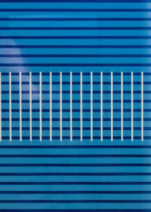
Citibank Square
Frosted glass in Citibank lobby16 total reviews
Comment from SteveANH
I'm glad you didn't de noise this! I love the look just the way it is. The image is perfect for the contest, the "squares" jump off the image and I'm very impressed that you spotted this and shot the scene for the contest.
Did folks in the bank think you were a little strange taking a picture of the wall? LOL
reply by the author on 13-Jul-2015
      |
I'm glad you didn't de noise this! I love the look just the way it is. The image is perfect for the contest, the "squares" jump off the image and I'm very impressed that you spotted this and shot the scene for the contest.
Did folks in the bank think you were a little strange taking a picture of the wall? LOL
Comment Written 08-Jul-2015
reply by the author on 13-Jul-2015
-
Thanks so much!! I waited until off hours and just took the picture from where the cash machines are. It's funny some people didn't see any squares but they are as obvious to me as they are to you! Paula
Comment from GaliaG
weird idea, but unique
good technique, good use of light, good focus and composition
good luck with the contest
thanks for sharing
This rating does not count towards story rating or author rank.
The highest and the lowest rating are not included in calculations.
reply by the author on 13-Jul-2015
      |
weird idea, but unique
good technique, good use of light, good focus and composition
good luck with the contest
thanks for sharing
This rating does not count towards story rating or author rank.
The highest and the lowest rating are not included in calculations.
Comment Written 08-Jul-2015
reply by the author on 13-Jul-2015
-
Thanks Galia
Comment from victoreahh
Have to give you a 5 for seeing the art in photographing this one. It does have a certain abstract appeal and the vibrant blue is eye catching. Although not a square itself,there are squares formed within the lines.
reply by the author on 13-Jul-2015
      |
Have to give you a 5 for seeing the art in photographing this one. It does have a certain abstract appeal and the vibrant blue is eye catching. Although not a square itself,there are squares formed within the lines.
Comment Written 07-Jul-2015
reply by the author on 13-Jul-2015
-
Thanks so much for enjoying!
Comment from lulube
I guess how you came up with this presentation, by chance, it makes sense to you, the creator, but in all honesty, I don't get it. Not being rude but I see wrapping paper design. I guess the mid-section follows the "yes be a square" so I hope you do well in the contest. Sorry that I don't know what you were going for.
lulube
      |
I guess how you came up with this presentation, by chance, it makes sense to you, the creator, but in all honesty, I don't get it. Not being rude but I see wrapping paper design. I guess the mid-section follows the "yes be a square" so I hope you do well in the contest. Sorry that I don't know what you were going for.
lulube
Comment Written 07-Jul-2015
Comment from Lilibug6
This is a nice shot and good entry for the contest! The lines and squares are very nice! The color is good! Nice job and good luck in the contest! Lilibug6
      |
This is a nice shot and good entry for the contest! The lines and squares are very nice! The color is good! Nice job and good luck in the contest! Lilibug6
Comment Written 07-Jul-2015
Comment from photobeat
very nice shot my friend, the color saturation is fantastic, wish the white batch on the left wasn't there but overall it is a good shot, well done indeed, beny ")
      |
very nice shot my friend, the color saturation is fantastic, wish the white batch on the left wasn't there but overall it is a good shot, well done indeed, beny ")
Comment Written 07-Jul-2015
Comment from sherry12034
This is very interesting. It definitely is made of squares. The shadow is not very visible but you did capture it. Good job. The color is nice.
      |
This is very interesting. It definitely is made of squares. The shadow is not very visible but you did capture it. Good job. The color is nice.
Comment Written 06-Jul-2015
Comment from a.samathasena
What a great nice gorgeous lovely shot.Beautiful scene and very nice entrance.Lot Of squares, blue b/g and blue white lines and designs,color and light balance are gorgeous and great. I like this lovely talent work.Focus color and all are excellent.Great job.Well Done.Thanks.
      |
What a great nice gorgeous lovely shot.Beautiful scene and very nice entrance.Lot Of squares, blue b/g and blue white lines and designs,color and light balance are gorgeous and great. I like this lovely talent work.Focus color and all are excellent.Great job.Well Done.Thanks.
Comment Written 06-Jul-2015
Comment from seshadri_sreenivasan
It is always nice to see alternate approaches. The idea behind the shot and the colour really speaks here.I also like the horizontal and vertical lines that relieve the monotony of a single design. Good luck!
      |
It is always nice to see alternate approaches. The idea behind the shot and the colour really speaks here.I also like the horizontal and vertical lines that relieve the monotony of a single design. Good luck!
Comment Written 06-Jul-2015
Comment from Sean T Phelan
Cool!
That's a pleasingly unusual and highly interesting image that you've presented us with here,my friend!
A really Good Show!
~Sean
      |
Cool!
That's a pleasingly unusual and highly interesting image that you've presented us with here,my friend!
A really Good Show!
~Sean
Comment Written 06-Jul-2015
