
St Louis Cardinals
Baseball35 total reviews
Comment from david F
i hear you , i hear you and couldnt agree with you more, you know ive said it a few times because its porter art and does exactly what its supposed to do (grab our attention ) its too easy to see the subject amtter and the mssage and not see just how good the art and the artist is , Not me Bro , top man
reply by the author on 29-Jun-2012
  |
i hear you , i hear you and couldnt agree with you more, you know ive said it a few times because its porter art and does exactly what its supposed to do (grab our attention ) its too easy to see the subject amtter and the mssage and not see just how good the art and the artist is , Not me Bro , top man
Comment Written 29-Jun-2012
reply by the author on 29-Jun-2012
-
thanks bro...im thinking about doing a ink art contest...any topic, but has to be dont in ink...i might get my butt handed to me in the contest..but i guess it will prove a point...what do you think? thanks for the ego boost and good reviw.
-
oh why noy yes i;ll do one for it "think ink " could be the tittle lol
-
or "think ink it dos'nt stink" LOL
-
roflmao...even my wife is laughing on that one..lol..ill consider that one...but i do have a habit sometimes of pissing people off..ill think on it...you will see soon..wink
-
you pissing people off !!! i find that hard to believe LOL
-
evil grin
Comment from phil1950
Fantastic poster love the way you have done the shadow from the cap gives it a feel of reallity the background and text look really good I can sense the motion of the baseball composition is spot on well done as usual. (Standing ovation)
reply by the author on 29-Jun-2012
|
Fantastic poster love the way you have done the shadow from the cap gives it a feel of reallity the background and text look really good I can sense the motion of the baseball composition is spot on well done as usual. (Standing ovation)
Comment Written 29-Jun-2012
reply by the author on 29-Jun-2012
-
whoa!,,thanks phil glad you have enjoyed this and thanks for the review.
Comment from brwartwork
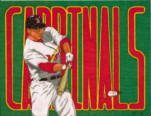
Fairly good, except you've got the player hitting with an away helmet while wearing a home uniform. (Cardinal home uniforms are white, away uniforms are gray. Home helmet/hat is red with blue letters).
This rating does not count towards story rating or author rank.
The highest and the lowest rating are not included in calculations.
reply by the author on 29-Jun-2012
  |
Fairly good, except you've got the player hitting with an away helmet while wearing a home uniform. (Cardinal home uniforms are white, away uniforms are gray. Home helmet/hat is red with blue letters).
This rating does not count towards story rating or author rank.
The highest and the lowest rating are not included in calculations.
Comment Written 28-Jun-2012
reply by the author on 29-Jun-2012
-
awwwww..you caught that...i love the away helmet for this project to give a better highlight effect..thanks for the review.
Comment from Kenneth Dinkel
Mark McGwire is the man and always will be. They crucified him and Barry bonds skates.
Nice rendering with vivid color and appeal. Well done
reply by the author on 29-Jun-2012
|
Mark McGwire is the man and always will be. They crucified him and Barry bonds skates.
Nice rendering with vivid color and appeal. Well done
Comment Written 28-Jun-2012
reply by the author on 29-Jun-2012
-
i agree, mark was the man! glad that you like and thanks for the review.,
Comment from Sam S
This is a neat drawing of the batter. That is a whole lot of letters to paint on. Kind of hard to read. Regardless you persevered and PAINTED them in well. Thanks for sharing. Sam
reply by the author on 29-Jun-2012
|
This is a neat drawing of the batter. That is a whole lot of letters to paint on. Kind of hard to read. Regardless you persevered and PAINTED them in well. Thanks for sharing. Sam
Comment Written 28-Jun-2012
reply by the author on 29-Jun-2012
-
you know sam...i was kept being gigged for the print being to small..you think they can see now?...lol. thanks for the review.
Comment from bernieozfrog
I wouldnt call being # 2 the back ground Mr MKFLood.
Great technic.Great focus and initial impact, and they are jaleous cos u can use other mediums and they would flop using sharpies.
good overal balance of the subject and back ground.
I would have thought one needs greater control to use sharpies.
reply by the author on 29-Jun-2012
 |
I wouldnt call being # 2 the back ground Mr MKFLood.
Great technic.Great focus and initial impact, and they are jaleous cos u can use other mediums and they would flop using sharpies.
good overal balance of the subject and back ground.
I would have thought one needs greater control to use sharpies.
Comment Written 28-Jun-2012
reply by the author on 29-Jun-2012
-
you know bernie i thought about organizing a ink art contest on here..i just dont know i would get more than oner person to participate...what do you think?...glad that you have enjoyed and thanks for the ego boost, brought me out of my manrag stage...lol.thanks for the review.
-
Well its a good way to win a contest,and speaking of which it reminds me of your piece on the different angle contest,i thought you did a magnificent work of art, well ahead of the rest!
As for an ink contest, i would throw the glove of challenge and invite your fellow arist to have a go at it.I am sure a dozen of them are very capable to raise to it!
Goodluck and thanks for the reply,
Regards,
Ape.
PS: Tell me,Mr MKFLood,is harder to use sharpies as a medium?I would have say yes!
-
opinions vary...i say its really easy...its like this whatever the project that is in front on you, it must be mapped out during the sketch..what is to be highlighted...and you work it opposite than any other medium..example..all the other mediums you would bring on your rich colors witha the lighter ones to highlight...its the opposite in ink..you start with light adn work way to the darkers color...in other words ill have several shades of color overlapping in particular areas. if you saw the sketch and the the ink starts , 1 layer, 2 layer and so on and each layer progresses it will come to life..the scky thing is if there is a mistake, its hard to cover up..99% of the time when that i happens i throw it aways and start over..i know ista bitch but your right about one thing..they can be a monster when something goes worng...lol..thanks for the comment on the angles contest..thats has memphis all over it..cant seem to get these suckers to notice me, to many artist around here..lol.thats is why i have been pushing my self everywhere but here...lol.
-
Thank you for the lesson on sharpies,very interesting!
Comment from Alison Ryde
red and green two of my favourite colours.
great for baseball fans I guess.
to be honest I admire the skill but I find it rather repetitive.
reply by the author on 29-Jun-2012
|
red and green two of my favourite colours.
great for baseball fans I guess.
to be honest I admire the skill but I find it rather repetitive.
Comment Written 28-Jun-2012
reply by the author on 29-Jun-2012
-
my apologize alison..as i said in my artist notes that im trying to get all the teams done in between other projects.there is always someone out there saying..good poster but i dont like that team do you have......you will see these pop in between other drawings...even though you dont like baseball i really appreciate you taking your time in giving me this review...thanks.
Comment from dream alone
Good job with the ball in motion - and I wonder how small it is and how you accomplished such detail, like you did with the nose, mouth and belt.
reply by the author on 29-Jun-2012
|
Good job with the ball in motion - and I wonder how small it is and how you accomplished such detail, like you did with the nose, mouth and belt.
Comment Written 28-Jun-2012
reply by the author on 29-Jun-2012
-
ball? less about 1/4 inch..the head is 1 inch by 1/2.. this is only 8x11 did it in about 5 hors..statring from sketch to ink finish. thanks for the great review.
-
yw. so do you use sharpie extra fine markers for things like the ball? i'm amazed at the details!
-
oh yeah..see i have several hundred sharpies from extra fine point to really fine poitn all the way up to a think markers, for bigger projects. yes and now you know how i can get those details on such a small area..
-
oh i'm still impressed - even using the extra fine it is still amazing to me how you dude it! lol
Comment from Meluwkah hierateuma
Hello there! This is good Sharpie marker on poster art work, i like the motion and the colours and the composition as well!
Thanks for sharing and good luck!
Shalom! :)
reply by the author on 29-Jun-2012
|
Hello there! This is good Sharpie marker on poster art work, i like the motion and the colours and the composition as well!
Thanks for sharing and good luck!
Shalom! :)
Comment Written 28-Jun-2012
reply by the author on 29-Jun-2012
-
thanks meluwkah for the great review.
Comment from Victoreus
I have no idea why the art world would not recognize that using the marker ink could actually be a bigger challenge? This is such an outstanding piece. The shading and sharpness is just incredible to me. Hang in there - someday they will know. I love your work.
reply by the author on 29-Jun-2012
|
I have no idea why the art world would not recognize that using the marker ink could actually be a bigger challenge? This is such an outstanding piece. The shading and sharpness is just incredible to me. Hang in there - someday they will know. I love your work.
Comment Written 28-Jun-2012
reply by the author on 29-Jun-2012
-
i know they will,,its taking me 40 years to finally getting noticed...i guess i overreacted when i saw those 2 contest excluding me when im catagorized as traditional artist...im thinking about participating anyway and let them boot me out..i know im a trouble maker...lol. glad that you like and thanks for the great review.