Earth
The second in my "Elemental Brothers"10 total reviews
Comment from saffron_factor
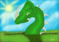
The lovely glinting green of the dragon is striking!
But, it looks phoney.
The background is not at all satisfactory.
The grass needs lots od work.
The expression on the dragon is perhaps that of dismay.
The eyes have an unpleasant shrewish look.
You have come a long way!
Great!
reply by the author on 17-Apr-2004
   |
The lovely glinting green of the dragon is striking!
But, it looks phoney.
The background is not at all satisfactory.
The grass needs lots od work.
The expression on the dragon is perhaps that of dismay.
The eyes have an unpleasant shrewish look.
You have come a long way!
Great!
Comment Written 17-Apr-2004
reply by the author on 17-Apr-2004
-
I had trouble getting the feel for this one.
Comment from Tillantria
Suggestion:
When I saw this work, I felt the shades of green already represented needed more variety to combat the clashing sky. To incorporate the blue and make it less distracting, you should have combined greens with blueish hues with the other greens already here. I feel that would have made this piece more appealing.
~Tillie
reply by the author on 16-Apr-2004
|
Suggestion:
When I saw this work, I felt the shades of green already represented needed more variety to combat the clashing sky. To incorporate the blue and make it less distracting, you should have combined greens with blueish hues with the other greens already here. I feel that would have made this piece more appealing.
~Tillie
Comment Written 16-Apr-2004
reply by the author on 16-Apr-2004
-
Thank you, I was lost on the right feel, when I can I'll redow this one.
Comment from Wolfdancer13
A beautiful green to capture the eye with that majestic rhino's horn...the expression so contemplative, sad for such a bright baby blue background. The line is too sharpened where the body sinks into the grassy sea. It should blend in so your onlooker has a hard time seeing where the two meet. This could use a little more depth of detail found in your other pieces. Otherwise, another great to add to your collection.
reply by the author on 16-Apr-2004
|
A beautiful green to capture the eye with that majestic rhino's horn...the expression so contemplative, sad for such a bright baby blue background. The line is too sharpened where the body sinks into the grassy sea. It should blend in so your onlooker has a hard time seeing where the two meet. This could use a little more depth of detail found in your other pieces. Otherwise, another great to add to your collection.
Comment Written 16-Apr-2004
reply by the author on 16-Apr-2004
-
I had trouble getting the feel of the earth in this one, I plan to some day redo this piece.
Comment from S.C.Cobb
This one reminds me of a Triceratops with a serpant body. I like this one as well, but unlike its counterparts, the surface that conceals its body cant just be there. If you would only give the impression of a little jagged breakage in the earth, this would do just fine
This rating does not count towards story rating or author rank.
The highest and the lowest rating are not included in calculations.
reply by the author on 16-Apr-2004
|
This one reminds me of a Triceratops with a serpant body. I like this one as well, but unlike its counterparts, the surface that conceals its body cant just be there. If you would only give the impression of a little jagged breakage in the earth, this would do just fine
This rating does not count towards story rating or author rank.
The highest and the lowest rating are not included in calculations.
Comment Written 16-Apr-2004
reply by the author on 16-Apr-2004
-
I had alot of trouble getting the feel of the earth on this one. I plan on redoing it some day.
Comment from emotif
Our Dragon friend is almost pretty, almost female, and I wonder where he/she sits in the story as she looks to me almost benign. Not at all frightening as a fiend, and rather a pretty girl. Best wishes.
reply by the author on 16-Apr-2004
|
Our Dragon friend is almost pretty, almost female, and I wonder where he/she sits in the story as she looks to me almost benign. Not at all frightening as a fiend, and rather a pretty girl. Best wishes.
Comment Written 16-Apr-2004
reply by the author on 16-Apr-2004
-
Thank you
Comment from stonesage
I like the overall look of this piece, but find the shadows a little off. And I guess I almost expect to see some sign that this wyrm(dragon) actually exited the ground(like rubble or dirt that has been pushed upward). The sky looks pretty darn nice though. Also, the look on the creatures face is nice. Looks pretty smug.
reply by the author on 16-Apr-2004
|
I like the overall look of this piece, but find the shadows a little off. And I guess I almost expect to see some sign that this wyrm(dragon) actually exited the ground(like rubble or dirt that has been pushed upward). The sky looks pretty darn nice though. Also, the look on the creatures face is nice. Looks pretty smug.
Comment Written 15-Apr-2004
reply by the author on 16-Apr-2004
-
I had alot of trouble with that one. When I can get photoshop again I'm going to redo this one.
-
When you redo it PM me and I will review it again. :)
Comment from Texas Rose
Wow, a one horned locknes monster,
I like this pic. Good job, can't wait to
see what you do next.
Good luck
T Rose
reply by the author on 16-Apr-2004
|
Wow, a one horned locknes monster,
I like this pic. Good job, can't wait to
see what you do next.
Good luck
T Rose
Comment Written 15-Apr-2004
reply by the author on 16-Apr-2004
-
That was the worst out of the set.
-
But it is good. Well, that's my opinion. hehe
Comment from Lpspider
Shadow isn't correct. Throughs it off drastically. work on different colors. Did like the spike things. The sky was nice. Keep drawing.
This rating does not count towards story rating or author rank.
The highest and the lowest rating are not included in calculations.
reply by the author on 15-Apr-2004
|
Shadow isn't correct. Throughs it off drastically. work on different colors. Did like the spike things. The sky was nice. Keep drawing.
This rating does not count towards story rating or author rank.
The highest and the lowest rating are not included in calculations.
Comment Written 15-Apr-2004
reply by the author on 15-Apr-2004
-
I had alot of trouble getting this one right. I couldn't quite get the right feel.
Comment from Richard
This is another good image. The realism isn't quite there though the shadows don't seem correct and the grass at the bottom edge of the neck doesn't fit with the rest of your quality. I look forward to more.
reply by the author on 15-Apr-2004
|
This is another good image. The realism isn't quite there though the shadows don't seem correct and the grass at the bottom edge of the neck doesn't fit with the rest of your quality. I look forward to more.
Comment Written 15-Apr-2004
reply by the author on 15-Apr-2004
-
Thankyou for pointing that out to me. I had trouble with this one, I couldn't get it to look right. Thank you
Comment from cube66
If it weren't for the fairly clean shading and color blending this would be a two star. It's look like it came out of paint, and is not realistic at all. I'm to say this but I am not flattered. This is average is not below, and nothing more. Keep working at it though, you'll get better!!!
reply by the author on 15-Apr-2004
|
If it weren't for the fairly clean shading and color blending this would be a two star. It's look like it came out of paint, and is not realistic at all. I'm to say this but I am not flattered. This is average is not below, and nothing more. Keep working at it though, you'll get better!!!
Comment Written 15-Apr-2004
reply by the author on 15-Apr-2004
-
I did have alot of trouble with this one, I couldn't get the feel of the background.