The book of postcards.
Viewing comments for Page 143 "Variations of Form"garphic design efforts, postcards
20 total reviews
Comment from Highfive
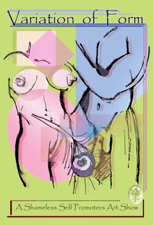
Lucien this is a pleasant blue, and green painting of two humans forms. I think this is a simple contour line drawing with a little gesture drawing. Very nice presentation, clarity in your design.
reply by the author on 14-Feb-2008
  |
Lucien this is a pleasant blue, and green painting of two humans forms. I think this is a simple contour line drawing with a little gesture drawing. Very nice presentation, clarity in your design.
Comment Written 14-Feb-2008
reply by the author on 14-Feb-2008
-
Highfive,
thanks for the kind words in the review, appreciate the time and take care and cheers!
Lucien
Comment from Katy
Great job Lucien! Interesting study of the male and female form. Abstract and most enjoyable to view. The colors you used are well chosen and work fabulously together. Wonderfully creative. I like this very much! Katy
reply by the author on 14-Feb-2008
|
Great job Lucien! Interesting study of the male and female form. Abstract and most enjoyable to view. The colors you used are well chosen and work fabulously together. Wonderfully creative. I like this very much! Katy
Comment Written 14-Feb-2008
reply by the author on 14-Feb-2008
-
Katy,
thank you, pleased by the fact you really like this image.
take care and cheers!
Lucien
Comment from shannonsad
this is very good-I know it would most likely get my husband to the art show! Very goos detail and i like the way that have blended the two together in place yet separated enough I love your choice of text as well.
reply by the author on 14-Feb-2008
|
this is very good-I know it would most likely get my husband to the art show! Very goos detail and i like the way that have blended the two together in place yet separated enough I love your choice of text as well.
Comment Written 14-Feb-2008
reply by the author on 14-Feb-2008
-
shannonsad,
thank you for nice words in the review, appreciated by me... take care and cheers!
Lucien
Comment from barka
A very interesting picture collage. I like the color palette very much. I like the framing too. The overall view is very nice. The letters do match up whit the image.
reply by the author on 14-Feb-2008
|
A very interesting picture collage. I like the color palette very much. I like the framing too. The overall view is very nice. The letters do match up whit the image.
Comment Written 14-Feb-2008
reply by the author on 14-Feb-2008
-
barka,
thnak you for your time and the review of this image, apprceiated by me on all counts... take care and cheers!
Lucien
Comment from BingoStar
Well you did let it all hang out in different directions for sure. Nice colors used here. I really like the green background then the pink and blue. It has a lot to say and has nice designs, shapes and sizes too
reply by the author on 14-Feb-2008
|
Well you did let it all hang out in different directions for sure. Nice colors used here. I really like the green background then the pink and blue. It has a lot to say and has nice designs, shapes and sizes too
Comment Written 14-Feb-2008
reply by the author on 14-Feb-2008
-
BingoStar,
thank you for your time and the review of this image, your observations are appreciated by me... take care and cheers!
LvO
Comment from sidewinder
I am so glad no one has ever asked me to do something like this. You've managed to stay in the classy range, I have no doubt if it were me I would have tried to slip something immature and sleezy into it. I have a frind who does animatin for disney and you should see some of the things they burry in the animations for fun. Anyway, it is nicley done and I suspect you will get a lot of positive feedback from the art community at the show. --Jim
reply by the author on 14-Feb-2008
|
I am so glad no one has ever asked me to do something like this. You've managed to stay in the classy range, I have no doubt if it were me I would have tried to slip something immature and sleezy into it. I have a frind who does animatin for disney and you should see some of the things they burry in the animations for fun. Anyway, it is nicley done and I suspect you will get a lot of positive feedback from the art community at the show. --Jim
Comment Written 14-Feb-2008
reply by the author on 14-Feb-2008
-
Jim,
yes keeping it tasteful and yet creative and new is the challange, I thought I had accomplished that in this image... the show has been very successful in attandance, sales have been good, but not spectacular... we run until the end of this month... thank you for the support, and the review, all are appreciated by me.
Take care and cheers!
Lucien
Comment from Edna1956
Luicen , nice work here .
Colours are used well. as far as the design a little too open considing it's an art show. Not all art is unclothed body parts. thanx for sharing. Edna
reply by the author on 13-Feb-2008
 |
Luicen , nice work here .
Colours are used well. as far as the design a little too open considing it's an art show. Not all art is unclothed body parts. thanx for sharing. Edna
Comment Written 13-Feb-2008
reply by the author on 13-Feb-2008
-
Edna, Edna, Edna,
it is variations of form, God made us all and most of my art isn't, you lost the intent.
cloes and shapes are all a part of the card as well... thanks for the review. i truly appreciated you reviewing this image...
take care and cheers!
Lucien
Comment from ostrich
The colours are well balanced and very symbolic.Everyone thinks pink for girls blue for boys. Perhaps that's why I hate pink shirts for men. Women are definitely fromVenus and men from Mars. Well presented work.
reply by the author on 13-Feb-2008
|
The colours are well balanced and very symbolic.Everyone thinks pink for girls blue for boys. Perhaps that's why I hate pink shirts for men. Women are definitely fromVenus and men from Mars. Well presented work.
Comment Written 13-Feb-2008
reply by the author on 13-Feb-2008
-
ostrich,
yes I think so too! Men and Women are very different, in more ways then one... and isn't that nice, grand ... thnaks for the time and the review, appreciated by me on all counts... have graet day and cheers!
LvO
-
It would be a very boring place if they were not.
-
yes, a very boring place indeed... or so we think.
have great day and cheers!
LvO
Comment from texasphotog
nice job here -- love the tactful ness of this -- great color scheme -- nice depth of field -- all in all this is a nice job
reply by the author on 13-Feb-2008
|
nice job here -- love the tactful ness of this -- great color scheme -- nice depth of field -- all in all this is a nice job
Comment Written 12-Feb-2008
reply by the author on 13-Feb-2008
-
texasphotog,
thank you for your time and review, glad you lkie this image, take care and cheers!
luicen
Comment from hazylee
Excellent! I like the rather mod form of art, colours and forms are great. I really like the is and isn't here, it creates an abstract in reality. The balance is good and the composition is wonderful, like it lots. H.
reply by the author on 13-Feb-2008
|
Excellent! I like the rather mod form of art, colours and forms are great. I really like the is and isn't here, it creates an abstract in reality. The balance is good and the composition is wonderful, like it lots. H.
Comment Written 12-Feb-2008
reply by the author on 13-Feb-2008
-
hazylee,
thank you for your time and review in looking at this image, really appreciated by me.
take acreand cheers!
Lucien