The book of postcards.
Viewing comments for Page 143 "Untamed"garphic design efforts, postcards
13 total reviews
Comment from jandaly
This is a fabulous artwork!! Love your fabulous composition, your wording and your creativity!! Very beautiful to view!! Thanks for sharing!!
Jan :)
reply by the author on 14-Apr-2008
  |
This is a fabulous artwork!! Love your fabulous composition, your wording and your creativity!! Very beautiful to view!! Thanks for sharing!!
Jan :)
Comment Written 12-Apr-2008
reply by the author on 14-Apr-2008
-
jandaly,
sorry for the delay in responding to your review of this postcard. Thank you for your time in doing so.
take care and cheers!
Lucien
Comment from Dazzleme
Good job working with this. Your detail is good and the use of the computer to complete this has seemingly worked well for you.
reply by the author on 14-Apr-2008
|
Good job working with this. Your detail is good and the use of the computer to complete this has seemingly worked well for you.
Comment Written 12-Apr-2008
reply by the author on 14-Apr-2008
-
dazzleme,
'thanks for the review, have great day and cheers!
Lucien
Comment from jgrace
Color choice for heading and lettering I feel were the right ones. The Untamed title grabbed my attention right away and wondered what it was about. Immediately my eyes went to the caption underneath. I feel it works well for what you are tyring to promote.
reply by the author on 12-Apr-2008
|
Color choice for heading and lettering I feel were the right ones. The Untamed title grabbed my attention right away and wondered what it was about. Immediately my eyes went to the caption underneath. I feel it works well for what you are tyring to promote.
Comment Written 11-Apr-2008
reply by the author on 12-Apr-2008
-
jgrace,
thank you for the time and the observations, I appreciate the review and the comments about the font and how your eye traveled through the composition.
take care and cheers!
Lucien
Comment from buckeye
Verynice computer image you have captued here. i like the layout. The image is well designed. The shapes and color flow well together. Thanks for sharing
reply by the author on 12-Apr-2008
|
Verynice computer image you have captued here. i like the layout. The image is well designed. The shapes and color flow well together. Thanks for sharing
Comment Written 11-Apr-2008
reply by the author on 12-Apr-2008
-
Buckeye,
thank you for the time and the review, very much appreciated by me on all counts.
take care and cheers!
Lucien
Comment from tuckerkao
The advertisement published formally with the organized format. I like the fonts that designed specially for the discovering of the art miracles.
reply by the author on 11-Apr-2008
|
The advertisement published formally with the organized format. I like the fonts that designed specially for the discovering of the art miracles.
Comment Written 11-Apr-2008
reply by the author on 11-Apr-2008
-
tuckerkao,
thanks for commenting on the font and I am glad you think it comes across well. I appreciate the time and effort on your part in having reviewed this image and that you like it and think it works.
Taek care and cheers!
Lucien
Comment from Rita Galvan
Very interesting, it shore calls
my attention, the images to
the right and left of the center
remind me of precolonial art
made by the native Aztec and
Olmec in Mexico, and the
colors they used too. Good
work.
reply by the author on 11-Apr-2008
|
Very interesting, it shore calls
my attention, the images to
the right and left of the center
remind me of precolonial art
made by the native Aztec and
Olmec in Mexico, and the
colors they used too. Good
work.
Comment Written 11-Apr-2008
reply by the author on 11-Apr-2008
-
Rita,
you are correct and that means it does comes across well, glad to know it does seem to work. thank you for the time you have taken to comment on the image, I appreciate the effort, take care and cheers!
Lucien
-
You are welcome
Comment from Robotkin
It is an interesting and somewhat intriguning invitation and I only wish that I was not a few thousand miles away to come and visit...drafting an 'invitation' poster is very difficult because after you list the times,,,dates,,and venue,,you then have to go on to make it as apppealing as possible grabbing the atteniton of the onlooker and then using the most persuasive words possible to motivate them to come to the show...I suppose that if you keep it as simple as possible and eyecatching ...you may have a winner...anyway good luck with everything...Rob
reply by the author on 11-Apr-2008
  |
It is an interesting and somewhat intriguning invitation and I only wish that I was not a few thousand miles away to come and visit...drafting an 'invitation' poster is very difficult because after you list the times,,,dates,,and venue,,you then have to go on to make it as apppealing as possible grabbing the atteniton of the onlooker and then using the most persuasive words possible to motivate them to come to the show...I suppose that if you keep it as simple as possible and eyecatching ...you may have a winner...anyway good luck with everything...Rob
Comment Written 11-Apr-2008
reply by the author on 11-Apr-2008
-
Robotkin,
thank you for ther time and the insightful comments about the iamge. Yes, it is definately different then just posting a piece of artwork. once again appreciate your time in doing so. take care and cheers! Where did I miss the mark?
Lucien
Comment from lil_nitelite /!!!/
Love the colors here, initial impact is really startling. Great job with the shading and the overall focus being something a little different using the different colors. Well done.
reply by the author on 11-Apr-2008
|
Love the colors here, initial impact is really startling. Great job with the shading and the overall focus being something a little different using the different colors. Well done.
Comment Written 11-Apr-2008
reply by the author on 11-Apr-2008
-
lil-=_nitlite,
yes it is different... has a different purpose then just posting artwork.
thank you for stopping looking at this image and then giving me your input, thsi one takes a little more time to absorb, but I'm glad you feel it did the job of catching your attention. your time is appreciated in doing this for me.
take care and cheers!
Lucien
Comment from blondencrazee
Very nicely done. Very artistic. Straight forward and eyecatching but not over the top. I like it. Thank you for sharing your awesome work.
reply by the author on 11-Apr-2008
|
Very nicely done. Very artistic. Straight forward and eyecatching but not over the top. I like it. Thank you for sharing your awesome work.
Comment Written 11-Apr-2008
reply by the author on 11-Apr-2008
-
blondercrazee,
thank you for stopping and looking and then letting me know your feeling regarding this image, I appreciate the time and the effort on your part.
take care and cheers!
Lucien
Comment from Gunner Smith
I think the card looks to red or to busy. I don't know it just does not look like something I would be interested in. I guess I would call it junk mail or spam. I don't understand why you put it on this site for review. If your the artist that did the pictures on it they are to small to see and again something I would not be interested in looking at or reviewing. But you asked and I am giving my honest opinion.
This rating does not count towards story rating or author rank.
The highest and the lowest rating are not included in calculations.
reply by the author on 11-Apr-2008
 |
I think the card looks to red or to busy. I don't know it just does not look like something I would be interested in. I guess I would call it junk mail or spam. I don't understand why you put it on this site for review. If your the artist that did the pictures on it they are to small to see and again something I would not be interested in looking at or reviewing. But you asked and I am giving my honest opinion.
This rating does not count towards story rating or author rank.
The highest and the lowest rating are not included in calculations.
Comment Written 11-Apr-2008
reply by the author on 11-Apr-2008
-
Gunner Smith,
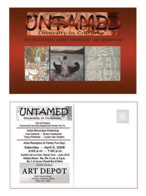
Yep, that's what I asked and so here is are a few answers back at you: I placed it under commercial art here on this FAR web site because to me the design of the card is a part of art, composition as it is called, and that is what this is posted. It is called advertising and promoting your work or a show you are in, again that is the art of communication and I wanted to see if it did what I wanted it to do; So that is why I posted it. Then just for clarification the image behind the ?Untamed? is mine. The red brown earth tones were used to catch your attention. The images are there to tantalize you and make you want to look further at the card. If this type of art does not appeal to you then it doesn't (I know they are not erotic nudes). Hope that clarifies your questions about the art and the reason for posting it and by the way thanks for the look and the review, very much appreciated by me.
Take care and cheers!
Lucien