The book of postcards.
Viewing comments for Page 143 "Wow"garphic design efforts, postcards
19 total reviews
Comment from easyt63
I have to give the five stars because of the fact that you did exactly what you set out to do, catch the viewers attention. Very effective and well done.
reply by the author on 24-Jun-2008
  |
I have to give the five stars because of the fact that you did exactly what you set out to do, catch the viewers attention. Very effective and well done.
Comment Written 24-Jun-2008
reply by the author on 24-Jun-2008
-
easy63
true if it does what is was intended and you agree that it does... then your rating is the only one that fits. take care and thanks,
cheers!
lucien
Comment from buckeye
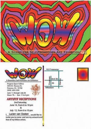
Lots of wasted white space here which I find very distracting. The colors at the top are very nice and vivid. Wish the image would have been bigger so we could read it. Thanks for sharing
reply by the author on 24-Jun-2008
 |
Lots of wasted white space here which I find very distracting. The colors at the top are very nice and vivid. Wish the image would have been bigger so we could read it. Thanks for sharing
Comment Written 23-Jun-2008
reply by the author on 24-Jun-2008
-
Buckeye,
you missed the part this is the front and the back of a postcard, maybe I should have placed a boarder around the bottom image so that would have been more clearly expressed and made the white space better understood.
thanks for the review, and cheers!
Lucien
Comment from jhillman
This is an interesting graphic art composition with plenty of wonderful eye catching colour. The wow part of it i is very good indeed though I would have presreed to blend that into the rest of the page as it looks quite separate from the rest. There are a couple of other issues however. I feel the image is too left heavy and also the lettering embedded within the wow surroundings is unclear and indistinct. I do a lot of posters like this and would not make those fundamental errors.
Good luck with your exhibition!
reply by the author on 22-Jun-2008
  |
This is an interesting graphic art composition with plenty of wonderful eye catching colour. The wow part of it i is very good indeed though I would have presreed to blend that into the rest of the page as it looks quite separate from the rest. There are a couple of other issues however. I feel the image is too left heavy and also the lettering embedded within the wow surroundings is unclear and indistinct. I do a lot of posters like this and would not make those fundamental errors.
Good luck with your exhibition!
Comment Written 22-Jun-2008
reply by the author on 22-Jun-2008
-
John,
you are reviweing this as if it were a poster, it is in fact the front and the back of a postcard. if it were a poster then i would agree with you and know this I would have laid it out differently, but it is not.
so... you have to re-asses your review... because as it is written it does not apply to this image. the bottom of the image being shown on FAR, is the back of the postcard so that is why the right side is banck... it's there for the mailing address infromation.
thanks anyway, have a great day and cheers!
Lucien
-
Thank you for the information - that is why it is so unbalanced.
I have reassessed it and regraded it. I still need to dock half a star due to the unclear message on the WOW side.
Best regards
John
-
thanks for the reassement.
have great day and as always cheers!
Lucien
Comment from The Jester Artist
I like the picture,
However theres really not just to it. It's just a design to promote your art, but wheres the real art.
Sorry if I didn't get it.
Mayhone
This rating does not count towards story rating or author rank.
The highest and the lowest rating are not included in calculations.
reply by the author on 22-Jun-2008
|
I like the picture,
However theres really not just to it. It's just a design to promote your art, but wheres the real art.
Sorry if I didn't get it.
Mayhone
This rating does not count towards story rating or author rank.
The highest and the lowest rating are not included in calculations.
Comment Written 21-Jun-2008
reply by the author on 22-Jun-2008
-
Mayhone,
Designing is art and doing layout and creating lettering is art, in this I did both so that is how it qualifies, make sense? it is advertizing art, it is getting people to stop and to look, if it did that then it deserves a higher rating.
thanks for the review, like teh notes sday did it make you want yto look and turn over the postcard? if yes, it worked and that is one way of dertming if the design is good. know what I mean?
take care and cheers!
lucien
Comment from Snopaw
Nice job with the design of this postcard Lucien. I would say it does an excellent job of making you want to read exactly what is it all about with those great pattersn and bright colors. I guess it would matter what crowd you are trying to appeal to. Nice job. Shirley
reply by the author on 22-Jun-2008
|
Nice job with the design of this postcard Lucien. I would say it does an excellent job of making you want to read exactly what is it all about with those great pattersn and bright colors. I guess it would matter what crowd you are trying to appeal to. Nice job. Shirley
Comment Written 21-Jun-2008
reply by the author on 22-Jun-2008
-
Shirley,
I'm trying to appeal to anyone that has Curiosity, to come on down... and then they can judge the artwork on display for themselves... and believe you me, there is some WOW! artwork on display.
thanks and cheers!
Lucien
Comment from tuckerkao
Wonderful advertisement for the artistic show. The combinations of the colors look pretty exciting as how your may be entertained by the graphic quality.
reply by the author on 22-Jun-2008
|
Wonderful advertisement for the artistic show. The combinations of the colors look pretty exciting as how your may be entertained by the graphic quality.
Comment Written 21-Jun-2008
reply by the author on 22-Jun-2008
-
tickerkao,
thank you fro your time and the review of this design, much appreciated.. take care and cheers!
Lucien
Comment from STICKMANART
Hi ther again! thsi si cool , has a preety cool impact and the colour seem to work ok as well!
Thanks1
TY!
:) ..
reply by the author on 22-Jun-2008
|
Hi ther again! thsi si cool , has a preety cool impact and the colour seem to work ok as well!
Thanks1
TY!
:) ..
Comment Written 21-Jun-2008
reply by the author on 22-Jun-2008
-
Ty, waht is wrong with teh image, from waht you wrote nothing, only your rating does not reflect waht your cooments say.
thanks and Cheers!
Lucien
Comment from sloeart
Lucien, This is way cool. I am doing this same thing in october in Nashville. I wish you all the luck my friend. Your invitation is great, Very creative and eyecatching. Good job, best to you, Diane
reply by the author on 22-Jun-2008
|
Lucien, This is way cool. I am doing this same thing in october in Nashville. I wish you all the luck my friend. Your invitation is great, Very creative and eyecatching. Good job, best to you, Diane
Comment Written 21-Jun-2008
reply by the author on 22-Jun-2008
-
sloeart,
good luck with your up coming show, remember have fun with it. take care and thanks for the comments in the review.
take care and cheers!
Lucien
Comment from Symransdad1
Impact 5
Colour 5
Composition 5
Artistic Impression 5
Like the idea of the shameless self promotion.
Great main design, love the simple pattern and the brilliant colours.
Gives people a good idea that there is some good stuff to see.
Thanks for sharing this, Mark
reply by the author on 22-Jun-2008
|
Impact 5
Colour 5
Composition 5
Artistic Impression 5
Like the idea of the shameless self promotion.
Great main design, love the simple pattern and the brilliant colours.
Gives people a good idea that there is some good stuff to see.
Thanks for sharing this, Mark
Comment Written 21-Jun-2008
reply by the author on 22-Jun-2008
-
Mark,
thanks for the great comments and review. yes there is definately some great artwork to be seen in this show.
take care and do stop by if you are in the area, like if you are going to be visiting American in the next month.
Cheers!
Lucien
Comment from Anne
Excellent the way you have done the wow and the beautiful bright colors you have used. The colors through the middle of the word are interesting. This should really catch a person's attention. I hope it works for you. A very creative approach.
reply by the author on 22-Jun-2008
|
Excellent the way you have done the wow and the beautiful bright colors you have used. The colors through the middle of the word are interesting. This should really catch a person's attention. I hope it works for you. A very creative approach.
Comment Written 21-Jun-2008
reply by the author on 22-Jun-2008
-
Anne,
Thank you for your continued support, the time and the review of this piece, appreciated by me on all counts... take care and cheers!
Lucien