
Portraits & People
Viewing comments for Page 6 "Cynthia's Wedding"Girls
29 total reviews
Comment from hazylee
This is really very nice, I like the simplicity and excellent form that you have here. This is very graceful and a delight to see, the colours are perfect for this and balance well. Very nice and unusual art, glad I saw this. H.
reply by the author on 01-Sep-2008
  |
This is really very nice, I like the simplicity and excellent form that you have here. This is very graceful and a delight to see, the colours are perfect for this and balance well. Very nice and unusual art, glad I saw this. H.
Comment Written 31-Aug-2008
reply by the author on 01-Sep-2008
-
Thank you so much again, Hazylee!!
Comment from Gramelli
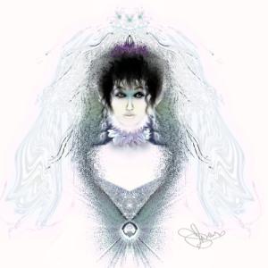
I like this illustration primarily because of the contrast of the ethereal wedding veil and the dark smudgy hair and eyes. It has sort of a science fiction Victorian feel to it. very nice.
reply by the author on 31-Aug-2008
  |
I like this illustration primarily because of the contrast of the ethereal wedding veil and the dark smudgy hair and eyes. It has sort of a science fiction Victorian feel to it. very nice.
Comment Written 31-Aug-2008
reply by the author on 31-Aug-2008
-
Thank you again for your wonderful comments, Gramelli.
Comment from Katy
This is a beautiful and very elegant piece. She has beautiful, and very expressive eyes. The white background, for me, is unusual, adding a haunting appeal that makes this unique and compelling to look at. Delicately feminine, and so very lovely. Katy
reply by the author on 31-Aug-2008
|
This is a beautiful and very elegant piece. She has beautiful, and very expressive eyes. The white background, for me, is unusual, adding a haunting appeal that makes this unique and compelling to look at. Delicately feminine, and so very lovely. Katy
Comment Written 31-Aug-2008
reply by the author on 31-Aug-2008
-
Thank you, Katy!!!
Comment from terrifictoby
This is a very interesting rendering. I like how you kept it very light, it really added to the lacy her look.
Wonderful expression on her face with beautifully worked eyes. Excellent job and wonderful use of subdued colors.
reply by the author on 31-Aug-2008
|
This is a very interesting rendering. I like how you kept it very light, it really added to the lacy her look.
Wonderful expression on her face with beautifully worked eyes. Excellent job and wonderful use of subdued colors.
Comment Written 30-Aug-2008
reply by the author on 31-Aug-2008
-
Thank you, Toby!!!
Comment from Anne
A very creative and beautiful work of art. I like the way you have this just fading off into the background. The detail and the way you have done the face are excellent. The simple coloring works well on this too. An excellent picture. I like the little touch of purple too.
reply by the author on 30-Aug-2008
|
A very creative and beautiful work of art. I like the way you have this just fading off into the background. The detail and the way you have done the face are excellent. The simple coloring works well on this too. An excellent picture. I like the little touch of purple too.
Comment Written 30-Aug-2008
reply by the author on 30-Aug-2008
-
Thank you again, Anne! Thank you also for the double review and excellent ratings on both.
Comment from sergiu
Your digital artwork is unique and original in every aspect.
Cynthia is very interesting character and you let much space around her that make, in my opinion, your character to be on second place, no bad but...
Colors and lines engender shapes that lead to harmony of composition, not enough to surpass a poor palette that take a little bit from picture to become something else completely.
reply by the author on 30-Aug-2008
|
Your digital artwork is unique and original in every aspect.
Cynthia is very interesting character and you let much space around her that make, in my opinion, your character to be on second place, no bad but...
Colors and lines engender shapes that lead to harmony of composition, not enough to surpass a poor palette that take a little bit from picture to become something else completely.
Comment Written 30-Aug-2008
reply by the author on 30-Aug-2008
-
Thank you for taking the time to review this, Sergiu!
-
Welcome ! No angry about review maybe I'm wrong, I write my opinion and you have talent ! just work !
-
If my thank you sounded angry, I apologize. I greatly welcome your reviews, because I feel that you know what you're talking about. I appreciate your comments and experience very much, and want to thank you for taking the time to let me know what you think. When this one is back in my portfolio, I will work on her more. I do have some wonderful ideas to improve her. Thank you, Sergui.
-
I reviewing more than one piece from your portfolio and I see many are very good, pleas go back and read my reviews.
About portrait my teacher say:" Look at portrait from inside's portrait and you see something else..." I don't know if is correct my English...
Great Regards !
Comment from Lucien van Oosten
Good morning in looking at this posting I find it to be for me to has a Tim Burton quality to it, I think that is because of the line quality and the textures and paleness of the skin tones. I like all of the central figure, the various textures you have created visually are all very nice with you limited pallet.
I do think that the background is to strong, it seems to overpower the main portions of the composition, by being to white. That area needs a little something to help push the figure towards the viewer as it is it seems to draw her into the background and visually that causes her Vail to get lost. Maybe the Vail should have a few darker lines in it as well to help separate it from the stark white background. The crown could also use the same type of help in my way of thinking. I know all small stuff but with those area being rethought and possibly reworked a little it would be a winner in my way of thinking. Other then that I like what you have done.
This rating does not count towards story rating or author rank.
The highest and the lowest rating are not included in calculations.
reply by the author on 30-Aug-2008
 |
Good morning in looking at this posting I find it to be for me to has a Tim Burton quality to it, I think that is because of the line quality and the textures and paleness of the skin tones. I like all of the central figure, the various textures you have created visually are all very nice with you limited pallet.
I do think that the background is to strong, it seems to overpower the main portions of the composition, by being to white. That area needs a little something to help push the figure towards the viewer as it is it seems to draw her into the background and visually that causes her Vail to get lost. Maybe the Vail should have a few darker lines in it as well to help separate it from the stark white background. The crown could also use the same type of help in my way of thinking. I know all small stuff but with those area being rethought and possibly reworked a little it would be a winner in my way of thinking. Other then that I like what you have done.
This rating does not count towards story rating or author rank.
The highest and the lowest rating are not included in calculations.
Comment Written 30-Aug-2008
reply by the author on 30-Aug-2008
-
Thank you, Lucien.
Comment from TJMc
Cynthia is a beautiful figment of your imagination. I like how faint you have made her Vail and focus on her. The eyes captured my attention and moved it along the rest of the rest of the work. Very well done.
reply by the author on 30-Aug-2008
|
Cynthia is a beautiful figment of your imagination. I like how faint you have made her Vail and focus on her. The eyes captured my attention and moved it along the rest of the rest of the work. Very well done.
Comment Written 30-Aug-2008
reply by the author on 30-Aug-2008
-
Thank you for the wonderful review, TJ!!
Comment from Rod Clarke
"Cynthias wedding",This is an interesting piece in that it has little color, but lots of color value. The expression is one of apprehension, which would proberbly fit the occasion. The subject is central ,and naturally balanced,and the emphases is on the hair and the eyes is quite effective. Good work. Regards Rod.
reply by the author on 30-Aug-2008
|
"Cynthias wedding",This is an interesting piece in that it has little color, but lots of color value. The expression is one of apprehension, which would proberbly fit the occasion. The subject is central ,and naturally balanced,and the emphases is on the hair and the eyes is quite effective. Good work. Regards Rod.
Comment Written 30-Aug-2008
reply by the author on 30-Aug-2008
-
Thank you for the wonderful review, Rod!
Comment from smithj9
I thought this had a very classic old timey feel to it. The girl reminded me of a doll lamp I had as a child. Very victorian in nature.
reply by the author on 30-Aug-2008
|
I thought this had a very classic old timey feel to it. The girl reminded me of a doll lamp I had as a child. Very victorian in nature.
Comment Written 30-Aug-2008
reply by the author on 30-Aug-2008
-
Thank you for the excellent review, smithj!!