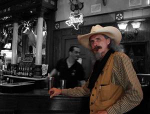
Buffalo Bill
Voluntary at Texas Ranger Museum17 total reviews
Comment from Mitchell17
Awesome shot. You captured a real story. I am going to have to look this program up. You made the right choice keeping the subject in the environment, and it would deffinitly be too busy if you did not convert to B+W. Nice job.
reply by the author on 17-Oct-2008
  |
Awesome shot. You captured a real story. I am going to have to look this program up. You made the right choice keeping the subject in the environment, and it would deffinitly be too busy if you did not convert to B+W. Nice job.
Comment Written 16-Oct-2008
reply by the author on 17-Oct-2008
-
Thank you for your generous review.
The program was made by Microsoft. It is the new version of "Picture it" but I really don't know if it is still on the market.
I just got Pant Shop Pro what seams to have more artistic tools [Freehand painting, Paintbrushes i.o.]
Comment from Daniel Farthing
I like the use of the selective color on this one. I like what you did with this one overall. Nice work on this. Thanks for sharing your work with us.
reply by the author on 16-Oct-2008
|
I like the use of the selective color on this one. I like what you did with this one overall. Nice work on this. Thanks for sharing your work with us.
Comment Written 16-Oct-2008
reply by the author on 16-Oct-2008
-
Thank you for your generous review.
Comment from Judith C Miller
What a terrific photo. Your technique is perfect, as it really does put the spotlight on Bill. Lovely framing of your subject and so interesting.
reply by the author on 16-Oct-2008
|
What a terrific photo. Your technique is perfect, as it really does put the spotlight on Bill. Lovely framing of your subject and so interesting.
Comment Written 16-Oct-2008
reply by the author on 16-Oct-2008
-
Thanks so much for your kind and generous review.
Comment from katbird921
Hi Cleo- this is a really imaginative capture. I love the composition and the soft blur of the background. To me, that the background is out of focus implies the fast pace of our lives today, as opposed to the slower pace of simpler times, which in your photo is represented by Bill! The selective coloring is perfect for this idea...good thinking!
I have witheld a half star because your subject is out of focus - of all aspects of this wonderful shot, the most important is that Bill should be sharp as a briar. And he's not.
Still, this is wonderfully creative, with a nice message.
reply by the author on 15-Oct-2008
  |
Hi Cleo- this is a really imaginative capture. I love the composition and the soft blur of the background. To me, that the background is out of focus implies the fast pace of our lives today, as opposed to the slower pace of simpler times, which in your photo is represented by Bill! The selective coloring is perfect for this idea...good thinking!
I have witheld a half star because your subject is out of focus - of all aspects of this wonderful shot, the most important is that Bill should be sharp as a briar. And he's not.
Still, this is wonderfully creative, with a nice message.
Comment Written 15-Oct-2008
reply by the author on 15-Oct-2008
-
Thank you for your generous and helpful critic. You are right. I caused the matter myself knowing that this may would happen. I refused to use the flash in very bad . I still think it was the right decision even with the flaw of that photo. the flash wold have wiped out the lamps of the Saloon, the candle on the bar and the Budwiser sign.So I took the lesser evel.
-
Cleo, it's a great study regardless! Congratulations!
-
Thank you.
Comment from susie049
I remember this guy! (I was in San Antonio not too long ago.) Your choice of a black and white background was a good one. Just wish his cigar showed up a little more clearly because he was really chomping on that thing!
reply by the author on 15-Oct-2008
|
I remember this guy! (I was in San Antonio not too long ago.) Your choice of a black and white background was a good one. Just wish his cigar showed up a little more clearly because he was really chomping on that thing!
Comment Written 15-Oct-2008
reply by the author on 15-Oct-2008
-
Thank you for you kind review. It's funny that you meet him. I didn't realised he was chomping on the cigar. Probaly we was to busy with the conversation. I caused the flaw in clearness myself by refusing to use the flash in this bad light. It would have wiped out the lamps and the Bud sign.
Comment from Snopaw
Fun picture Cleo, what a character this guy must be. I really enjoy your use of selective coloring. I only wish Bill were in sharper focus, I am guessing the hand held with the lack of light probably made that pretty difficult. Shirley
reply by the author on 15-Oct-2008
|
Fun picture Cleo, what a character this guy must be. I really enjoy your use of selective coloring. I only wish Bill were in sharper focus, I am guessing the hand held with the lack of light probably made that pretty difficult. Shirley
Comment Written 15-Oct-2008
reply by the author on 15-Oct-2008
-
Thanks for you kind review Shirley, You are right especially the lack of light. But I refused to use a flash since it would have wiped out the lights of the saloon and damaged the aura of that place.
Comment from Dazzleme
Even though I find the backgroiund in this a bit distracting, the image has been done nicely with the selective colour effect. You rfocus and the light has worked well for this
reply by the author on 14-Oct-2008
 |
Even though I find the backgroiund in this a bit distracting, the image has been done nicely with the selective colour effect. You rfocus and the light has worked well for this
Comment Written 14-Oct-2008
reply by the author on 14-Oct-2008
-
Thank you for your friendly review.
The background is original and the opposites of new and old were what attracted me beside the great character of 'Buffalo Bill'. I really like it. It's part of the story for me. But as always things as this are in the eye of the beholder. Truth I' sorry that the photo doesn't do it for you, I'm happy that people have different likings. That is normal and make life interesting.
Comment from shiloh106
I like your selective color very much for this photo. It really makes Buffalo Bill stand out. His old west colors look great. Nice pose against the bar. Very pleasing photo.
reply by the author on 14-Oct-2008
|
I like your selective color very much for this photo. It really makes Buffalo Bill stand out. His old west colors look great. Nice pose against the bar. Very pleasing photo.
Comment Written 14-Oct-2008
reply by the author on 14-Oct-2008
-
Thank you. I have to thank you for much more than you generous review. I didn't like selective colors until I saw your Renaissance Festival pictures. These pictures changed my mine and gave me the idea how to present 'Buffalo Bill' . Thank you.
-
I'm very happy that I was able to inspire you to try out the selective coloring.
-
Me too. Thank you.
Comment from ZenTrip
You've got such a wonderful way of getting out of the way of your camera, cleo - and of letting your imaginative muse play around with your way of seeing and manipulating photos as to try for the different and unusual.
That is such a plus for anyone who likes to hold a camera in hand. It stretches boundaries and allows for new approaches that adds dimension to the art form. All personal opinion of course and subject to disagreements.
Many may feel more comfortable conforming to the rules and expectations of others - but I always feel inspired and enlightened for those who like to take bold steps and strides for achieving what we can accomplish and contribute in our lifetime.
I like what you've done here and for showing the playful and expressive side of your self and which contributes to the concept of Cody himself.
You are as wild and original as Buffalo Bill - but without the beard.
You're as original as
reply by the author on 14-Oct-2008
|
You've got such a wonderful way of getting out of the way of your camera, cleo - and of letting your imaginative muse play around with your way of seeing and manipulating photos as to try for the different and unusual.
That is such a plus for anyone who likes to hold a camera in hand. It stretches boundaries and allows for new approaches that adds dimension to the art form. All personal opinion of course and subject to disagreements.
Many may feel more comfortable conforming to the rules and expectations of others - but I always feel inspired and enlightened for those who like to take bold steps and strides for achieving what we can accomplish and contribute in our lifetime.
I like what you've done here and for showing the playful and expressive side of your self and which contributes to the concept of Cody himself.
You are as wild and original as Buffalo Bill - but without the beard.
You're as original as
Comment Written 14-Oct-2008
reply by the author on 14-Oct-2008
-
Thank you for your kind review my pink glassed friend. I'm blushing red and that is embarrassing in my age.
You got something right. I'm a rebel. Must be were I grow up. East Site Germany was an ideal place to bread rebelling artists back then.
I know there are rules and its good to follow them otherwise we end up in chaos but rules are made by people. There is a possibility that people cold be wrong with the best intention. Especially in art since that is not a since but a product of human imagination. So that means for us as artists: Know the rules, proof the rules, go by them if it is in harmony with what you wan't to say but if the rules imprison your imagination or your abilities it's necessary to do something different. Most the time we learn afterwards we didn't really broke the rules we just extended them to a higher level. If da Vinchi wold have gone by the rules, the Mona Lisa wouldn't exist.
I'm not at all a fan of color selections since I haven't seen many what wasn't just a show piece. But I have learned [especially with art seen on this site] that it could be a very helpful tool in the right circumstances. It gets red of cluttering background without taking the ambiente away and magnifies the eyes of the viewer to what you want.
Thanks again and in spite of my blushing and having red ears: Thanks for the compliments.
-
Thanks, cleo. You so well describe the rebel as I like to interpret - not an out and out who likes to reject everything just for the sake of being different, but one who knows how to temper, accept what can be useful and reject what may be tried differently. I hope to see further influrences in your work and in your words as you reveal more about East Germany. It had to be even more intense and on-the-edge than what we read in history books. That's one of the real pleasues in discoursing with you as the cultural influences always seem to manifest themselves in our works. I've never tried any selective coloring with photos but when I get ready to try I'll ask for some guidance. Would at least like to see how it works. It always seems a bit contrived to me but there are times, as you've demonstrated, when it works to convey a special touch. Thanks again for the reply.
-
hank you very much for your Re. You are right about the edges. Nobody who wasn't there could possibly really understand but I will tell you sometime in email. Usually I dislike to talk about. I dislike to put myself the center. It isn't about me. It is about art and how art is able to influence and even change our life.
That is strange that you ask for advice. I didn't do selective coloring before. I'm just trying it out myself. Truth I did see some of them but it didn't work for me then. I think I did see the wrong pictures. Actually I changed my mine when I stumbled in accident over some of 'shiloh 106' pictures on this site.
To give guidance with this is complicated anyway since the programs work different. I think it is much easier with photo shop then it is with my program. For all I know there are online tutorial's.
Thanks again for your Re.
~ Heidi :)
-
Thanks for the note, Heidi. We've both got too many pots on the stove right now so I'll wait until later to ask more about the 'edges'. It would be, or rather - it is, of tremendous interest to me. It is a point in history I need to spend some reading time with.
I'll have to check out some of shiloh's work to see what he has done with this method of selective coloring. I like his work very much but haven't taken the time to go through his portfolio and look at past photos.
I doubt if I'll try any of it soon. So many other learning curves I"m working on now.
I have Photoshop but I don't know how to use it. I play around with it when I can find an extra hour - but I need days and weeks to read and understand the methodology. It's much easier to use PainShop Pro which accomplishes what little I do in post-production.
Appreciate the note. Thanks.
-
Thanks.
I have Paint Shop too beside Digital Imaging and the old Picture it. I'm really happy with them. I actually believe these programs leave more imaginary room for us. If I understand right on what I read and what I was told one difference between the programs is: With Photo Shop the program does most of the work, with Paint Shop we do it.
They say McIntosh has the best paint- and graphic programs. But there is a problem with it. These computers are like designer cars beautiful and easy to handle but working only on 30% of the roads.
You are right. We have our pots full right now. Talk to you later.
[If you look at shiloh's serge especially for the Renaissance festival pictures.]
Comment from jgrace
Having him in color really works well for this. Keeps the focus on him. Background very interesting and adds that old time feel to the photo. He does look a lot like the original Buffalo Bill. Enjoyed viewing.
reply by the author on 14-Oct-2008
|
Having him in color really works well for this. Keeps the focus on him. Background very interesting and adds that old time feel to the photo. He does look a lot like the original Buffalo Bill. Enjoyed viewing.
Comment Written 14-Oct-2008
reply by the author on 14-Oct-2008
-
Thank you very much for your kind and generous review.