Fantasy in Depth
aka: Elegant Display15 total reviews
Comment from Cherylynn
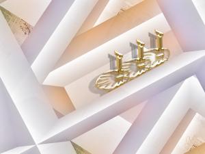
I the think the most important in this pice would have to be the light. I wish you had made a note to let us know what these shapes represent; walls, shelves?
I, however, do know that I like the colours chosen - very soft pastels - and the items on display appears to be gold/white gold with the light.While they are on display they are artfully done and don't scream at you- just a nice addition to the overall effect.
With the use of the lights there is always shadow which in this case adds depth and interest.
Very interesting piece
Cherylynn
  |
I the think the most important in this pice would have to be the light. I wish you had made a note to let us know what these shapes represent; walls, shelves?
I, however, do know that I like the colours chosen - very soft pastels - and the items on display appears to be gold/white gold with the light.While they are on display they are artfully done and don't scream at you- just a nice addition to the overall effect.
With the use of the lights there is always shadow which in this case adds depth and interest.
Very interesting piece
Cherylynn
Comment Written 16-Mar-2009
Comment from wrhosie935
Another in depth creation. Very light feeling to this. Nice pastel colors. I tried to straighten the boxes but couldn't do it. Good show, as usual.
|
Another in depth creation. Very light feeling to this. Nice pastel colors. I tried to straighten the boxes but couldn't do it. Good show, as usual.
Comment Written 15-Mar-2009
Comment from Alisha Mordicae
Really like this one too. but this i rather the purple one. hope you don't mind, HA!
Digital impact ****
Creativeness *****
Centre of Interest*****
Technical Excellence*****
Technique*****
Story Telling *****
|
Really like this one too. but this i rather the purple one. hope you don't mind, HA!
Digital impact ****
Creativeness *****
Centre of Interest*****
Technical Excellence*****
Technique*****
Story Telling *****
Comment Written 15-Mar-2009
Comment from Katy
Very interesting design, with all the connecting shapes, and excellent control of depth, as well a subtle shadowing, to enhance each separate area. You have such a creative mind that just keeps creating the most unique, and interesting concepts. Love what you did with this piece. Terrific work! Katy
|
Very interesting design, with all the connecting shapes, and excellent control of depth, as well a subtle shadowing, to enhance each separate area. You have such a creative mind that just keeps creating the most unique, and interesting concepts. Love what you did with this piece. Terrific work! Katy
Comment Written 15-Mar-2009
Comment from Mike Roberts
Shawn, those are some interesting golden forms aligned within. I like the illusion of depth, once again, created by the patterns of beams, with the light and shadow. They look massive and do have the sense of dimension, 3D, spacial effect. Nice illusionary image.
Mike
reply by the author on 15-Mar-2009
|
Shawn, those are some interesting golden forms aligned within. I like the illusion of depth, once again, created by the patterns of beams, with the light and shadow. They look massive and do have the sense of dimension, 3D, spacial effect. Nice illusionary image.
Mike
Comment Written 15-Mar-2009
reply by the author on 15-Mar-2009
-
Thank you, Mike. Believe it or not, these pieces are really tedious to do. It is easier to just paint a regular painting. Just thought I'd let you know I'm not going to do any more of these for a long, long time...lol. I kinda be sluffing, cause I've had the flu. Again, thank you for the excellent on this!
Comment from Angelheart The First
Well Shawn,I can't quite figure
what it is supposed to be but
I do like all of the very cool looking angles that you created in this one.What throws me off is the gold what-
ever in the whole scheme of
things.I think it would look cool
if the gold were removed,leav-
ing all of the angles and depth
Just a suggestion but I like it
this way also.
This one is great,thanx for this
share!!
Angelheart :)
|
Well Shawn,I can't quite figure
what it is supposed to be but
I do like all of the very cool looking angles that you created in this one.What throws me off is the gold what-
ever in the whole scheme of
things.I think it would look cool
if the gold were removed,leav-
ing all of the angles and depth
Just a suggestion but I like it
this way also.
This one is great,thanx for this
share!!
Angelheart :)
Comment Written 14-Mar-2009
Comment from artcart1111
Wow...I like this very much. The angles and the contrast between the warm and cool colors, plus the bit of texture is great. Very nice photograph!
artcart1111
  |
Wow...I like this very much. The angles and the contrast between the warm and cool colors, plus the bit of texture is great. Very nice photograph!
artcart1111
Comment Written 14-Mar-2009
Comment from Daniel Farthing
I like how you filled the frame with this one. I like the looks of this one and the details. I think you did a good job on this. Thanks for shairn gyour work with us.
|
I like how you filled the frame with this one. I like the looks of this one and the details. I think you did a good job on this. Thanks for shairn gyour work with us.
Comment Written 14-Mar-2009
Comment from lorac1
This is a lovely digital painting in pastel colors, which are nicely harmonious. The picture does show depth very well. The composition is excellent, and I like the detail. There is a lot of story telling ability here.
|
This is a lovely digital painting in pastel colors, which are nicely harmonious. The picture does show depth very well. The composition is excellent, and I like the detail. There is a lot of story telling ability here.
Comment Written 14-Mar-2009
Comment from Snapdecisions
Good piece , with good light and presentation , and good creativity skills , and the overall color / contrast is super , Trev
|
Good piece , with good light and presentation , and good creativity skills , and the overall color / contrast is super , Trev
Comment Written 14-Mar-2009