The Look Of Autumn
A digital painting of an autumn scene.3 total reviews
Comment from katshelton
Wow, this is truly the look of Autumn in all its glory. The trees are so full of color and yet you can distinguish one from the other. This is a very nice job and of course the colors are magnificent. Great job.
reply by the author on 12-Apr-2009
  |
Wow, this is truly the look of Autumn in all its glory. The trees are so full of color and yet you can distinguish one from the other. This is a very nice job and of course the colors are magnificent. Great job.
Comment Written 11-Apr-2009
reply by the author on 12-Apr-2009
-
Thank you for your fine comments about my artwork, and for your 5-Star score.
VMarguarite
Comment from artcart1111
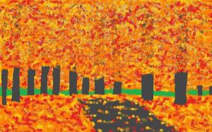
I love your autumn painting because of how you varied the yellow, orange and reds. The initial impact is very colorful and creative.
I inserted a yellow grid of thirds...so you can see how I tried to bring out the character of ONE TREE ...plus...I added blue sky in the background. Why?
Because you need a PRIMARY POINT OF INTEREST...AND by adding blue sky it sets off the one tree by the cross hairs of the grid, plus creates DEPTH AND DISTANCE...and.... breaks up the repetition of most of the painting being the same thing.
I give my art students this example:
Look at all of the autumn colors.
Look at all of the autumn colors.
Look at all of the autumn colors.
Look at all of the autumn colors.
Look at all of the autumn colors.
"How many times do I need to say that same sentence before you...or the viewer ,...gets bored with the same thing being repeated?
They begin to laugh at my example...usually by the 4th time I repeat it.
When you add blue sky...you are also adding the complimentary color to the autumn colors...and you make your VISUAL STORY...more powerful and interesting.
You have a wonderful eye and talent for keeping things simple. It is part of the charm of your creativity. Even so... keep these things in mind:
What is your POINT OF INTEREST.
Use the grid to place your primary and secondary point of interest ...if there are two of them...on the cross hairs of the grid.
the PRIMARY POINT OF INTEREST is why you wanted to do the piece of artwork in the first place.
If you are going to do a forest of trees in their autumn dress. ... then... pick out ONE tree and bring out the character...limbs ...and texture of its trunk ...so it sings the loudest VISUALLY...in detail, texture, and character of its limbs.
If you do add sky...remember that the blue closest to the horizon is lighter then the part of the sky that gets closer t the top area ...over your head...IF...you were standng in the forest. That visual variation of value in color creates depth and distance.
On the trunks of the trees ...ask yourself .."Which side of the trunk would be faced towards the LIGHT SOURCE? then make that side a bit lighter.... you are visually creating a consistent light source throughout your composition, which is very good.
Also ... notice that I put some of the trees on different PLANE LINES...this creates depth and distance into your forest. When you vary the plane lines...you make your visual story more interesting.
I hope these thoughts help.
Keep up the great artwork.
Hugs and a smile ...are sent to you.
your friend...Artcart1111
reply by the author on 12-Apr-2009
   |
I love your autumn painting because of how you varied the yellow, orange and reds. The initial impact is very colorful and creative.
I inserted a yellow grid of thirds...so you can see how I tried to bring out the character of ONE TREE ...plus...I added blue sky in the background. Why?
Because you need a PRIMARY POINT OF INTEREST...AND by adding blue sky it sets off the one tree by the cross hairs of the grid, plus creates DEPTH AND DISTANCE...and.... breaks up the repetition of most of the painting being the same thing.
I give my art students this example:
Look at all of the autumn colors.
Look at all of the autumn colors.
Look at all of the autumn colors.
Look at all of the autumn colors.
Look at all of the autumn colors.
"How many times do I need to say that same sentence before you...or the viewer ,...gets bored with the same thing being repeated?
They begin to laugh at my example...usually by the 4th time I repeat it.
When you add blue sky...you are also adding the complimentary color to the autumn colors...and you make your VISUAL STORY...more powerful and interesting.
You have a wonderful eye and talent for keeping things simple. It is part of the charm of your creativity. Even so... keep these things in mind:
What is your POINT OF INTEREST.
Use the grid to place your primary and secondary point of interest ...if there are two of them...on the cross hairs of the grid.
the PRIMARY POINT OF INTEREST is why you wanted to do the piece of artwork in the first place.
If you are going to do a forest of trees in their autumn dress. ... then... pick out ONE tree and bring out the character...limbs ...and texture of its trunk ...so it sings the loudest VISUALLY...in detail, texture, and character of its limbs.
If you do add sky...remember that the blue closest to the horizon is lighter then the part of the sky that gets closer t the top area ...over your head...IF...you were standng in the forest. That visual variation of value in color creates depth and distance.
On the trunks of the trees ...ask yourself .."Which side of the trunk would be faced towards the LIGHT SOURCE? then make that side a bit lighter.... you are visually creating a consistent light source throughout your composition, which is very good.
Also ... notice that I put some of the trees on different PLANE LINES...this creates depth and distance into your forest. When you vary the plane lines...you make your visual story more interesting.
I hope these thoughts help.
Keep up the great artwork.
Hugs and a smile ...are sent to you.
your friend...Artcart1111
Comment Written 11-Apr-2009
reply by the author on 12-Apr-2009
-
Wow! I am very pleased that you took the time to really observe my digital painting and send me your well received comments and practical suggestions for improvement. Thank you very much.
VMarguarite
Comment from gypsywoman
I love this modernistic feel to this digital painting. I love the bright fall colors against the dark tree trunks, and how I can't distinguish the individual trees. I love the pile of leaves on the ground and scattered across the road. The bright strip of green grass across the middle adds a bit of flair to the piece. Well done!
reply by the author on 12-Apr-2009
|
I love this modernistic feel to this digital painting. I love the bright fall colors against the dark tree trunks, and how I can't distinguish the individual trees. I love the pile of leaves on the ground and scattered across the road. The bright strip of green grass across the middle adds a bit of flair to the piece. Well done!
Comment Written 11-Apr-2009
reply by the author on 12-Apr-2009
-
Thank you for your detailed comments and for your 5-Star rating of my artwork.
VMarguarite