Flowers & Still Life
Viewing comments for Page 7 "Big Red"Arty Flowers
44 total reviews
Comment from amfunny
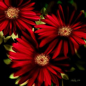
These are really pretty. They look like a photograph and so very realisitc. Nice job on the details in this.
  |
These are really pretty. They look like a photograph and so very realisitc. Nice job on the details in this.
Comment Written 20-Apr-2013
Comment from Candy Barger
Another lovely job with this one MoonWillow! Love the title.It fits so well with the flowers.I like how they take up the whole space with just alittle blackened background showing.The leaves are a very nice contrasting color.Nice detail and shading as well.
reply by the author on 05-Jun-2009
|
Another lovely job with this one MoonWillow! Love the title.It fits so well with the flowers.I like how they take up the whole space with just alittle blackened background showing.The leaves are a very nice contrasting color.Nice detail and shading as well.
Comment Written 05-Jun-2009
reply by the author on 05-Jun-2009
-
Thank you so much for the beautiful review, Candy :)
Comment from jlmccarthy
Another stunning piece. I love the richness of the reds and the use of color and shadow to draw you into the center of the picture. Great detail. Nice composition, makes a big impression on the piece only working with a couple colors in different hues to keep you interested. The use of negative space also adds to the overall piece.
reply by the author on 05-Jun-2009
|
Another stunning piece. I love the richness of the reds and the use of color and shadow to draw you into the center of the picture. Great detail. Nice composition, makes a big impression on the piece only working with a couple colors in different hues to keep you interested. The use of negative space also adds to the overall piece.
Comment Written 05-Jun-2009
reply by the author on 05-Jun-2009
-
Thank you so much for the excellent review on this, JL!! I really appreciate it :)
Comment from Two99point8
Very, very nice color. I really like the vibrant red contrasting against the black. This actually fooled me at first, I thought it was a photo until I full-viewed it.
As for your question about the halo you get from sharpening, that's usually a sign that you're using too much. If you try simply decreasing the sharpening until the halos diminish, you may find that it is still sharp enough. My experience is with photography however, and you also didn't mention what software you're using, so what I said may not apply. Without knowing more, that's my best guess though.
  |
Very, very nice color. I really like the vibrant red contrasting against the black. This actually fooled me at first, I thought it was a photo until I full-viewed it.
As for your question about the halo you get from sharpening, that's usually a sign that you're using too much. If you try simply decreasing the sharpening until the halos diminish, you may find that it is still sharp enough. My experience is with photography however, and you also didn't mention what software you're using, so what I said may not apply. Without knowing more, that's my best guess though.
Comment Written 05-Jun-2009
Comment from jesuel
wow moonwillow these just keep getting better and better the color composition here is fantastic it looks as if you could reach out and touch it fantastic work here
reply by the author on 05-Jun-2009
|
wow moonwillow these just keep getting better and better the color composition here is fantastic it looks as if you could reach out and touch it fantastic work here
Comment Written 04-Jun-2009
reply by the author on 05-Jun-2009
-
Thank you, James!! :)
Comment from grace9
Very well composed work, excellent colouring make this a very eyecatching piece. Love the tonal variance, can not offer any changes, its a great piece.
|
Very well composed work, excellent colouring make this a very eyecatching piece. Love the tonal variance, can not offer any changes, its a great piece.
Comment Written 04-Jun-2009
Comment from Cascade
Beautiful the red is so intense and the depth of tones in the daisy's is fantastic. The center of the daisy's stand out well and are full of detail Once again you have contrasted the red with the green background this creates amazing impact.
Excellent work.
I havn,t been a member long and wanted to ask with digital painting, according to FAR is every thing created on the computer or can you start out with a scan and work on top.
Thank's for sharing your lovely work.
|
Beautiful the red is so intense and the depth of tones in the daisy's is fantastic. The center of the daisy's stand out well and are full of detail Once again you have contrasted the red with the green background this creates amazing impact.
Excellent work.
I havn,t been a member long and wanted to ask with digital painting, according to FAR is every thing created on the computer or can you start out with a scan and work on top.
Thank's for sharing your lovely work.
Comment Written 04-Jun-2009
Comment from southern1
Another beauty. Red is a favorite color of mine so this is gorgeous to me. Such nice composition. the filtered light shining on them is so pretty. If I had a 6, you would get it.
|
Another beauty. Red is a favorite color of mine so this is gorgeous to me. Such nice composition. the filtered light shining on them is so pretty. If I had a 6, you would get it.
Comment Written 04-Jun-2009
Comment from Robin Gillow
Cant help you re digital stuff. sorry. As is your norm, you have captured lovely balance here. A well thought out composition that is very eye-catching in its simplicity. Very pleasing altogether, I loved viewing it. I look forward to the roses. Robin
|
Cant help you re digital stuff. sorry. As is your norm, you have captured lovely balance here. A well thought out composition that is very eye-catching in its simplicity. Very pleasing altogether, I loved viewing it. I look forward to the roses. Robin
Comment Written 04-Jun-2009
Comment from ARTHOUND
can't helpyou there shawn but this is a great looking flowers i like the deep red of them and the technical desigh that you came up with i like the depth of it looks like you can just go deeper and deeeper ilike the way you shaded and the way you did the lighing, has a nice texture very creative and artstic presentation great colors john{ :"
|
can't helpyou there shawn but this is a great looking flowers i like the deep red of them and the technical desigh that you came up with i like the depth of it looks like you can just go deeper and deeeper ilike the way you shaded and the way you did the lighing, has a nice texture very creative and artstic presentation great colors john{ :"
Comment Written 04-Jun-2009