My Immortal
Confused and Lonely11 total reviews
Comment from Texas Rose
Great shot, but what SPORT is this? I am totally confused, I thought I read the contest rules and it said something to do with Sports. Am I in the wrong contest reviewing? Have a great day.
T Rose
The topic is sports. Submit a photo that somehow relates to sports.
The photograph can be about anything and can be touched up lightly.
But it must incorporate this topic in some way. The topic is Sports.
   |
Great shot, but what SPORT is this? I am totally confused, I thought I read the contest rules and it said something to do with Sports. Am I in the wrong contest reviewing? Have a great day.
T Rose
The topic is sports. Submit a photo that somehow relates to sports.
The photograph can be about anything and can be touched up lightly.
But it must incorporate this topic in some way. The topic is Sports.
Comment Written 22-Jun-2004
Comment from Draugr
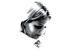
This pic would be better if it was clearer. The greyed out theme is being done by alot of people nowadays, but the way it fades out is great.
|
This pic would be better if it was clearer. The greyed out theme is being done by alot of people nowadays, but the way it fades out is great.
Comment Written 22-May-2004
Comment from King Diamond
I'm not sure what to make of this. The fade to white is excellent, but the image itself is very grainy and hard to see. The writing at the bottom is distracting and would be better left out.
|
I'm not sure what to make of this. The fade to white is excellent, but the image itself is very grainy and hard to see. The writing at the bottom is distracting and would be better left out.
Comment Written 21-May-2004
Comment from Wera
I Think that this is a great picture. I love the way that you took it.
I think that there is just a little bit too much shadowing around the eyes. But that doesn't take away the fact that I really do like it alot! Great job!!
reply by the author on 21-May-2004
|
I Think that this is a great picture. I love the way that you took it.
I think that there is just a little bit too much shadowing around the eyes. But that doesn't take away the fact that I really do like it alot! Great job!!
Comment Written 21-May-2004
reply by the author on 21-May-2004
-
Thank you very much for your wonderful comments. They will definantly come into use on further projects. Thank you once again for your time.
Comment from Sysop912
Tara, this has the potential to be a much better image. See those squared artifacts in the girls face. This is a result of the way you saved the image (maybe a few times) before uploading. I see you're around the 50k, almost 60k limit, and black and white should looks a lot better even with that low kilobyte limit. I think you may have saved this image in a smaller size, either dimensionally, or file size, and then increased it later. Unfortunately the image cannot create details that were previously removed, but does however use interpolation where it borrows or inherits properties of adjoining pixels when increased from a lesser image. If you have the original, I'd suggest trying to save it again without over reducing anything, it should look a lot better.
Hope you found this helpful.
Brian
reply by the author on 20-May-2004
|
Tara, this has the potential to be a much better image. See those squared artifacts in the girls face. This is a result of the way you saved the image (maybe a few times) before uploading. I see you're around the 50k, almost 60k limit, and black and white should looks a lot better even with that low kilobyte limit. I think you may have saved this image in a smaller size, either dimensionally, or file size, and then increased it later. Unfortunately the image cannot create details that were previously removed, but does however use interpolation where it borrows or inherits properties of adjoining pixels when increased from a lesser image. If you have the original, I'd suggest trying to save it again without over reducing anything, it should look a lot better.
Hope you found this helpful.
Brian
Comment Written 20-May-2004
reply by the author on 20-May-2004
-
Thank you for the advice. I do think that I saved it wrong. This should come in very handy. I appreciate your helpful comments.
Comment from rebeld
nice picture. the shadow across her face is very good and the work not quite being in focus is a nice added touch. thanks for sharing.
reply by the author on 20-May-2004
|
nice picture. the shadow across her face is very good and the work not quite being in focus is a nice added touch. thanks for sharing.
Comment Written 20-May-2004
reply by the author on 20-May-2004
-
Thank you very much for your comments.
Comment from Cricket
The lighting is wrong, too bright on parts of her face and too dark in others. Looks definitely digital. Rough lines instead of smooth ones. Keep working at it.
This rating does not count towards story rating or author rank.
The highest and the lowest rating are not included in calculations.
reply by the author on 20-May-2004
|
The lighting is wrong, too bright on parts of her face and too dark in others. Looks definitely digital. Rough lines instead of smooth ones. Keep working at it.
This rating does not count towards story rating or author rank.
The highest and the lowest rating are not included in calculations.
Comment Written 20-May-2004
reply by the author on 20-May-2004
-
Thank you.
Comment from simpledlte
I really like the way this whole thing has been minimized. It adds to the title you gave it of "My Immortal". My only suggestion would be to lose the Fox Tv T-Shirt she is wearing. Most angels would not be wearing it. :)
This rating does not count towards story rating or author rank.
The highest and the lowest rating are not included in calculations.
reply by the author on 20-May-2004
|
I really like the way this whole thing has been minimized. It adds to the title you gave it of "My Immortal". My only suggestion would be to lose the Fox Tv T-Shirt she is wearing. Most angels would not be wearing it. :)
This rating does not count towards story rating or author rank.
The highest and the lowest rating are not included in calculations.
Comment Written 19-May-2004
reply by the author on 20-May-2004
-
Thank you for the good advice. I appreciate it very much. I agree with you as well. The Fox T-Shirt really does throw it off quite a bit. Thank you for your comments.
Comment from Stanbo
Very nice job for your work though I would have added a bit of background color or added clouds to this work you have done an excellent job. It is very impressive
reply by the author on 19-May-2004
|
Very nice job for your work though I would have added a bit of background color or added clouds to this work you have done an excellent job. It is very impressive
Comment Written 19-May-2004
reply by the author on 19-May-2004
-
Thank you very much for your comments. I truly appreciate it.
Comment from stajduhar
Emotive use of toning and minimalistic approach to overall composition. The use of effects put additional weight on the message this work is trying to tell... maybe the letters are in a way obstructing the way of the whole perspective going down with the view from the model... otherwise, well done...
reply by the author on 19-May-2004
|
Emotive use of toning and minimalistic approach to overall composition. The use of effects put additional weight on the message this work is trying to tell... maybe the letters are in a way obstructing the way of the whole perspective going down with the view from the model... otherwise, well done...
Comment Written 19-May-2004
reply by the author on 19-May-2004
-
Thank you for the comments. I appreciate the ideas that i have recieved. Thank you once again.
-
Thank you for the comments. I appreciate the ideas that i have recieved. Thank you once again.