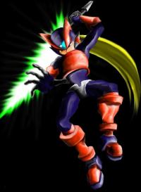
rockman zero colored
a pic of zeor colored5 total reviews
Comment from redwalkker7
wow the ditigil art is really taking off and for good reason it is a great medium great job i like the colors and the action the photo gives great job
      |
wow the ditigil art is really taking off and for good reason it is a great medium great job i like the colors and the action the photo gives great job
Comment Written 17-Jun-2004
Comment from S.C.Cobb
Yaaaaaaaaaay! good stuff man. Rockman huh, ah where Im from I know him as Mega Man. 2 was my fav. Are we on the same page or is this something totally unrelated? At any rate, this here is a kick-a** drawing my friend. Your colors are almost as impressive as the awesome pose you chose. I hope youve got more like this on the way! Bravo!
reply by the author on 23-May-2004
      |
Yaaaaaaaaaay! good stuff man. Rockman huh, ah where Im from I know him as Mega Man. 2 was my fav. Are we on the same page or is this something totally unrelated? At any rate, this here is a kick-a** drawing my friend. Your colors are almost as impressive as the awesome pose you chose. I hope youve got more like this on the way! Bravo!
Comment Written 22-May-2004
reply by the author on 23-May-2004
-
yea its from the megaman series, just a lot of people call em rockman caus thats the japanese title of it.. ah wel its all good either way, this pic is actually of zero my fav megaman character. who i draw in excesss. but im happy u liked :)
Comment from zelphiablue
This looks very professional. I know work like this isn't easy to do and you have done a terrific job. one thing confuses me though, It says a pic, colored. How did you do that? It almost has a cutout three D look. Very clever. The colors are very vivid.
reply by the author on 22-May-2004
      |
This looks very professional. I know work like this isn't easy to do and you have done a terrific job. one thing confuses me though, It says a pic, colored. How did you do that? It almost has a cutout three D look. Very clever. The colors are very vivid.
Comment Written 22-May-2004
reply by the author on 22-May-2004
-
well i used the line mask tool in photoshop and inside the mask colored one color, alomst like a paper cutout. then i shaded each part with the blend tool
-
I'm jealous. I can only do the most rudimentary things in photoshop. The classes to learn cost hundreds of dollars, but I wish I could go to one evertime I see an artist like you do somethingthis creative.
Comment from Richard
Good use of the software. the tones and colors are nice. The action looks good. Just some othe edges have jaggys. I look forward to seeing more of your work.
reply by the author on 22-May-2004
      |
Good use of the software. the tones and colors are nice. The action looks good. Just some othe edges have jaggys. I look forward to seeing more of your work.
Comment Written 22-May-2004
reply by the author on 22-May-2004
-
hey thanks man:) i should have messed with it more to kill the jaggies. however the original is better, the lowering of size becasue of this sites 50k restriction is why it looks kinda cruddy
Comment from Holly M.
The colors in this piece are amazing and the look in the characters eyes gives the piece of work a menancing feel. Fanstastic job-thanx for sharing. Have a great weekend-holly m.
reply by the author on 22-May-2004
      |
The colors in this piece are amazing and the look in the characters eyes gives the piece of work a menancing feel. Fanstastic job-thanx for sharing. Have a great weekend-holly m.
Comment Written 22-May-2004
reply by the author on 22-May-2004
-
hey thanks Holly :)
