Catrina
Catrina Figurine33 total reviews
Comment from Echo7
What a strange composition. Its every well done though. It certainly tells a story of two. spooky though. Certainly a great idea for your halloween contest. Detail lighting and focus a;; good. Good array of vibrant colours. Good luck
reply by the author on 10-Nov-2010
  |
What a strange composition. Its every well done though. It certainly tells a story of two. spooky though. Certainly a great idea for your halloween contest. Detail lighting and focus a;; good. Good array of vibrant colours. Good luck
Comment Written 08-Nov-2010
reply by the author on 10-Nov-2010
-
Thank you very much for your encouraging review and your kind wishes.
Comment from GaliaG
excelelnt focus, colors, contrast, composition and presentation
very good notes and explanation about the subject
thansk for sharing
reply by the author on 10-Nov-2010
|
excelelnt focus, colors, contrast, composition and presentation
very good notes and explanation about the subject
thansk for sharing
Comment Written 08-Nov-2010
reply by the author on 10-Nov-2010
-
Thank you Galia, for your very kind and encouraging review.
Comment from willie
Poor Catalina. She had a date with a handsome sailor. He said he would pick her up at eight. She is still waiting. I like what you did here.
reply by the author on 10-Nov-2010
  |
Poor Catalina. She had a date with a handsome sailor. He said he would pick her up at eight. She is still waiting. I like what you did here.
Comment Written 08-Nov-2010
reply by the author on 10-Nov-2010
-
Thank you for your kind review and humorous interpretation.
Comment from tedmunro
good artist notes on this scary looking photograph. nice and clear with lots of great detail. a pleasure to review and ty for sharing
reply by the author on 10-Nov-2010
|
good artist notes on this scary looking photograph. nice and clear with lots of great detail. a pleasure to review and ty for sharing
Comment Written 08-Nov-2010
reply by the author on 10-Nov-2010
-
Thank you very much for your kind review.
Comment from ademuro
Great info on this photo
Lady of death wouldn't want to meet her.
Great color all over this shot
Good framing
Good focus
Good clarity
Good lighting
reply by the author on 10-Nov-2010
|
Great info on this photo
Lady of death wouldn't want to meet her.
Great color all over this shot
Good framing
Good focus
Good clarity
Good lighting
Comment Written 08-Nov-2010
reply by the author on 10-Nov-2010
-
Thank you for your encouraging review. It is save to meet Catrina. She is always smiling as her nature to be some kind of an historical comic figure in Mexican art.
Comment from vulken
I am way too new to give you much critical help. I do like the color and I know that the focus is clear. Thank you for sharing the background. Very interesting.
reply by the author on 10-Nov-2010
|
I am way too new to give you much critical help. I do like the color and I know that the focus is clear. Thank you for sharing the background. Very interesting.
Comment Written 07-Nov-2010
reply by the author on 10-Nov-2010
-
Thank you for your kind review.
Comment from raineyknightartwork
Initial Perception: fashionable piece of work
Emotionally Charged: yes
Title: fits
Artist Notes: helpful and detailed, suggest editing artist notes because when copy paste is used ?? marks appear in text
Creativity: challenging piece with attention to details
Color Harmony: dynamic
Center of Interest: the skull
Technique (category): Correct
Story Telling Ability: Yes
What Works Well? The subject, depth of field
Comments: pleasure to review
Star Rating: 5
Per site scale (6=Exceptional, 5.5=Professional, 5=Expert (no revisions necessary) 4.5=Above Average, 4=Average)
Thank you for sharing. Rainey
reply by the author on 10-Nov-2010
|
Initial Perception: fashionable piece of work
Emotionally Charged: yes
Title: fits
Artist Notes: helpful and detailed, suggest editing artist notes because when copy paste is used ?? marks appear in text
Creativity: challenging piece with attention to details
Color Harmony: dynamic
Center of Interest: the skull
Technique (category): Correct
Story Telling Ability: Yes
What Works Well? The subject, depth of field
Comments: pleasure to review
Star Rating: 5
Per site scale (6=Exceptional, 5.5=Professional, 5=Expert (no revisions necessary) 4.5=Above Average, 4=Average)
Thank you for sharing. Rainey
Comment Written 07-Nov-2010
reply by the author on 10-Nov-2010
-
Thank you Rainey for your throuough review. I edit the comments right away. I forgot the strange settings of FAR. [I wrote the comments in my work program.] The guys name is Posada. The three Question marks occur were an apostrophe is meant to be. I have no choice as just to eliminate it. Thank you for putting my attention to it.
-
no you can just go directly into the edit feature into artist notes and edit it directly within the FAR site - fix the questions and then save it again. Rainey
-
I know, I have it already fixed. Sorry for being unclear on this. With strange settings I meant that you can't use grammatical signs at FAR. Thew always tour into question marks. With eliminate it I meant to eliminate the apostrophe nothing else. Since English isn't my original language and I'm a language freak anyway I'm allways u8sing my word program and spell check. I am maybe a bit picky with the grammar. Not to use the proper grammatical signs seems always wrong to me.
Thanks again
Cleo
-
I would be in deep trouble without spell check. Rainey
-
Me too!
Cleo
Comment from RedRockArt
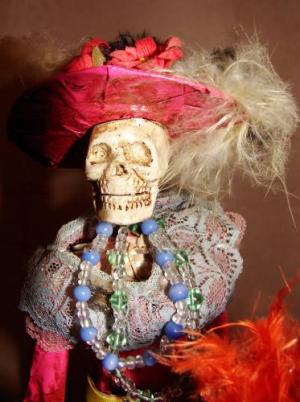
Chose to review this, because the image grabbed my attention.
Lighting 5
Natural appearing lighting of an interesting subject, with open shadows... Side lighting brings out good detail in the skull, lace, and feathers especially. A bit of fill light might have opened the shadows. In Lightroom, the Fill Slider would do the same.
Comparing your image with a zone scale, see a good range of zones.
Why is this important?
Because, it is the range of blacks, grays, and whites, that control colors, create impact or drama. A true contrast scale in Black and White, gives maximum usable contrast for color. Usually this means a lot of impact in the Image.
IF we do not understand comments in someones review, it can be that a monitor is not calibrated. For if you adjust an image, to look good on one it may not on another. Viewed on other monitors calibrated or not, it can look different than it looks on the original..
That said, lets take a look at the Impact - Strong 6
It has lots of impact in the subject, the colors, especially red demands it. It has specific points of interest that keep bringing me back to see them.
Composition - 5
Love it when people "shoot and compose for maximum impact." The skull is as close to an ideal as it could be. The beads lead us to the red feathers and back to the skull. An oval or circle in composition is always good.
In composing, we want to choose a powerful interest point, put it into the position with most impact. You have done well with this.
Creativity: 5
My favorite subjects are not skeletons, but Ill ignore that for Halloween. ;)
There is a good variation of color, with yellow, orange and red or browns and magenta, which add punch.
It has interesting patterns in light and shadows, with good detail in mid-tones, and highlights that are white as well as those without detail..
Ansel Adams, said, "12 images, is a good years work."
When we Aim for Adams or Weston's and the quality in others work, we can achieve it, with practice.
The more we look at the work of others closely to see what we like, the more info we store in our brain. Then, the brain uses this information, all combined to create our own style of work.
My desire as a reviewer, is to help you produce something better, each time. Sometimes that is difficult.
Some "Technical" rules, can be broken, when breaking them is creative or expresses your feelings. But, just breaking them, does not work unless it improves the piece of art. My comments are merely suggestions, use them if you like them, ignore them if you do not.
You have done very well with this image, will enjoy seeing more.
Take into consideration the knowledge of those writing reviews, even mine. Everyone's experience is different, they may lack the knowledge to do a good review and mean well.... They may criticize technical elements, when the artist varies from normal, to create a piece of art. For many think no photo should even be altered.
Artists use colors which express what they "feel" about the image. Not just ones reviewers believe are "technically correct" according to some standard. If we change colors or make them the way we want, it says what we want to communicate. If someone does not understand our communication, they just do not speak the same language of art. It does not mean they or you are wrong, and its just an opinion. Just go back, and enjoy the piece you created.
Only if, _we_feel_ it is not quite right, should we change it to suit others....
Story - 5
Images are worth thousands of words.
The best require no words to describe, not even a Title.
When your work communicates emotions or ideas and effects the viewer, a Story has been told.
=======================
Important Photo Technical info :
Calibrated Monitors make it easier to show viewers Art the way we see it. Even the best of Artwork, will look different than we intended, if created OR viewed, on un-calibrated Monitors. Monitors do not come calibrated. Pro's. Spend $300 - 600 or more for a device to calibrate them.
What is Gamma, and why do I care? Monitors, can be reasonably calibrated, with Adobe Gamma, which is free. If you cant afford or do not want to spend money for a device to calibrate your monitor, at least do it with free software. Then, everyone will see your work, close to what you create.
Output brightness of monitors are not linear.
For example when displaying a gray square, with a color half way between white and black, the result will -not- be half as bright as a full white. So creations can look flat.
This effect doesn't just apply to brightness of grays, but to the shade of all colors, it is the grays that create shading, mixed with the color. So if a monitor is not calibrated, there is no way you can control how it will appear to the viewer. It can can completely change the viewed image, on another's computer.
Gamma correction is a factor by which software can correct for this non-linearity, that results in a correctly displayed image on the Internet, if saved with sRGB.
For more info: http://www.cgsd.com/papers/gamma.html
Firefox may be the only calibrated Browser. So I use Firefox and the color management add-on... If others don't, then recommend it and the add-on that manages color. They are also free.
reply by the author on 10-Nov-2010
|
Chose to review this, because the image grabbed my attention.
Lighting 5
Natural appearing lighting of an interesting subject, with open shadows... Side lighting brings out good detail in the skull, lace, and feathers especially. A bit of fill light might have opened the shadows. In Lightroom, the Fill Slider would do the same.
Comparing your image with a zone scale, see a good range of zones.
Why is this important?
Because, it is the range of blacks, grays, and whites, that control colors, create impact or drama. A true contrast scale in Black and White, gives maximum usable contrast for color. Usually this means a lot of impact in the Image.
IF we do not understand comments in someones review, it can be that a monitor is not calibrated. For if you adjust an image, to look good on one it may not on another. Viewed on other monitors calibrated or not, it can look different than it looks on the original..
That said, lets take a look at the Impact - Strong 6
It has lots of impact in the subject, the colors, especially red demands it. It has specific points of interest that keep bringing me back to see them.
Composition - 5
Love it when people "shoot and compose for maximum impact." The skull is as close to an ideal as it could be. The beads lead us to the red feathers and back to the skull. An oval or circle in composition is always good.
In composing, we want to choose a powerful interest point, put it into the position with most impact. You have done well with this.
Creativity: 5
My favorite subjects are not skeletons, but Ill ignore that for Halloween. ;)
There is a good variation of color, with yellow, orange and red or browns and magenta, which add punch.
It has interesting patterns in light and shadows, with good detail in mid-tones, and highlights that are white as well as those without detail..
Ansel Adams, said, "12 images, is a good years work."
When we Aim for Adams or Weston's and the quality in others work, we can achieve it, with practice.
The more we look at the work of others closely to see what we like, the more info we store in our brain. Then, the brain uses this information, all combined to create our own style of work.
My desire as a reviewer, is to help you produce something better, each time. Sometimes that is difficult.
Some "Technical" rules, can be broken, when breaking them is creative or expresses your feelings. But, just breaking them, does not work unless it improves the piece of art. My comments are merely suggestions, use them if you like them, ignore them if you do not.
You have done very well with this image, will enjoy seeing more.
Take into consideration the knowledge of those writing reviews, even mine. Everyone's experience is different, they may lack the knowledge to do a good review and mean well.... They may criticize technical elements, when the artist varies from normal, to create a piece of art. For many think no photo should even be altered.
Artists use colors which express what they "feel" about the image. Not just ones reviewers believe are "technically correct" according to some standard. If we change colors or make them the way we want, it says what we want to communicate. If someone does not understand our communication, they just do not speak the same language of art. It does not mean they or you are wrong, and its just an opinion. Just go back, and enjoy the piece you created.
Only if, _we_feel_ it is not quite right, should we change it to suit others....
Story - 5
Images are worth thousands of words.
The best require no words to describe, not even a Title.
When your work communicates emotions or ideas and effects the viewer, a Story has been told.
=======================
Important Photo Technical info :
Calibrated Monitors make it easier to show viewers Art the way we see it. Even the best of Artwork, will look different than we intended, if created OR viewed, on un-calibrated Monitors. Monitors do not come calibrated. Pro's. Spend $300 - 600 or more for a device to calibrate them.
What is Gamma, and why do I care? Monitors, can be reasonably calibrated, with Adobe Gamma, which is free. If you cant afford or do not want to spend money for a device to calibrate your monitor, at least do it with free software. Then, everyone will see your work, close to what you create.
Output brightness of monitors are not linear.
For example when displaying a gray square, with a color half way between white and black, the result will -not- be half as bright as a full white. So creations can look flat.
This effect doesn't just apply to brightness of grays, but to the shade of all colors, it is the grays that create shading, mixed with the color. So if a monitor is not calibrated, there is no way you can control how it will appear to the viewer. It can can completely change the viewed image, on another's computer.
Gamma correction is a factor by which software can correct for this non-linearity, that results in a correctly displayed image on the Internet, if saved with sRGB.
For more info: http://www.cgsd.com/papers/gamma.html
Firefox may be the only calibrated Browser. So I use Firefox and the color management add-on... If others don't, then recommend it and the add-on that manages color. They are also free.
Comment Written 07-Nov-2010
reply by the author on 10-Nov-2010
-
Thank you verry much for your through review. I have to admit that I put the shadows intentionally as they are. Against my usual style I have used some artificial light to get them. It's just to emphasize the juxtaposition of elegance and battered scull in relation with the contemporary occurrence of the Catrina in Mexican art and culture. The almost hot light at the scull fills the same purpose. The emotional intake of the image is somehow very different in the tropical land of harsh light, bold color and burning emotion. I know the image is hard to understand for most of the viewers who aren't familiar with very different culture. The photo therefore is not as much a piece of art but a piece of journalism and information. I like critical reviews very much. They are usual more helpful than the positive once even in a disagreement. I also have to admit that I sometimes love to provoke people with some of my images as I have done with this one.
Comment from virginian
Good story. What an icon; weird and different to say the least. Good lighting, colors and details. Love the hat. 'Enjoyed and good luck in the contest.
reply by the author on 10-Nov-2010
|
Good story. What an icon; weird and different to say the least. Good lighting, colors and details. Love the hat. 'Enjoyed and good luck in the contest.
Comment Written 07-Nov-2010
reply by the author on 10-Nov-2010
-
Thank you very much for your kind review and your wishes.
Comment from Daliant
A very fashioable dame. She dresses or should I say dressed well. Nicelt set uo good light. Love her beads think I want them foer me. Enjoyed viewing
reply by the author on 10-Nov-2010
|
A very fashioable dame. She dresses or should I say dressed well. Nicelt set uo good light. Love her beads think I want them foer me. Enjoyed viewing
Comment Written 07-Nov-2010
reply by the author on 10-Nov-2010
-
Thank you for your kind review. I will talk to Catrina about the beads but I am affraid she wants to keep them for herself.