REAL (what is?)
mysteriously whimsical6 total reviews
Comment from RUBY REDWINE
HOLDEN, I personally like this picture very much. I love the colors and the way they are arranged on the card board. You just gave me some ideas for something new and different. Good luck
RUBY REDWINE
reply by the author on 24-Apr-2004
  |
HOLDEN, I personally like this picture very much. I love the colors and the way they are arranged on the card board. You just gave me some ideas for something new and different. Good luck
RUBY REDWINE
Comment Written 24-Apr-2004
reply by the author on 24-Apr-2004
-
thank you very much!
Comment from emotif
There certainly was a ton of work, and mediums, that were used to create this art work. I like the image having a weaker replica, but not a shadow, maybe an alter ego. Best wishes.
reply by the author on 24-Apr-2004
 |
There certainly was a ton of work, and mediums, that were used to create this art work. I like the image having a weaker replica, but not a shadow, maybe an alter ego. Best wishes.
Comment Written 22-Apr-2004
reply by the author on 24-Apr-2004
-
thank you for your suggestions/comments. best wishes to you too
Comment from JATH
I really like this piece. Very interesting how it was made and a message can be seen without it being overbearing. I think the right frame could really set it off.
reply by the author on 22-Apr-2004
|
I really like this piece. Very interesting how it was made and a message can be seen without it being overbearing. I think the right frame could really set it off.
Comment Written 22-Apr-2004
reply by the author on 22-Apr-2004
-
thanks! by 'right frame' what more precisely do you mean, if you have an idea for it please let me know. i was just thinking of an opusframe, like a silver/basic one.
-
I would steer clear of silver as that would distract from the warm colors of the painting. Using a simple frame to pick up the blue at the bottom would visually balance the color a tad better.
Comment from Papa
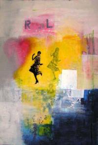
holden, this, I think, is excellent, exciting and mysterious. You've creatively used a variety of media to produce a truly stunning image. The colours and contrast are magnificent. The figure and her "shadow" are intriguing. The piece truly is wonder-full!
Peace,
Papa
reply by the author on 22-Apr-2004
|
holden, this, I think, is excellent, exciting and mysterious. You've creatively used a variety of media to produce a truly stunning image. The colours and contrast are magnificent. The figure and her "shadow" are intriguing. The piece truly is wonder-full!
Peace,
Papa
Comment Written 22-Apr-2004
reply by the author on 22-Apr-2004
-
thank you so much for your comments, they are very encouraging and uplifting!
Comment from Wolfdancer13
I could see this being snagged up by a teen to decorate their room. I think it is kind of a wash of tone they can relate to with its colors, symbols...the R and L are backwards...there's energy, passion with fading hues. I especially like the bottom right corner with the mix of blue and white brush strokes and splatters. The texturing is appealing to the eye.
The only thing I would suggest, possibly, is consider adapting the black of the dancing girl to either one of the blue tones or reds...the black seems out of place with its flat element sticking out from the depth and dimension the rest of the piece provides with its reflective casts you achieved via photography. What I like the most is you can look and look and still take in more concepts.
reply by the author on 22-Apr-2004
|
I could see this being snagged up by a teen to decorate their room. I think it is kind of a wash of tone they can relate to with its colors, symbols...the R and L are backwards...there's energy, passion with fading hues. I especially like the bottom right corner with the mix of blue and white brush strokes and splatters. The texturing is appealing to the eye.
The only thing I would suggest, possibly, is consider adapting the black of the dancing girl to either one of the blue tones or reds...the black seems out of place with its flat element sticking out from the depth and dimension the rest of the piece provides with its reflective casts you achieved via photography. What I like the most is you can look and look and still take in more concepts.
Comment Written 22-Apr-2004
reply by the author on 22-Apr-2004
-
thank you very much for your suggestions. to change the image at this point would not be possible, because i used an oil based paint and it won't cover to well. and i did want to create this juxtaposition, (of flat versus depth of images etc) but your comments are helpful in how other's would perceive my intentions through my work! thanks!
Comment from Richard
I like this piece. It just doesn't knock my socks off. The compostion and colors seem well chosen and the cut out is nice. I think it is just the dark blue corner that distracts me from the lady. Keep em coming.
reply by the author on 22-Apr-2004
|
I like this piece. It just doesn't knock my socks off. The compostion and colors seem well chosen and the cut out is nice. I think it is just the dark blue corner that distracts me from the lady. Keep em coming.
Comment Written 22-Apr-2004
reply by the author on 22-Apr-2004
-
thank you, this is a slightly earlier work of mine, that i've just become so attached to. i am happy to hear your comments.