South Australia
Viewing comments for Page 31 "St Aloysius' Church Interior"Photos of various parts of South Australi
10 total reviews
Comment from Sange
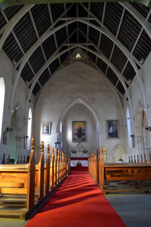
Magnificent POV Mary! From the awesome architectural ceiling to the long red carpet down to the altar. Fab Perspective here. The use of natural light and the soft shadows and the leading lines of the pews are simply fabulous. Outstanding capture girl! Well done!
reply by the author on 26-Apr-2012
  |
Magnificent POV Mary! From the awesome architectural ceiling to the long red carpet down to the altar. Fab Perspective here. The use of natural light and the soft shadows and the leading lines of the pews are simply fabulous. Outstanding capture girl! Well done!
Comment Written 25-Apr-2012
reply by the author on 26-Apr-2012
-
Thank you so much, I am so glad you enjoyed this photo and gave such positive feedback :) Mary
Comment from chickadee
Wow just stunning to have seen this as it is in the image Mary! The ceiling is amazing and the capture must have given you a crick in your neck! Nice clarity with excellent framing to show off the beauty of the interior of the church. Great narrative, very interesting!
/Chickadee
reply by the author on 25-Apr-2012
|
Wow just stunning to have seen this as it is in the image Mary! The ceiling is amazing and the capture must have given you a crick in your neck! Nice clarity with excellent framing to show off the beauty of the interior of the church. Great narrative, very interesting!
/Chickadee
Comment Written 25-Apr-2012
reply by the author on 25-Apr-2012
-
Thanks once again, glad you enjoyed the photo :) Mary
Comment from canon shooter
Old church are sure nice and this one is know exception! Great work with the light coming in the side. It looks so warm and very nice presentation. Thanks for the information!
reply by the author on 25-Apr-2012
|
Old church are sure nice and this one is know exception! Great work with the light coming in the side. It looks so warm and very nice presentation. Thanks for the information!
Comment Written 25-Apr-2012
reply by the author on 25-Apr-2012
-
Thanks very much, I found this church had a very welcoming feel when you walked through the door.
Comment from insiya
Good shot - I like the content, the exposure is great and leads the eyes of the viewer to the end of the room. The arches help add dimension to your image. My feedback would be to center the picture better - I can see an extra window on the left which is all light and is distracting. There are different angles you could have used to achieve the interesting results - like showing less of the right side of the church - showing the full window on the right side to showcase the light coming in and focusing on the shadows made by the pews. Thanks for sharing!!!
reply by the author on 25-Apr-2012
|
Good shot - I like the content, the exposure is great and leads the eyes of the viewer to the end of the room. The arches help add dimension to your image. My feedback would be to center the picture better - I can see an extra window on the left which is all light and is distracting. There are different angles you could have used to achieve the interesting results - like showing less of the right side of the church - showing the full window on the right side to showcase the light coming in and focusing on the shadows made by the pews. Thanks for sharing!!!
Comment Written 25-Apr-2012
reply by the author on 25-Apr-2012
-
Thanks very much, I have taken shots of the different angles but this one was best for the roof. May post another showing the leadlight later :)
Comment from GaliaG
excellent capture of the shadows on the floor
good focus, depth of field, angle of shot and composition
thansk for sharing
reply by the author on 25-Apr-2012
|
excellent capture of the shadows on the floor
good focus, depth of field, angle of shot and composition
thansk for sharing
Comment Written 25-Apr-2012
reply by the author on 25-Apr-2012
-
Thanks so much I appreciate your comments.
Comment from regine_anne09
At first look, i felt that it was unbalanced. The upper part is symmetrical, so I believe the lower part should be symmetrical ,too. It looks like the left side is heavier than the other.
reply by the author on 25-Apr-2012
   |
At first look, i felt that it was unbalanced. The upper part is symmetrical, so I believe the lower part should be symmetrical ,too. It looks like the left side is heavier than the other.
Comment Written 25-Apr-2012
reply by the author on 25-Apr-2012
-
Thanks for your comments.
Comment from outsideMAN
Your image is enjoyable, well composed, sharp and has good exposure. I have liked looking at it and reviewing it. Very nice photo, well done!
reply by the author on 25-Apr-2012
|
Your image is enjoyable, well composed, sharp and has good exposure. I have liked looking at it and reviewing it. Very nice photo, well done!
Comment Written 25-Apr-2012
reply by the author on 25-Apr-2012
-
Thanks so much, appreciate your feedback.
Comment from amfunny
Very pretty. I love the angle of this. Great lighting as well. Good details. Makes you want to walk right in. Nice job.
reply by the author on 25-Apr-2012
|
Very pretty. I love the angle of this. Great lighting as well. Good details. Makes you want to walk right in. Nice job.
Comment Written 25-Apr-2012
reply by the author on 25-Apr-2012
-
Thanks so much, I appreciate your comments.
Comment from dubach
Obvioulsy a good choice of time of day to shoot this. the lighting and shadows make all the difference here. Good clarity and exposure over all. It does'nt really need it but if you want more light in the ceiling area, you can experiment with this. it will help with other photos in the future once you get the hang of it.
1) duplicate layer
2) change blend mode from normal to "screen" to lighten a photo or to "multipy" to darken.
3) Use a combination of opacity adjustment and a soft eraser brush to bring back light or dark to areas that you want.
thanks and nice job on this, dave :)
reply by the author on 25-Apr-2012
|
Obvioulsy a good choice of time of day to shoot this. the lighting and shadows make all the difference here. Good clarity and exposure over all. It does'nt really need it but if you want more light in the ceiling area, you can experiment with this. it will help with other photos in the future once you get the hang of it.
1) duplicate layer
2) change blend mode from normal to "screen" to lighten a photo or to "multipy" to darken.
3) Use a combination of opacity adjustment and a soft eraser brush to bring back light or dark to areas that you want.
thanks and nice job on this, dave :)
Comment Written 25-Apr-2012
reply by the author on 25-Apr-2012
-
Thanks Dave will take a note of your suggestions for future reference. Much appreciated.
-
no problem Zilyram, dave
Comment from Sam S
This is a great shot of the church interior. There certainly is a lot of height inside. I like the focus and detail. The only thing I see that is wrong with this image is that it is leaning to the left. Otherwise, well done. Thanks for sharing. Sam
reply by the author on 25-Apr-2012
|
This is a great shot of the church interior. There certainly is a lot of height inside. I like the focus and detail. The only thing I see that is wrong with this image is that it is leaning to the left. Otherwise, well done. Thanks for sharing. Sam
Comment Written 25-Apr-2012
reply by the author on 25-Apr-2012
-
Thanks for your review, I think I have managed to straighten, must learn to check that before posting. Cheers Mary