St Louis Cardinals
Baseball35 total reviews
Comment from click3333
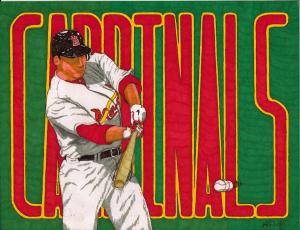
Good image for the cardinals, I especially like the moving ball, great colors, good details in the player. thanks so much for sharing.
reply by the author on 11-May-2014
  |
Good image for the cardinals, I especially like the moving ball, great colors, good details in the player. thanks so much for sharing.
Comment Written 09-May-2014
reply by the author on 11-May-2014
-
thanks for the great review
Comment from JIRINA
Well, I am insulted! What about us Blue Jay fans? Still, a good work, nice colours and posture of the batter. Nice work done on the moving ball. Colours are great, nice sharp drawing.
reply by the author on 11-May-2014
|
Well, I am insulted! What about us Blue Jay fans? Still, a good work, nice colours and posture of the batter. Nice work done on the moving ball. Colours are great, nice sharp drawing.
Comment Written 09-May-2014
reply by the author on 11-May-2014
-
i guess i need to repromote the "bluejay country" again..u did see it the last i did didnt U?..thanks for the great review
-
No, I am sorry I did not see it. Jirina
-
alright ill get it posted very soon..wink
Comment from BrooklynMyra
Not being a sports lover, I can still appreciate the excellent drawing and lettering of this post. Good action and composition.
reply by the author on 11-May-2014
|
Not being a sports lover, I can still appreciate the excellent drawing and lettering of this post. Good action and composition.
Comment Written 09-May-2014
reply by the author on 11-May-2014
-
thanks for the great review
Comment from Linda Engel
I have a friend who would love this. This is great. good lighting and shadows, well positioned image of player in contrast to background lettering. details are spot on. well framed. I'm waiting for the Cincinnati Reds!! (bet ya thought I would say Braves)
reply by the author on 11-May-2014
|
I have a friend who would love this. This is great. good lighting and shadows, well positioned image of player in contrast to background lettering. details are spot on. well framed. I'm waiting for the Cincinnati Reds!! (bet ya thought I would say Braves)
Comment Written 09-May-2014
reply by the author on 11-May-2014
-
lol..thanks for the great review
Comment from M. Celeste
Great work! Love the action shot with the ball and the detail you display. Fantastic work on the lettering, shading and shadows. I'm across the river from St. Louis and have rooted for them a time or two. Really cool! Great job!
reply by the author on 26-Sep-2013
|
Great work! Love the action shot with the ball and the detail you display. Fantastic work on the lettering, shading and shadows. I'm across the river from St. Louis and have rooted for them a time or two. Really cool! Great job!
Comment Written 23-Sep-2013
reply by the author on 26-Sep-2013
-
thanks for the great review
Comment from Jairos
Another Masterpiece, good impact, I like the Detail good initial impact, beautiful colors well done , - jairos
reply by the author on 26-Sep-2013
|
Another Masterpiece, good impact, I like the Detail good initial impact, beautiful colors well done , - jairos
Comment Written 23-Sep-2013
reply by the author on 26-Sep-2013
-
thanks for the great review
Comment from Lynda Joyce
This really has great complimentary colors. It's really good, even though I'm not a great baseball fan. Except when it was my sons or grandsons. Your just good!
reply by the author on 26-Sep-2013
|
This really has great complimentary colors. It's really good, even though I'm not a great baseball fan. Except when it was my sons or grandsons. Your just good!
Comment Written 23-Sep-2013
reply by the author on 26-Sep-2013
-
thanks for the great review
Comment from MinoYasue
You have challenged yourself again for the very difficult pose. Now, I know you have tried more than one time to make it work perfectly and I wonder how much effect you have to put into this composition. You really do the sport figure very well �?? not only the pose, but also something more internal level like power, concentration, energy flow etc. You must be a guy who loves the sport. I think the letter stretches little too much vertically as it is hard to read, but it may be not for reading, but for the color effect. Thank you for sharing. Yasue.
reply by the author on 26-Sep-2013
 |
You have challenged yourself again for the very difficult pose. Now, I know you have tried more than one time to make it work perfectly and I wonder how much effect you have to put into this composition. You really do the sport figure very well �?? not only the pose, but also something more internal level like power, concentration, energy flow etc. You must be a guy who loves the sport. I think the letter stretches little too much vertically as it is hard to read, but it may be not for reading, but for the color effect. Thank you for sharing. Yasue.
Comment Written 23-Sep-2013
reply by the author on 26-Sep-2013
-
love the game and the lettering was trying a different style..thanks for the great review
Comment from suzannethompson2
Excellent sports action drawing with your Sharpie markers. I like the bright colours you used for this, ideal for a poster. Excellent light and shading. Very good composition. Suzanne
reply by the author on 26-Sep-2013
|
Excellent sports action drawing with your Sharpie markers. I like the bright colours you used for this, ideal for a poster. Excellent light and shading. Very good composition. Suzanne
Comment Written 23-Sep-2013
reply by the author on 26-Sep-2013
-
thanks for thevgreat review
Comment from Rustyroy
POWER meets SPEED! I really like the form of the player. Leaves me wondering if he connects with the ball. Your colors stand out. The background is a bit confusing unless you knew the St.Louis Cardinals. Even so I really like what you did.
reply by the author on 02-Oct-2012
  |
POWER meets SPEED! I really like the form of the player. Leaves me wondering if he connects with the ball. Your colors stand out. The background is a bit confusing unless you knew the St.Louis Cardinals. Even so I really like what you did.
Comment Written 01-Oct-2012
reply by the author on 02-Oct-2012
-
just trying to create a lil excitment for the team..glad that you have enjoyed this and thanks for the great review.