Existing Debris
Dark gothic space and cold.15 total reviews
Comment from emotif
that was horrible and gave me the creeps, and made me feel sad that this is what our world may come to. The poor old thinker must have something to really think about here. Best wishes.
reply by the author on 24-Apr-2004
  |
that was horrible and gave me the creeps, and made me feel sad that this is what our world may come to. The poor old thinker must have something to really think about here. Best wishes.
Comment Written 24-Apr-2004
reply by the author on 24-Apr-2004
-
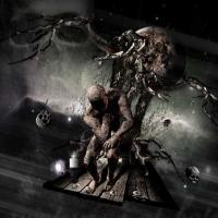
The poor old thinker may also be the evil little bugger destroying worlds floating about on his little raft of timbers through space, alone by candelight... thinking about what to devour next... Visit www.blacklodgearts.com for more of my work.
Comment from Wolfdancer13
I liked the suspended agony of this piece, Aphoste. You offer alot to stir the consciousness with your light on the world of agonizing internalizations. I like a picture that draws on depth and dimension to branch out its underlying conceptualizations. Your focal subject is quite affecting with his faceless persona deduced to circumstance and fate's dealings. The only thing distracting in the piece's overall composition is the illuminated light to the left of the platform by the candle. It's too large and too bright. Otherwise, great piece.
reply by the author on 24-Apr-2004
|
I liked the suspended agony of this piece, Aphoste. You offer alot to stir the consciousness with your light on the world of agonizing internalizations. I like a picture that draws on depth and dimension to branch out its underlying conceptualizations. Your focal subject is quite affecting with his faceless persona deduced to circumstance and fate's dealings. The only thing distracting in the piece's overall composition is the illuminated light to the left of the platform by the candle. It's too large and too bright. Otherwise, great piece.
Comment Written 23-Apr-2004
reply by the author on 24-Apr-2004
-
Yea... your right about that star... poor posistioning on my part, the candle was an after-thought to the existing star already... but I think the image needs this over-sight changed. Thanks. Visit www.blacklodgearts.com for more of my work.
Comment from kzm007
Duh, I thnk I'm beginnig to see what you are. You take art, or famous things, and give them a new, almost Hellish gothism-style paint job. The Thinker looks like he's going to Hell. I love how you describe things without words. Forget what others say bad about you, Aphoste- you have a new fan!
reply by the author on 24-Apr-2004
|
Duh, I thnk I'm beginnig to see what you are. You take art, or famous things, and give them a new, almost Hellish gothism-style paint job. The Thinker looks like he's going to Hell. I love how you describe things without words. Forget what others say bad about you, Aphoste- you have a new fan!
Comment Written 23-Apr-2004
reply by the author on 24-Apr-2004
-
Thanks. Visit www.blacklodgearts.com for more of my work.
Comment from JATH
I must be in a dark mode today as am being drawn to these less cheerful images and the deep textures within. I like how there is just enough warmth of color to draw your attention to the focal point. The only thing that seemed out of place was the bright star so close to the candle. It draws the attention away from the design slightly. It seems a little out of place.
This rating does not count towards story rating or author rank.
The highest and the lowest rating are not included in calculations.
reply by the author on 23-Apr-2004
|
I must be in a dark mode today as am being drawn to these less cheerful images and the deep textures within. I like how there is just enough warmth of color to draw your attention to the focal point. The only thing that seemed out of place was the bright star so close to the candle. It draws the attention away from the design slightly. It seems a little out of place.
This rating does not count towards story rating or author rank.
The highest and the lowest rating are not included in calculations.
Comment Written 23-Apr-2004
reply by the author on 23-Apr-2004
-
Yes you are right... that star does suck there... photoshop here I come !
-
Your not the only one to note the flaw within this image... good eye and thanks again for the comment, it truly is a flaw... and yet I wonder if perhaps I should just leave that flaw there ? Visit www.blacklodgearts.com for more of my work.
Comment from luckylara
again, a very well made picture but its still too eerie for a wall unless its in a art-gallery. it reminds more of scary cartoons than anything
This rating does not count towards story rating or author rank.
The highest and the lowest rating are not included in calculations.
reply by the author on 24-Apr-2004
 |
again, a very well made picture but its still too eerie for a wall unless its in a art-gallery. it reminds more of scary cartoons than anything
This rating does not count towards story rating or author rank.
The highest and the lowest rating are not included in calculations.
Comment Written 23-Apr-2004
reply by the author on 24-Apr-2004
-
My art is mostly made for the music industry in mind... music often has very dark covers to help illustrate the music being sold. Visit www.blacklodgearts.com for more of my work.