The Power
Philosophical thoughts27 total reviews
Comment from chickadee
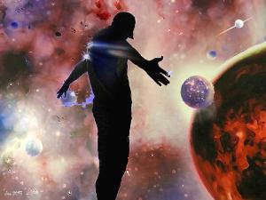
Hmmm now I have to think, but seems the man wants to circle the world with his arms and take away all the horrific things going on. The downcast head gives me the impression he is sad and possible at wits end on what to do with the planet earth. Kind of gives me a sad feeling looking at this, like mankind is his own worst enemy! Nice emotional piece Cleo!The colors are amazing!
/Chickadee
reply by the author on 03-Mar-2013
  |
Hmmm now I have to think, but seems the man wants to circle the world with his arms and take away all the horrific things going on. The downcast head gives me the impression he is sad and possible at wits end on what to do with the planet earth. Kind of gives me a sad feeling looking at this, like mankind is his own worst enemy! Nice emotional piece Cleo!The colors are amazing!
/Chickadee
Comment Written 03-Mar-2013
reply by the author on 03-Mar-2013
-
You got the meaning pretty good. It's indeed mankind who has the power; but bit more than he can chew. Mankind cannot quite handle this power. Mankind is abusing this power sometimes, thinking of being master of the universe while he is only part of it. Mankind has great power, the question is if mankind will ever able to handle this power our blow our planet our may our galaxy to pieces.
-
Personally with the goings on now I suspect the later will take place. A bit too big for their bridges I feel! Sigh!
-
That is exactly what I mean! I couldn'd say it better.
Comment from photoman12
The creator of the universe looking over his work. The colors are so lively and details are great. Good luck.
reply by the author on 03-Mar-2013
 |
The creator of the universe looking over his work. The colors are so lively and details are great. Good luck.
Comment Written 03-Mar-2013
reply by the author on 03-Mar-2013
-
Thank you very much for your great review and the splendid rating. You made my day!
Comment from Kenneth Dinkel
Like the concept and vivid emotion that the viewer is embraced with. A spiritual piece that captivates the senses in every way.
reply by the author on 03-Mar-2013
|
Like the concept and vivid emotion that the viewer is embraced with. A spiritual piece that captivates the senses in every way.
Comment Written 03-Mar-2013
reply by the author on 03-Mar-2013
-
Thank you, I appreciate your thoughtful review.
Comment from supernova08
Ooh now with is cool. I love the way process you used to create the entire piece.Brilliant! the verying color contrast and the way you used the space on the page gives the viewer a real feeling of being in deep space. The silhouette of the person kind of makes me feel like the picture is say this is MY creation this is my world.take it as it is because I am the master of my own fate.there is only a couple of things that I would have worked on with this piece you did such an amazing job smoothing the background and the largest planet and the the two smaller planets seem like they were hastily put on there I, if you were worried about them fading into the back ground because of smoothing out the edges to much, don't. Have that ruff edge and just ever so slightly smooth out only certain parts of the circle this will give it that edge you were looking for but stop it from seeming like you just pasted it in the last minute the farthest circle needs come work it looks very cartoonish and as much as I love cartoon since ill be going to school for animation it looks as though you ran out of time and drew it in as quickly as you could add a little more detail and color depth and that will help the over all effect. The last thing is the silhouette of the person. Once again smoothing out those edges some what will not detract from the avid POP that you were going for. It will just make it look more like it is naturally supposed to be in the picture. Over all you did a wonderfully fantastic job! Keep up the good work!
reply by the author on 03-Mar-2013
  |
Ooh now with is cool. I love the way process you used to create the entire piece.Brilliant! the verying color contrast and the way you used the space on the page gives the viewer a real feeling of being in deep space. The silhouette of the person kind of makes me feel like the picture is say this is MY creation this is my world.take it as it is because I am the master of my own fate.there is only a couple of things that I would have worked on with this piece you did such an amazing job smoothing the background and the largest planet and the the two smaller planets seem like they were hastily put on there I, if you were worried about them fading into the back ground because of smoothing out the edges to much, don't. Have that ruff edge and just ever so slightly smooth out only certain parts of the circle this will give it that edge you were looking for but stop it from seeming like you just pasted it in the last minute the farthest circle needs come work it looks very cartoonish and as much as I love cartoon since ill be going to school for animation it looks as though you ran out of time and drew it in as quickly as you could add a little more detail and color depth and that will help the over all effect. The last thing is the silhouette of the person. Once again smoothing out those edges some what will not detract from the avid POP that you were going for. It will just make it look more like it is naturally supposed to be in the picture. Over all you did a wonderfully fantastic job! Keep up the good work!
Comment Written 03-Mar-2013
reply by the author on 03-Mar-2013
-
Thank you very much for your inspiring review and the generous rating. Ups! I guess that we have a generation problem here. [ha,ha]. Due to the time and place were I grow up; strange as it sounds, I have never read a comic book, except the adventures of Micky Mouse and company or the Peanuts count. So I am not well educated at comics. I have almost everything you point out to smooth, made raggedy. It is may not well visible in this resized small version, but there are docents of strokes on the surfaces of the planets. Nevertheless, you have a point with the hastily put in, just it wasn't me. I gave this appearance in order to show that mankind clams to be the power of universe; but cannot quite handle this power. So many of what is done harms more than it dos well. I guess the thought dos not comes out. So I will have to re-think the concept. The red planet is lava which has not a distinct form. The sight of the far planet is meant to occur distorted by the nebula in front of it. The silhouette is literally made from a photo by filling the person with black, I had a lot of work to give this one edges, in order to make him more symbolic, more statuesque . Uuuups, didn't came out either. As I say, seems I have to re-think the entire concept. Again I appreciate your throughout and thoughtful review very much!
Comment from BirdsEyeView
very nice imagery of the work. the power of color and light and shadows present a nice view. very explosive with prsentation. good detail and definition. BEV
reply by the author on 03-Mar-2013
|
very nice imagery of the work. the power of color and light and shadows present a nice view. very explosive with prsentation. good detail and definition. BEV
Comment Written 03-Mar-2013
reply by the author on 03-Mar-2013
-
Thank you very much! I appreciate your kind review.
Comment from Bill Adelman
A very futurist work. I like the composition and the use of distributed color. The message I take home is one of being part of the universe.
reply by the author on 03-Mar-2013
|
A very futurist work. I like the composition and the use of distributed color. The message I take home is one of being part of the universe.
Comment Written 03-Mar-2013
reply by the author on 03-Mar-2013
-
Thank you, I appreciate your review very much.
Comment from Grammysandy
Very nicely done digital painting. I enjoy your notes too. I find it difficult to come up with ideas to execute. I have the skills but my mind is to rooted in reality. Not much of an imagination. I can interpret your painting fairly easily. You are telling a big story. Your frame is well composed, well balanced, & is very dynamic. Well done, & thanks for sharing. Grammysandy
reply by the author on 03-Mar-2013
|
Very nicely done digital painting. I enjoy your notes too. I find it difficult to come up with ideas to execute. I have the skills but my mind is to rooted in reality. Not much of an imagination. I can interpret your painting fairly easily. You are telling a big story. Your frame is well composed, well balanced, & is very dynamic. Well done, & thanks for sharing. Grammysandy
Comment Written 03-Mar-2013
reply by the author on 03-Mar-2013
-
Thank you very much! I appreciate your review. My problem is just the opposite. Truth pretty much rooted in reality; I have to many ideas and never enough time to realize them. Cleo
Comment from susanlen
For the most part, I like this image. Read your notes to learn that a great deal of work has gone into its creation. I am not too keen on the shape of the silhouette though which is a bit unflattering. Love all the colours in the background with lots of shapes making that area look like space. The planets work very well too. In fact, I have no problems with the composition at all. What I do find a little distracting though is the outline around the subjects, partiularly the figure. You can also see similar around the two planets. Might be intentional which is fine but from my point of view gives the impression these objects have been lifted from other photographs and pasted into this one.
This rating does not count towards story rating or author rank.
The highest and the lowest rating are not included in calculations.
reply by the author on 03-Mar-2013
|
For the most part, I like this image. Read your notes to learn that a great deal of work has gone into its creation. I am not too keen on the shape of the silhouette though which is a bit unflattering. Love all the colours in the background with lots of shapes making that area look like space. The planets work very well too. In fact, I have no problems with the composition at all. What I do find a little distracting though is the outline around the subjects, partiularly the figure. You can also see similar around the two planets. Might be intentional which is fine but from my point of view gives the impression these objects have been lifted from other photographs and pasted into this one.
This rating does not count towards story rating or author rank.
The highest and the lowest rating are not included in calculations.
Comment Written 03-Mar-2013
reply by the author on 03-Mar-2013
-
Thank you very much. By being flattered by the silhouette, you show exact the reaction I intended. The silhouette is meant to be disturbing, but still my mistake since you do not got the message why it is disturbing.
I will have to re-think my concept. [Meaning is: Mankind has great power, but is misusing it, by claiming to be master of the universe, while being just a little part of it. Mankind has to learn to find the way jet; otherwise this power will blow up into our face and destroy our universe].
You are right. The outlines are put there in purpose. The picture is invented in layers. Some layers were accentuated, which make the silvery and colored outlines. The black outlines are painted with a small brush on another layer. Some layers do not have outlines but are distorted. You are also right that the objects are pasted in [eight of them on different layers]. They are just not from photos but from separate paintings, except the silhouette, which is the only part created from a photo.
Comment from seshadri_sreenivasan
I always enjoy the insight into the art. Your picture and its colours are bold and alive. They look like colours applied in a layered technique.They seem to unite the thought process and the concept behind it. Well done!Good luck in the contest.!
reply by the author on 03-Mar-2013
|
I always enjoy the insight into the art. Your picture and its colours are bold and alive. They look like colours applied in a layered technique.They seem to unite the thought process and the concept behind it. Well done!Good luck in the contest.!
Comment Written 03-Mar-2013
reply by the author on 03-Mar-2013
-
Thank you very much for your review and your kind wishes! You are right, the colors are applied in a layered technique.
Comment from RavnAdairDesigns
This is terrific. Like the composition of darks and lights across the picture. Really like what you've done with background with the cloudy colors and very sharp pieces of color on top - very interesting and exciting. And your figure just off centered (like that he isn't right smack in the center) is just sparking with electric energy! Very nice work.
reply by the author on 03-Mar-2013
|
This is terrific. Like the composition of darks and lights across the picture. Really like what you've done with background with the cloudy colors and very sharp pieces of color on top - very interesting and exciting. And your figure just off centered (like that he isn't right smack in the center) is just sparking with electric energy! Very nice work.
Comment Written 03-Mar-2013
reply by the author on 03-Mar-2013
-
Thank you very much, I appreciate your review.