Music Art Contest (Ad only)
ad for music art contest on FAR62 total reviews
Comment from bushimages
Hey great work with great details and color I like it music action the whole image works for me good luck :)
reply by the author on 10-Aug-2013
  |
Hey great work with great details and color I like it music action the whole image works for me good luck :)
Comment Written 07-Aug-2013
reply by the author on 10-Aug-2013
-
thanks for the great review!
Comment from JB Stevenson
Excellent poster art. Love the colors and, again, the technique. The red head cover and shirt really catches the eye. Sounds like another good contest. Thanks for sharing.
JB
reply by the author on 10-Aug-2013
|
Excellent poster art. Love the colors and, again, the technique. The red head cover and shirt really catches the eye. Sounds like another good contest. Thanks for sharing.
JB
Comment Written 06-Aug-2013
reply by the author on 10-Aug-2013
-
comeon and join us! thanks for the great review!
Comment from M. Celeste
Love the control you have. This is a cool CD or album cover. Love the motion in the body and the expression on the singers face. A really nice, colorful rendering. Good luck in the contest!
reply by the author on 06-Aug-2013
|
Love the control you have. This is a cool CD or album cover. Love the motion in the body and the expression on the singers face. A really nice, colorful rendering. Good luck in the contest!
Comment Written 06-Aug-2013
reply by the author on 06-Aug-2013
-
u gonna join us? thanks for the great review!
Comment from BirdsEyeView
why haven't you took over the New Year Celebration? great color, tones with sharpie detail and textures. keep on rocking and great composition. BEV
reply by the author on 06-Aug-2013
|
why haven't you took over the New Year Celebration? great color, tones with sharpie detail and textures. keep on rocking and great composition. BEV
Comment Written 06-Aug-2013
reply by the author on 06-Aug-2013
-
dunno? never asked..lol.thanks for the great review!
Comment from photoman12
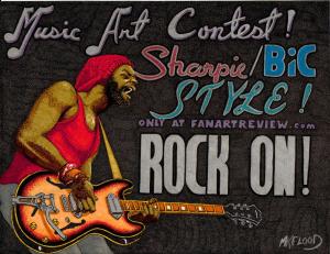
FREEEE Bird. You captured the guitarist perfectly. The guitar is cool looking. The singer belting it out is wonderful. But I have to ask why do you have FAR and other words on the art work. I like rock on though. Just a thought
reply by the author on 06-Aug-2013
|
FREEEE Bird. You captured the guitarist perfectly. The guitar is cool looking. The singer belting it out is wonderful. But I have to ask why do you have FAR and other words on the art work. I like rock on though. Just a thought
Comment Written 06-Aug-2013
reply by the author on 06-Aug-2013
-
i manage my portfolio at many websites..so when i post here i do a well at others..it does help promote the site.wink.. thanks for the great review!
Comment from FBI GUY
You are at it again. This is very cool. The facial expression screams Rock and Roll. The colors are very good and the red really pops the figure. Then you switch up and use orange which jumps off the page. Very Cool!
reply by the author on 06-Aug-2013
|
You are at it again. This is very cool. The facial expression screams Rock and Roll. The colors are very good and the red really pops the figure. Then you switch up and use orange which jumps off the page. Very Cool!
Comment Written 06-Aug-2013
reply by the author on 06-Aug-2013
-
(music) would rather to burn up in flames than fade awwwwaaaay..rock of ages...(music)..llol. thanks for the great review
Comment from Dick Lee Shia
I like his pearly white teeth! The initial impact is very strong!
The subject rocks!
The font is retro and stylish!
The whole ad layout and concept is very inviting and convincing.
What is that interesting feature on that guitar? First time to see that!
Thanks for sharing.
reply by the author on 06-Aug-2013
|
I like his pearly white teeth! The initial impact is very strong!
The subject rocks!
The font is retro and stylish!
The whole ad layout and concept is very inviting and convincing.
What is that interesting feature on that guitar? First time to see that!
Thanks for sharing.
Comment Written 06-Aug-2013
reply by the author on 06-Aug-2013
-
u not talking about the handle on left end? it extends notes and changes pitch.thanks for the great review
Comment from Doris1022
wonder if I can get one ready for the contest??
a nice poster for a contest and well drawn for a real good style of an illustrationist.
reply by the author on 06-Aug-2013
|
wonder if I can get one ready for the contest??
a nice poster for a contest and well drawn for a real good style of an illustrationist.
Comment Written 06-Aug-2013
reply by the author on 06-Aug-2013
-
sure u can!cya there and thanks for the great review!
Comment from trishgoody
Super cool MK . Everything you have done here is so clever , the concept, the words, the drawing, the colors, the composition and the message. Just brilliant! What a talent, its awesome!
This rating does not count towards story rating or author rank.
The highest and the lowest rating are not included in calculations.
reply by the author on 06-Aug-2013
  |
Super cool MK . Everything you have done here is so clever , the concept, the words, the drawing, the colors, the composition and the message. Just brilliant! What a talent, its awesome!
This rating does not count towards story rating or author rank.
The highest and the lowest rating are not included in calculations.
Comment Written 06-Aug-2013
reply by the author on 06-Aug-2013
-
i hope to see ya there trish if ya get the time. would love to have ur talent there if ya can. thanks for the great review
-
If time permits will give it a go. Am at the hospital for checkup today and that always gobbles up your day so could be tricky.. If hosp gift shop sells sharpie bics i'll get some and take my sketch pad and have a go!
-
Just looked at the contest details and saw that the closing date is not til the end of next month so time shouldn't be an issue, really glad to see that you have excluded the digitals , I really get put off the contests here because you always get slammed by the digital work except of course for the top few whose awesome work is without question.!
Comment from chris1000
An interesting Bob Marley take to promote a future contest. I like the bright colours of the artist in contrast to the graffiti style brick wall. You have certainly captured the atmosphere by adopting an angle similar to looking up at the stage. Very effective
reply by the author on 06-Aug-2013
|
An interesting Bob Marley take to promote a future contest. I like the bright colours of the artist in contrast to the graffiti style brick wall. You have certainly captured the atmosphere by adopting an angle similar to looking up at the stage. Very effective
Comment Written 06-Aug-2013
reply by the author on 06-Aug-2013
-
i hope to see ya there trish if ya get the time. would love to have ur talent there if ya can. thanks for the great review