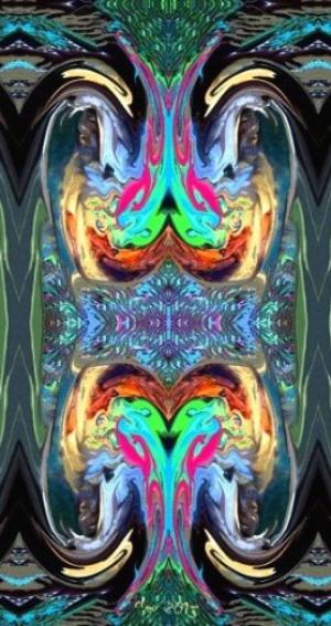
Angel and Demons
What do you see?24 total reviews
Comment from Jean A Cormier
This is an interesting entry because it is a total abstract, but my eye tries to find shapes and patterns which form something I recognize. I actually see what I will call 'demon' dogs (the four sandy colored area) and also faces (of angels?) beneath the white waves which look like wings. The darker brown shapes look like two headed snakes! I like the geometric patterns you present as a part of this piece and you give my eye neutral areas to rest! I like the colors and the felling of fluid movement! Great entry! Jean
reply by the author on 22-Nov-2013
  |
This is an interesting entry because it is a total abstract, but my eye tries to find shapes and patterns which form something I recognize. I actually see what I will call 'demon' dogs (the four sandy colored area) and also faces (of angels?) beneath the white waves which look like wings. The darker brown shapes look like two headed snakes! I like the geometric patterns you present as a part of this piece and you give my eye neutral areas to rest! I like the colors and the felling of fluid movement! Great entry! Jean
Comment Written 28-Oct-2013
reply by the author on 22-Nov-2013
-
Thank you Jean! I always appreciate your thought full reviews. I apologize again for a very late reply.
-
No problem ever even if you don't have time to reply it is fine!
Comment from MKFlood
cleo my imagination is not seeing angels or demons but i do see a very coloful and cool design. love the pattern and great job overall
reply by the author on 25-Nov-2013
|
cleo my imagination is not seeing angels or demons but i do see a very coloful and cool design. love the pattern and great job overall
Comment Written 28-Oct-2013
reply by the author on 25-Nov-2013
-
Thank you very much! I apologize for your my late reply.
Comment from Life is but a dream.
Cleo, the shot is soft, not sharp at all but perhaps you used the soften button to make it this way?
I like the balance within the abstraction the two mirrored images compliment each other and the greenish frame surrounding the "hot action" holds everything in for us.
I do not see angels and demons. I see a frog like alien creature surrounded by green forest hues looking at itself in a reflection and he is rather a narcissist! He is smiling at himself and is in love with himself.
I like the flow of this whole presentation, it looks like you spent a lot of time on it. The balance between vibrant colours and muted provides a good balance.
I find your image captivating, it is the kind of art that if hanging in a gallery I would pause and study....like I'm doing here :-)
reply by the author on 28-Oct-2013
|
Cleo, the shot is soft, not sharp at all but perhaps you used the soften button to make it this way?
I like the balance within the abstraction the two mirrored images compliment each other and the greenish frame surrounding the "hot action" holds everything in for us.
I do not see angels and demons. I see a frog like alien creature surrounded by green forest hues looking at itself in a reflection and he is rather a narcissist! He is smiling at himself and is in love with himself.
I like the flow of this whole presentation, it looks like you spent a lot of time on it. The balance between vibrant colours and muted provides a good balance.
I find your image captivating, it is the kind of art that if hanging in a gallery I would pause and study....like I'm doing here :-)
Comment Written 28-Oct-2013
reply by the author on 28-Oct-2013
-
No I didn't. That is not a photo at all. Its a digital painting, digitally enhanced [please read the description in the comments]. It is the xzxzxz re-sizing! The post is re-sized to 525 pixels horizontal as recommended by FAR. The post is OK, it dos not looks soft on my computer, but the small version which shows up beside the comment box is for not known reason blown way up which cause that it looks fuzzed because the recommended ppi [pixels per inch] for the re-sized version is way to low to allow a blow up like this. I bet if I turn it 90 degrees, it will be completely clear. The problem is, that it will not have the intended appearance if I do that. I try to re-size again. You have a friendly nature like my demons. The frog is one of the demons who carries more of them in its belly. At least I see them there. Thank you very much for your throughout and thoughtful review.
-
Hi Cleo,
I did read your artist's notes, I always do for everyone because I sometimes try to do what the artist has accomplished. I am also quite frustrated at the amount of fuzzy images going up and have written to TOM about this and have encouraged members to write and complain, it should not happen this is a photography and art site, the images ought to be crystal clear. As reviewers how can we give honest reviews if the uploads are dishonest....I just dunno anymore. 525 pixels is small and a lot of detail will go missing with that count. I would encourage you to write to Tom, perhaps if enough of us write the squeaky wheel will get the oil.
-
Sorry, I did not mean to say you did not read the notes. I just told you misunderstand because you wrote PHOTO. I have the notes changed a bit to make them better understandable.
I have it re-sized again using my paint program. [I should have done that in the first place.] It is a bit better, but still not clear. I will ask Tom, but I don't remember if I used metal paint in the original painting, because the original I have manipulated is 6 years old. Metal colors seam always cause problems when re-sized.
-
Hi, I just looked and yes, I think it is sharper. It would be a good idea to mention to Tom as you plan.
-
I will.
Right now either my Internet or the site seems to act up. Its very slow and I keep losing it.
Comment from genedigger
Very interesting and intreging. It looks to me like an angel diving into the depths of hell. Then mirrored from right to left and then flipped so there are now 4 angels. Very good use of color. Contrast is good. The hues really work together making the angel bright and the hellfire below. Great job!
This rating does not count towards story rating or author rank.
The highest and the lowest rating are not included in calculations.
reply by the author on 25-Nov-2013
|
Very interesting and intreging. It looks to me like an angel diving into the depths of hell. Then mirrored from right to left and then flipped so there are now 4 angels. Very good use of color. Contrast is good. The hues really work together making the angel bright and the hellfire below. Great job!
This rating does not count towards story rating or author rank.
The highest and the lowest rating are not included in calculations.
Comment Written 28-Oct-2013
reply by the author on 25-Nov-2013
-
Sorry for being late. I appreciate your review very much. Thank you!