What's Messier than Oil Paint?
Oil Paint Mess22 total reviews
Comment from skyborne
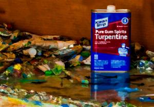
Nice warm colors complimenting the blue. The diagonal formed by the background shows an insightful angle here. Good job framing this in to maximize effectiveness.
reply by the author on 30-Nov-2014
  |
Nice warm colors complimenting the blue. The diagonal formed by the background shows an insightful angle here. Good job framing this in to maximize effectiveness.
Comment Written 28-Nov-2014
reply by the author on 30-Nov-2014
-
Thanks so very much!
Comment from fitzml
I like the way the background appears to have been painted in. The bright blue can is a wonderful focal point and kicks this piece up about five notches in terms of visual stimulation. Very nice!
|
I like the way the background appears to have been painted in. The bright blue can is a wonderful focal point and kicks this piece up about five notches in terms of visual stimulation. Very nice!
Comment Written 27-Nov-2014
Comment from farmgramma
This is very definitely a mess. Great placement of the turpentine. Cool reflection. Great colour and lighting. Super focus. Well done.
reply by the author on 27-Nov-2014
|
This is very definitely a mess. Great placement of the turpentine. Cool reflection. Great colour and lighting. Super focus. Well done.
Comment Written 27-Nov-2014
reply by the author on 27-Nov-2014
-
Thanks so much for enjoying!
Comment from Efffell
I do know a lot of things 'messier' than paint BUT this posting shows us a lot of things that go to make oil paintings beautiful...well done
reply by the author on 27-Nov-2014
|
I do know a lot of things 'messier' than paint BUT this posting shows us a lot of things that go to make oil paintings beautiful...well done
Comment Written 27-Nov-2014
reply by the author on 27-Nov-2014
-
I thought I would leave the messier rather than 'more messy' because it's messier! Glad you caught that. Thanks
Comment from seshadri_sreenivasan
Yes. I can relate to this. My painting area ( I do't have a studio) looks far worse than this. And a reason for my wife's constant grumbling!:) Good entry for the contest. The light, colour and the composition have worked well. Good effort!
reply by the author on 27-Nov-2014
|
Yes. I can relate to this. My painting area ( I do't have a studio) looks far worse than this. And a reason for my wife's constant grumbling!:) Good entry for the contest. The light, colour and the composition have worked well. Good effort!
Comment Written 27-Nov-2014
reply by the author on 27-Nov-2014
-
Thanks, Far worse?! That's impressive. But i think unavoidable!
Comment from Aesma
nice details the can of turpentine is very clear ^^. the colors are nice. i like the angle of the image.
reply by the author on 27-Nov-2014
|
nice details the can of turpentine is very clear ^^. the colors are nice. i like the angle of the image.
Comment Written 26-Nov-2014
reply by the author on 27-Nov-2014
-
Thank you very much.
Comment from albert65
great initial impact
excellent texture
sharp focus
good frame.
good job
excellent color
good depth
very nice presentation
good job
reply by the author on 27-Nov-2014
|
great initial impact
excellent texture
sharp focus
good frame.
good job
excellent color
good depth
very nice presentation
good job
Comment Written 26-Nov-2014
reply by the author on 27-Nov-2014
-
Thanks for enjoying.
Comment from jesuel
What a beautiful photo it looks like a painting the color is great the detail is great excellent depth and perspective and the effects are awesome fine work here
reply by the author on 26-Nov-2014
|
What a beautiful photo it looks like a painting the color is great the detail is great excellent depth and perspective and the effects are awesome fine work here
Comment Written 26-Nov-2014
reply by the author on 26-Nov-2014
-
Thanks so much Jesuel!
Comment from GaliaG
wow, if this is how it's studio looks, I wonder how it's works are
good colors, focus and contrast
thanks for sharing
reply by the author on 26-Nov-2014
|
wow, if this is how it's studio looks, I wonder how it's works are
good colors, focus and contrast
thanks for sharing
Comment Written 26-Nov-2014
reply by the author on 26-Nov-2014
-
Pretty abstract and messy too, Thanks
Comment from pattigirl
Excellent image and good choice for the contest. Well balanced composition, and colors are just excellent, presenting your message perfectly. Very nice work. Creative and original, and a pleasure to view.
reply by the author on 26-Nov-2014
|
Excellent image and good choice for the contest. Well balanced composition, and colors are just excellent, presenting your message perfectly. Very nice work. Creative and original, and a pleasure to view.
Comment Written 26-Nov-2014
reply by the author on 26-Nov-2014
-
Thanks so much for a wonderful review! Very much appreciated!! You're so sweet! Hearts!