The rescue (Book 2)
The cover artwork, Book 2 of the K-bridge series19 total reviews
Comment from Lolly Cardinal
Magnificently done. Colors are bright, detailed, centered and shadowed to proportion. Fantastic eye viewer.
Thanks for sharing.
Congratulations and Good Luck.
Have a nice day.
reply by the author on 06-May-2016
  |
Magnificently done. Colors are bright, detailed, centered and shadowed to proportion. Fantastic eye viewer.
Thanks for sharing.
Congratulations and Good Luck.
Have a nice day.
Comment Written 05-May-2016
reply by the author on 06-May-2016
-
Lolly Cardinal,
Your are welcome!
Thank you for your time and comments, I appreciate you taking the the time to look and then write me your thoughts on the cover. I hope you will visit the books on amazon and read the reviews by those that have read the books, and perhaps buy them as well.
Again, Thank you for your time.
Cheers!!
Lucien
-
My pleasure. You are most welcome!
Comment from seshadri_sreenivasan
Honestly speaking I have no clue about the contents of the book. I have missed the earlier one.Hence I am in position to comment on the suitablity of the cover design. But the presentation as such is interesting. Fine illustration. Thanks for sharing!
reply by the author on 05-May-2016
|
Honestly speaking I have no clue about the contents of the book. I have missed the earlier one.Hence I am in position to comment on the suitablity of the cover design. But the presentation as such is interesting. Fine illustration. Thanks for sharing!
Comment Written 05-May-2016
reply by the author on 05-May-2016
-
seshadri_sreenivasan,
you are welcome! thank you for your comments and that you think that the way it is laid out is interesting. The books can be purchased on Amazon, and reviews by readers are there as well.
Comment from Linda Bickston
Wow, this is fantastic. Your art has added so much to this book. So professional. The children are the most endearing. The birds are perfect, and the lettering is top notch.
reply by the author on 05-May-2016
 |
Wow, this is fantastic. Your art has added so much to this book. So professional. The children are the most endearing. The birds are perfect, and the lettering is top notch.
Comment Written 04-May-2016
reply by the author on 05-May-2016
-
Linda Bickston,
I am honored by the rating you gave the books cover.
Thank you for your comments and that you think that the art work is fantastic and you enjoyed the lay out and lettering used way it is laid out is interesting. The books can be purchased on Amazon, and reviews by readers are there as well.
Comment from Life is but a dream.
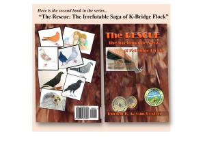
Lucien, I do not mind the colour palette and feel it does justice with a warm rather neutral background that looks like a close up of feathers.
The front and the back clash. I would not mind seeing the front drawing of bridge a bit larger with those stickers smaller. I don't know what those badges there say but it is like a personal signature that is too large, and seemingly in a state of bragging about how great something is because it is done by "So and So Artist" ...it is the art that sells and the name and accolades take a back seat, not the other way around.
As to the back, what in heaven's name is that eagle doing on a pigeon book? ....and those kids? Looks like you are mixing the wrong ingredients trying to come up with a good stew, and it is not working, not visually, not grabbing our attention, if anything you have spoiled the stew.
A little less would give you a lot more.
reply by the author on 05-May-2016
 |
Lucien, I do not mind the colour palette and feel it does justice with a warm rather neutral background that looks like a close up of feathers.
The front and the back clash. I would not mind seeing the front drawing of bridge a bit larger with those stickers smaller. I don't know what those badges there say but it is like a personal signature that is too large, and seemingly in a state of bragging about how great something is because it is done by "So and So Artist" ...it is the art that sells and the name and accolades take a back seat, not the other way around.
As to the back, what in heaven's name is that eagle doing on a pigeon book? ....and those kids? Looks like you are mixing the wrong ingredients trying to come up with a good stew, and it is not working, not visually, not grabbing our attention, if anything you have spoiled the stew.
A little less would give you a lot more.
Comment Written 04-May-2016
reply by the author on 05-May-2016
-
Life is but a Dream,
thank you for your candid comments, I disagree with them for the book lay out name etc. Is common with book I have seen and covers I have seen. Next the bird is a Hawk and is relevant to the story as is the crow, and the children. Never seen kids laying on a floor mixing anything, their body posture is all wrong for that action.
Thank you again for your time, reading the book(s) may help resolve some of you concerns about the rear cover lay out and images; it is available on Amazon, and reviews by readers are there as well.
-
Thank you for clearing that up.
-
you have to read the book to get the significance of the cover fully, yet I think your comments about title and artist name are off base, that aspect is balanced. On top of that, the hawk, that you think it being on the rear cover is unusual, that being said, I think you rating is a little to harsh based on your not knowing hawks are pigeons main predators, adversaries. might consider revising that rating. cheers... have a great day!
-
Lucien, a 4 star is appropriate for my evaluation of your book. Sorry, it's not a 5 ....didn't think you were a star chaser....thought you only chased dreams LOL! Cheers.
-
4 stars okay, but not 3.5, LOl!! star chaser, noooo... I want you to read the books... you are a pigeon lover, Right?
take care... I know you'd love the story, After all a persons perspective is their reality, and to change it you need to read the books... Cheers!!
Lucien
-
WHAT 3.5....that is too harsh. Will insure it's a 4....thank you for pointing that out.
Comment from pixs
Maybe you should start a contest for a book cover design.....and see how other people design then.
Your book cover is very hard to make out I'm sorry but it is what it is i'm starting to re -think the diamond committee.
This rating does not count towards story rating or author rank.
The highest and the lowest rating are not included in calculations.
reply by the author on 05-May-2016
|
Maybe you should start a contest for a book cover design.....and see how other people design then.
Your book cover is very hard to make out I'm sorry but it is what it is i'm starting to re -think the diamond committee.
This rating does not count towards story rating or author rank.
The highest and the lowest rating are not included in calculations.
Comment Written 04-May-2016
reply by the author on 05-May-2016
-
pixs,
not sure what you are saying, the books presented to the Diamond Committee are nothing like this one, they are picture books that are suppose to tell a story. Not sure what makes it difficult make out or to read?
Thank you for your time, it is appreciated, however, a more comprehensive review would have helped me understand your rating. By the way the book(s) is available on Amazon, and reviews by readers are there as well.
Comment from marcoartist
I really like this cover. The front is eye catching with a picture and most of the print is easy to read.
The back cover with your drawings is very interesting, something one doesn't usually see.
It will help the reader have a good idea about the contents of the book.
Great job!
reply by the author on 05-May-2016
|
I really like this cover. The front is eye catching with a picture and most of the print is easy to read.
The back cover with your drawings is very interesting, something one doesn't usually see.
It will help the reader have a good idea about the contents of the book.
Great job!
Comment Written 04-May-2016
reply by the author on 05-May-2016
-
Marcoartist,
I am honored by the rating you gave the books cover.
Thank you for your comments and that you think that the art work are eye catching and you enjoyed the lay out and lettering used way it is laid out is interesting. The book(s) can be purchased on Amazon, and reviews by readers are there as well.
Comment from Regina E.H-Ariel
Well as an author and cover designer I feel the following:
first of all the front side is beautiful, harmonious in color range and well composed
The idea in relation of the experiences of the first book to place some works out on the back cover is excellent
the arrangement to me is kind like distracting and does not allow to focus on the picture, some kind like flying around without the ability to catch the beautiful items
to change that - I would place the kids in the center and straight as main focus point - than I would place all the beautiful birds around them and take care that the birds are in position to look at the center - one of the birds second up left is looking out of the book confusing the eye as it takes the focus away - I also would place the eagle as biggest bird up left and the orange one below in third position - the 2 pigeons would have to be at the right side so the one is looking t the center with the kids and the other one to the front cover
I would not go further with the drawings as the sales code using the left space beside it for a short author description and artist - just try it out -I can literally feel the harmony that comes in grabbing interest to look closed - this arrangement I s kind like wild loll
hope I could be of some help - you did what I still want to do with my art -loll - all the best of success
reply by the author on 05-May-2016
|
Well as an author and cover designer I feel the following:
first of all the front side is beautiful, harmonious in color range and well composed
The idea in relation of the experiences of the first book to place some works out on the back cover is excellent
the arrangement to me is kind like distracting and does not allow to focus on the picture, some kind like flying around without the ability to catch the beautiful items
to change that - I would place the kids in the center and straight as main focus point - than I would place all the beautiful birds around them and take care that the birds are in position to look at the center - one of the birds second up left is looking out of the book confusing the eye as it takes the focus away - I also would place the eagle as biggest bird up left and the orange one below in third position - the 2 pigeons would have to be at the right side so the one is looking t the center with the kids and the other one to the front cover
I would not go further with the drawings as the sales code using the left space beside it for a short author description and artist - just try it out -I can literally feel the harmony that comes in grabbing interest to look closed - this arrangement I s kind like wild loll
hope I could be of some help - you did what I still want to do with my art -loll - all the best of success
Comment Written 04-May-2016
reply by the author on 05-May-2016
-
Regina E.H-Ariel,
Thank you for your time, and comprehensive review of the book and the rear cover lay out, (a note of interest, the bar code space is decided & dictated by the publisher.)
Reading the book(s) may help resolve some of you concerns about the rear cover lay out and images; it is available on Amazon, and reviews by readers are there as well.
( The reason for the layout, one of the birds in the center drawing is killed, during the telling of the story. The one looking off to the left is meant to symbolize, looking into the unknown.)
-
That makes it understandable - I did not know that it is already published I though you are in creation process - I will have a look at Amazon xoxoxo
Comment from cslove
I enjoy the pictures of the birds on the back and if you wish to interest people in this book, the birds should be on the front. The neutral brown tone should maybe be changed to a clean looking white or another lighter neutral color. The cover does not make me want to read it, and should somehow be changed to look more contemporary. The picture of the birds and the bridge, however do make me want to see what it is about.
reply by the author on 28-Jan-2016
|
I enjoy the pictures of the birds on the back and if you wish to interest people in this book, the birds should be on the front. The neutral brown tone should maybe be changed to a clean looking white or another lighter neutral color. The cover does not make me want to read it, and should somehow be changed to look more contemporary. The picture of the birds and the bridge, however do make me want to see what it is about.
Comment Written 25-Jan-2016
reply by the author on 28-Jan-2016
-
cslove,
you are welcome. Go to Amazon and read about the K-bridge books, and reviews posted there.
Thank you, for your time and your review of my artwork, it is appreciated by me.
Comment from iPhone7
Overall a very nice book cover. The front cover seems a bit empty with the gap between the emblems and the bridge. The back cover is nicely patterned with the off-set drawings of the birds. It looks like an interesting book. Thank you for sharing.
reply by the author on 28-Jan-2016
  |
Overall a very nice book cover. The front cover seems a bit empty with the gap between the emblems and the bridge. The back cover is nicely patterned with the off-set drawings of the birds. It looks like an interesting book. Thank you for sharing.
Comment Written 25-Jan-2016
reply by the author on 28-Jan-2016
-
Stephen D. Parella,
you are welcome. Go to Amazon and read about the K-bridge books, and reviews posted there.
Thank you, for your time and your review of my artwork, it is appreciated by me.
Comment from RachelS135
A gorgeous book cover design full of variety and interesting images! Great placement of the title, author name, and barcode although the collection of bird pictures on the back cover could be shifted somewhat to the bottom right to reduce the large space in that area (or reposition the image of the black bird to fill in the bottom right area).
On the cover, the middle negative space seems a bit dominating and empty; possibly moving the circular emblems upwards would create more balance in spacial management.
Overall, a delightful design to view with a variety of colors, patterns, and textures! Thanks for sharing and I would definitely love to read more about the book!
reply by the author on 28-Jan-2016
|
A gorgeous book cover design full of variety and interesting images! Great placement of the title, author name, and barcode although the collection of bird pictures on the back cover could be shifted somewhat to the bottom right to reduce the large space in that area (or reposition the image of the black bird to fill in the bottom right area).
On the cover, the middle negative space seems a bit dominating and empty; possibly moving the circular emblems upwards would create more balance in spacial management.
Overall, a delightful design to view with a variety of colors, patterns, and textures! Thanks for sharing and I would definitely love to read more about the book!
Comment Written 25-Jan-2016
reply by the author on 28-Jan-2016
-
RachelS135,
you are welcome. Go to Amazon and read about the K-bridge books, and reviews posted there.
Thank you, for your time and your review of my artwork, it is appreciated by me.