The rescue (Book 2)
The cover artwork, Book 2 of the K-bridge series19 total reviews
Comment from GaliaG
Nice technique and creativity
good focus, colors and presentation
nice initial impact and composition
thanks for sharing
reply by the author on 25-Jan-2016
    |
Nice technique and creativity
good focus, colors and presentation
nice initial impact and composition
thanks for sharing
Comment Written 25-Jan-2016
reply by the author on 25-Jan-2016
-
GaliaG,
Thank you, for your time and your review of my artwork, it is appreciated by me. so why the mark down, based on the rating you gave you think it could be improved? I would very much like to know how?
Thanks,
Lucien
Comment from Terri Fors
Yes I think this is a very handsome book cover and as for me I would like to read the series. Where do I find this book you have written and illustrated?
reply by the author on 24-Jan-2016
|
Yes I think this is a very handsome book cover and as for me I would like to read the series. Where do I find this book you have written and illustrated?
Comment Written 24-Jan-2016
reply by the author on 24-Jan-2016
-
Terri Fors,
you can order the books from Amazon or createspace:
#1 "K-Bridge: A Story About Discovery" and #2 "The Rescue: The Irrefutable Saga of K-Bridge Flock".
If you go Amazon, there are reader reviews there on the first book.
your support would really be appreciated.
Thank you, for your time and your review of my artwork, it is appreciated by me.
Cheers,
Lucien
Comment from AndreThreeThou
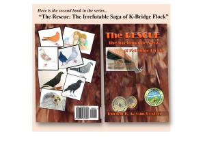
The pictures of photos of birds in the back have a great design layout, making them slightly irregular to add shape. I also like how the entire cover has a tree bark background. However, I had to give it four and a half stars because it seems like the font and the background clash with each other. Both have a lot of contrast going on, and with all this noise it's hard to grasp all those letters. Also, since they're in the same color family, this even further accentuates the need to lower the contrast in the background to bring out the letters of the title. Otherwise everything else looks great, the graphics and sketches' layout is awesome. I would definitely try to get the title to stand out more, by toning down the contrast of the bark and giving the font more shadow.
reply by the author on 24-Jan-2016
|
The pictures of photos of birds in the back have a great design layout, making them slightly irregular to add shape. I also like how the entire cover has a tree bark background. However, I had to give it four and a half stars because it seems like the font and the background clash with each other. Both have a lot of contrast going on, and with all this noise it's hard to grasp all those letters. Also, since they're in the same color family, this even further accentuates the need to lower the contrast in the background to bring out the letters of the title. Otherwise everything else looks great, the graphics and sketches' layout is awesome. I would definitely try to get the title to stand out more, by toning down the contrast of the bark and giving the font more shadow.
Comment Written 24-Jan-2016
reply by the author on 24-Jan-2016
-
Andre Three Thou,
Thank you, for your time and your review of my artwork, it is appreciated by me.
Cheers
Lucien
Comment from a.samathasena
What a great nice gorgeous art.Colors are gorgeous and great.Beautiful artistic book cover.Lovely birds and details,letters and words,another artistic designs and items,brown b/g and all are gorgeous great and make a nice scene.Light and color balance are great.I like this talent work.Creativity color and all are excellent.Great job.Well Done.Thanks.
reply by the author on 24-Jan-2016
|
What a great nice gorgeous art.Colors are gorgeous and great.Beautiful artistic book cover.Lovely birds and details,letters and words,another artistic designs and items,brown b/g and all are gorgeous great and make a nice scene.Light and color balance are great.I like this talent work.Creativity color and all are excellent.Great job.Well Done.Thanks.
Comment Written 23-Jan-2016
reply by the author on 24-Jan-2016
-
a.samathasena,
you are welcome.
Thank you, for your time and your review of my artwork, it is appreciated by me.
I am glad the color scheme, grabbed your attention as was intended.
have a great day, Cheers!!
Lucien
-
Thanks for your kind, Lucien.Have a great day.
Comment from dalebraatz
What a wonderful cover. Very good colors and good details and texture, Very nicely laid out. Thank you for sharing. Dale
reply by the author on 24-Jan-2016
|
What a wonderful cover. Very good colors and good details and texture, Very nicely laid out. Thank you for sharing. Dale
Comment Written 23-Jan-2016
reply by the author on 24-Jan-2016
-
dalebraatz,
you are welcome,
Thank you, for your time and your review of my artwork, it is appreciated by me.
Pleased it worked for you and drew you into look further at the artwork.
Cheers!!
Lucien
Comment from Dick Lee Shia
Impressive layout.
Nice color scheme in contrast with the bright bird frames.
On second thought, I would prefer a more vibrant tone if it should lend a hopeful note to "The RESCUE" title...
The informal arrangement is playful.
Creative concept.
Innovative approach.
Imaginative presentation.
I find the two logos quite "invasive" near your name...
Can we place them higher than the colored one or they can switch places according to which is more stellar in the "billing"?
Thanks for sharing...
reply by the author on 24-Jan-2016
|
Impressive layout.
Nice color scheme in contrast with the bright bird frames.
On second thought, I would prefer a more vibrant tone if it should lend a hopeful note to "The RESCUE" title...
The informal arrangement is playful.
Creative concept.
Innovative approach.
Imaginative presentation.
I find the two logos quite "invasive" near your name...
Can we place them higher than the colored one or they can switch places according to which is more stellar in the "billing"?
Thanks for sharing...
Comment Written 23-Jan-2016
reply by the author on 24-Jan-2016
-
Dick Lee Shia,
you are welcome, and thank you, for your time and your review of my artwork, it is appreciated by me.
The patches are a comment on gaming ranches as are several sections of the book. The book and what it is trying to say in graphic design, the artwork was more important to me then my name, does that make sense?
Have a great day,
cheers!!
Lucien
-
Okay, thanks!
Comment from mamamary
I like the shadow of the bird on the front cover and the brown hues that remind me of trees. For me, I don't like the round disks or badges on the front. I don't care for the pictures of the birds on the back. It looks too busy. Maybe too many birds on the back. The whiteness takes away from the beautiful browns as well. I feel like I'm picking it apart, but you asked. I feel less is more.
reply by the author on 24-Jan-2016
|
I like the shadow of the bird on the front cover and the brown hues that remind me of trees. For me, I don't like the round disks or badges on the front. I don't care for the pictures of the birds on the back. It looks too busy. Maybe too many birds on the back. The whiteness takes away from the beautiful browns as well. I feel like I'm picking it apart, but you asked. I feel less is more.
Comment Written 23-Jan-2016
reply by the author on 24-Jan-2016
-
mamamary,
Thank you, for your time and your review of my artwork, it is appreciated by me.
Yes in some cases less is more, in this case I wanted to show some of the characters, it has to do with the cost difference between adding color to the inside. Keep in mind on the shelf you would not see it as presented here each the page front and back would be seen independently.
Pleased you like the basic color scheme.
Cheers!!
Lucien
-
I'm glad you didn't take offense at my review. You are the expert, for sure. Not me. Just an opinion. May you have a blessed day.
Comment from Jack Moore
I don't know that much about this but to me it really sends a message about birds. I think that it deserves a thumbs up. JackJr.
reply by the author on 24-Jan-2016
|
I don't know that much about this but to me it really sends a message about birds. I think that it deserves a thumbs up. JackJr.
Comment Written 23-Jan-2016
reply by the author on 24-Jan-2016
-
Jack Moore,
Thank you, for your time and your review of my artwork, it is appreciated by me.
In this case you do not need to know much about art, just if the design art work on the front and back covers makes you look and makes you want to read the book.
Cheers!!
Lucien
Comment from MKFlood
Professionally done penmaster. The set up is excellent. The colorfully illustration of birds is great. The creation is balanced and very eye appealing to the viewer. Creative and awesome work overall
This rating does not count towards story rating or author rank.
The highest and the lowest rating are not included in calculations.
reply by the author on 24-Jan-2016
|
Professionally done penmaster. The set up is excellent. The colorfully illustration of birds is great. The creation is balanced and very eye appealing to the viewer. Creative and awesome work overall
This rating does not count towards story rating or author rank.
The highest and the lowest rating are not included in calculations.
Comment Written 23-Jan-2016
reply by the author on 24-Jan-2016
-
MKFlood,
Thank you, for your time and your review of my artwork.
Your support o me and my work it is appreciated by me.
Take care,
Lucien