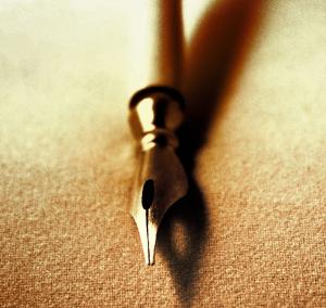
A Fountain Pen Nib
The writing tip of a fountain pen is the Nib19 total reviews
Comment from Steve Hanulec
Very Nice Meg, did you find this pen in the closet? I haven't seen one forever or used one for even longer! They were tricky to use...A nice capture of the business end resting on a fiber of some sort. Sepia tone is like chocolate syrup, it makes everything look good! A nice touch...Thanks,...Steve H.
This rating does not count towards story rating or author rank.
The highest and the lowest rating are not included in calculations.
reply by the author on 03-Feb-2016
    |
Very Nice Meg, did you find this pen in the closet? I haven't seen one forever or used one for even longer! They were tricky to use...A nice capture of the business end resting on a fiber of some sort. Sepia tone is like chocolate syrup, it makes everything look good! A nice touch...Thanks,...Steve H.
This rating does not count towards story rating or author rank.
The highest and the lowest rating are not included in calculations.
Comment Written 03-Feb-2016
reply by the author on 03-Feb-2016
-
Thank you for the great review and generous rating :)
Comment from rasmine
The way the texture of the rug or table the pen is on gives it depth. It is a little blurry, but I also like the effect of that. My eye is drawn to the nib. Thank you for sharing this.
reply by the author on 03-Feb-2016
|
The way the texture of the rug or table the pen is on gives it depth. It is a little blurry, but I also like the effect of that. My eye is drawn to the nib. Thank you for sharing this.
Comment Written 03-Feb-2016
reply by the author on 03-Feb-2016
-
Thank you. What do you suggest I do to the photo to improve it? A 4.5 indicates that it needs improvement in some technical aspect. If it is the difference in the focus that is not a reason to deduct points because macro photography will result in a narrow depth of field.
-
I'm sorry I didn't know that. I don't see how you could improve it. I learned though thank you and I'm sorry. Want me to fix this and make it 5 instead I don't know how to do that.
-
I see that you are new to FAR and maybe don't understand all the more advanced techniques in photography. Read the authors notes when you review because they may have used special software enhance the photo. In this photo for example I was able to change it from a colored photo to a sepia or brownish tint to give it the look of an old photograph. If you click on this photo again as if to review your old comments will appear and the box for a score will ask you to choose a score. once you do that just submit as usual and your score will be updated. Just a tip for reviewing. If the photo is good and needs no improvement a 5 is pretty much the score given. If you think it needs improvement you give less than a 5 and give your suggestions for improving the photo. If you have any questions please don't hesitate to message me. We all started at the bottom and helped each other to improve our work. I have learned a lot from the members of FAR. I didn't mean to scare you I was just trying to explain about how the scoring is done. Mary Eileen :)
-
Thank you for taking your time in writing all that. I changed the rating. I only do photo editing using computer software so I don't know a lot of techniques. Thank you :)
-
You are very welcome. If you have questions don't hesitate to message me. I will be looking forward to seeing your work in the future. :)
Comment from Paul G.
Now that is something I did not know. I always just called it the point. I actually used fountain pens for a. Of time. However, they always ruin my shirts. So I went the ball points. I have never used a feather quill. Don't think I want to. Very good photograph and a very nice history lesson. Thank you for sharing both.
reply by the author on 03-Feb-2016
|
Now that is something I did not know. I always just called it the point. I actually used fountain pens for a. Of time. However, they always ruin my shirts. So I went the ball points. I have never used a feather quill. Don't think I want to. Very good photograph and a very nice history lesson. Thank you for sharing both.
Comment Written 03-Feb-2016
reply by the author on 03-Feb-2016
-
Thank you Paul. I am glad you liked the photo and the lesson. :)
Comment from Dick Lee Shia
Superb macro.
Subtle illumination.
Diffused or selective focusing.
An artistic rendition. Monochromatic colors. Excellent details & features. Impressive lighting & textures. Thanks for sharing...
reply by the author on 03-Feb-2016
|
Superb macro.
Subtle illumination.
Diffused or selective focusing.
An artistic rendition. Monochromatic colors. Excellent details & features. Impressive lighting & textures. Thanks for sharing...
Comment Written 03-Feb-2016
reply by the author on 03-Feb-2016
-
Thank you :)
Comment from avmurray
What I like especially about this photo is the simplicity, and the selective focus. I also think this photo looks very good in sepia.
The focus is also nice and sharp showing really clear and well defined details on the tip of the pen, and also the shadow is well defined and adds interest to the photo. I do however find it a bit distracting with the almost blown out upper left corner. Perhaps a darker vignette would therefore have worked better.
When it comes to the composition I think the pen is too centered. Still it would not be a good idea to crop more on either side. What I think could have helped was if the pen had been placed in a more diagonal position. I think your idea was a good one and very creative, but I also think it is a few things that could have worked better.
This rating does not count towards story rating or author rank.
The highest and the lowest rating are not included in calculations.
reply by the author on 02-Feb-2016
|
What I like especially about this photo is the simplicity, and the selective focus. I also think this photo looks very good in sepia.
The focus is also nice and sharp showing really clear and well defined details on the tip of the pen, and also the shadow is well defined and adds interest to the photo. I do however find it a bit distracting with the almost blown out upper left corner. Perhaps a darker vignette would therefore have worked better.
When it comes to the composition I think the pen is too centered. Still it would not be a good idea to crop more on either side. What I think could have helped was if the pen had been placed in a more diagonal position. I think your idea was a good one and very creative, but I also think it is a few things that could have worked better.
This rating does not count towards story rating or author rank.
The highest and the lowest rating are not included in calculations.
Comment Written 02-Feb-2016
reply by the author on 02-Feb-2016
-
Thank you Annie for the great tips
-
You are more than welcome.
Comment from AndreThreeThou
Excellent photo in an artistic way. A very simple shot of a small item rendered very well, especially with the brown tint to create a mood and take away any predictability. At first glance I had to guess what this was. Great balance of sharpness up front with the blurred shadow. I also like how the grainy texture creates a base for the bottom of the photo, and light top gives it an ethereal appeal, as if the pen disappears into the background.
reply by the author on 02-Feb-2016
|
Excellent photo in an artistic way. A very simple shot of a small item rendered very well, especially with the brown tint to create a mood and take away any predictability. At first glance I had to guess what this was. Great balance of sharpness up front with the blurred shadow. I also like how the grainy texture creates a base for the bottom of the photo, and light top gives it an ethereal appeal, as if the pen disappears into the background.
Comment Written 02-Feb-2016
reply by the author on 02-Feb-2016
-
Thank you Andre. I am doing a lot of experimenting with macro shots and trying to figure out post processing methods to bring them out so they are interesting.
Comment from Bernadette Ballarin
This is one very cool picture. I love how the texture is visible and how clear and crisp the actual nib is. Great detail and lovely shadows and contrasts. Very nice overall concept. Thanks for sharing it.
reply by the author on 02-Feb-2016
|
This is one very cool picture. I love how the texture is visible and how clear and crisp the actual nib is. Great detail and lovely shadows and contrasts. Very nice overall concept. Thanks for sharing it.
Comment Written 02-Feb-2016
reply by the author on 02-Feb-2016
-
Thank you :)
Comment from foxangie123
I love the mystique you have captured here. I started crying because my granny wrote Calligraphy when I was young and I miss her. Thank you for this and taking me back to a stunning woman that was the only one who Never treated me as the adopted. Sending you big hugs...
reply by the author on 02-Feb-2016
|
I love the mystique you have captured here. I started crying because my granny wrote Calligraphy when I was young and I miss her. Thank you for this and taking me back to a stunning woman that was the only one who Never treated me as the adopted. Sending you big hugs...
Comment Written 02-Feb-2016
reply by the author on 02-Feb-2016
-
Ahhh Thank you. I am glad it brought back sweet memories of someone you loved very much.
-
Thank you it was a wonderful memory and piece.
Comment from Joelgraphuchin
Initial impact: An enjoyable close up shot.
Creativity of presentation: Depth of field is well executed. Shadow creates dimension
Color Harmony: eye-pleasing
Center of Interest: the image is sharp and clean.
Technical Excellence: good framing
Well done and thanks for sharing.
reply by the author on 02-Feb-2016
|
Initial impact: An enjoyable close up shot.
Creativity of presentation: Depth of field is well executed. Shadow creates dimension
Color Harmony: eye-pleasing
Center of Interest: the image is sharp and clean.
Technical Excellence: good framing
Well done and thanks for sharing.
Comment Written 02-Feb-2016
reply by the author on 02-Feb-2016
-
Thank you Joel :)
Comment from seshadri_sreenivasan
Interesting subject. Interesting shot! Minimalist approach! You have framed it well. The light, colour and the composition have worked well. Good effort!
reply by the author on 02-Feb-2016
|
Interesting subject. Interesting shot! Minimalist approach! You have framed it well. The light, colour and the composition have worked well. Good effort!
Comment Written 02-Feb-2016
reply by the author on 02-Feb-2016
-
Thank you