Time Traveler
Wrist watch11 total reviews
Comment from Linda Bickston
"Time Travel" is a catchy title for a brilliant idea. I especially love the deep blue color of space. The highlights add so much. Great work.
reply by the author on 04-May-2016
  |
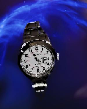
"Time Travel" is a catchy title for a brilliant idea. I especially love the deep blue color of space. The highlights add so much. Great work.
Comment Written 04-May-2016
reply by the author on 04-May-2016
-
Thank you :)
Comment from rasmine
I think your fun turned out great! I love the background. It looks like space but also like leaves or branches on a plant , but whatever it is its a good photo!
reply by the author on 04-May-2016
|
I think your fun turned out great! I love the background. It looks like space but also like leaves or branches on a plant , but whatever it is its a good photo!
Comment Written 04-May-2016
reply by the author on 04-May-2016
-
Thank you :)
Comment from iPhone7
What a great idea. The watch reminds of the Tardis that Dr. Who cruises around the universe in. Unique idea with a perfect background for the effect. So I guess instead of cruising around in a Tardis he now cruises around in a Timex. Ugh... Oh well, I'll keep my day job Mary Eileen ~ Steve
reply by the author on 04-May-2016
|
What a great idea. The watch reminds of the Tardis that Dr. Who cruises around the universe in. Unique idea with a perfect background for the effect. So I guess instead of cruising around in a Tardis he now cruises around in a Timex. Ugh... Oh well, I'll keep my day job Mary Eileen ~ Steve
Comment Written 04-May-2016
reply by the author on 04-May-2016
-
Thank you. Lol. I never watched Dr Who. Now Star Trek...
Comment from Regina E.H-Ariel
Yes yes yes Loll you turned it - fantastic title for this composition, the color range is excellent and the deeper sense comes out , time and space in one as they belong together like Yin and Yang - I love the way you worked the shades in the e blue giving it the perfect 3 D effect - excellent idea - great focus contrast and lighting on the watch, it is clear and hyper sharp in details and build the perfect balance to the smoothly soft macro blurred BG , well done, thanks for sharing
reply by the author on 04-May-2016
|
Yes yes yes Loll you turned it - fantastic title for this composition, the color range is excellent and the deeper sense comes out , time and space in one as they belong together like Yin and Yang - I love the way you worked the shades in the e blue giving it the perfect 3 D effect - excellent idea - great focus contrast and lighting on the watch, it is clear and hyper sharp in details and build the perfect balance to the smoothly soft macro blurred BG , well done, thanks for sharing
Comment Written 04-May-2016
reply by the author on 04-May-2016
-
Thank you..lol..I turned it and removed the flowers too. I gave it a 90 degree turn and I like it much better. Thanks for the tip. Mary Eileen
Comment from seshadri_sreenivasan
Interesting. Actually there is no concept of time in space. This is innovative The white wristwatch shows off well against the blue space! Excellent sharpness. overall a fine effort! and skillfully done!
reply by the author on 04-May-2016
|
Interesting. Actually there is no concept of time in space. This is innovative The white wristwatch shows off well against the blue space! Excellent sharpness. overall a fine effort! and skillfully done!
Comment Written 03-May-2016
reply by the author on 04-May-2016
-
Lol. Thank you Sesha.
Comment from a.samathasena
What a great nice wonderful lovely mixed media shot.Beautiful fantasy scene.Time Traveler and details,time and other all signs,front face,belt and all are gorgeous great and make a nice scene.Blue B/g,light and shadows are gorgeous great and make a nice scene.I like this lovely work.Focus color and all are excellent.Great job.Well Done.Thanks.
reply by the author on 03-May-2016
|
What a great nice wonderful lovely mixed media shot.Beautiful fantasy scene.Time Traveler and details,time and other all signs,front face,belt and all are gorgeous great and make a nice scene.Blue B/g,light and shadows are gorgeous great and make a nice scene.I like this lovely work.Focus color and all are excellent.Great job.Well Done.Thanks.
Comment Written 03-May-2016
reply by the author on 03-May-2016
-
Thank you
Comment from Life is but a dream.
You are really having a lot of fun with those backgrounds whether they are on your fruits or watches they are well done Meg. Did you use a Topaz Filter on this or your own made up filter?
Yes, this does have a "lost in space" feel and because it is on a slight diagonal it adds to movement. I like the "gradient" the darker hue at bottom to lighter blue at top because it feels like the watch is floating and will rise. The colour of blue adds an otherworldly feel, cool, quiet, mysterious. Colour always affects us carbon based bi-peds....
I think a horizontal format would have worked better because it would have given the watch more space to travel through and visually it would have given a broader story....just a suggestion.
Like the fun aspect to this shot and yes, I have noticed the stars in the distance!
reply by the author on 03-May-2016
|
You are really having a lot of fun with those backgrounds whether they are on your fruits or watches they are well done Meg. Did you use a Topaz Filter on this or your own made up filter?
Yes, this does have a "lost in space" feel and because it is on a slight diagonal it adds to movement. I like the "gradient" the darker hue at bottom to lighter blue at top because it feels like the watch is floating and will rise. The colour of blue adds an otherworldly feel, cool, quiet, mysterious. Colour always affects us carbon based bi-peds....
I think a horizontal format would have worked better because it would have given the watch more space to travel through and visually it would have given a broader story....just a suggestion.
Like the fun aspect to this shot and yes, I have noticed the stars in the distance!
Comment Written 03-May-2016
reply by the author on 03-May-2016
-
Thank you. Yes this background is from Topaz Texture effects.
Comment from michiganmike
Did you by any chance intend to post this rotated 90 degrees clockwise? A very nice image although I don't know about those flowers.
reply by the author on 03-May-2016
|
Did you by any chance intend to post this rotated 90 degrees clockwise? A very nice image although I don't know about those flowers.
Comment Written 03-May-2016
reply by the author on 03-May-2016
-
That is how I photographed it. However, I may have to edit it since you are the second person to be confused by the rotation. Also, removing the flowers would be no problem either. I may disable this until I can revise it. Thank you.
Comment from Joelgraphuchin
Sweet advertisement of Seiko...:o)
Love your choice of blue background. It well serves the wrist watch. Focus on the watch is great. Every number and letter is noticeable.
Well done and thanks for sharing.
reply by the author on 03-May-2016
|
Sweet advertisement of Seiko...:o)
Love your choice of blue background. It well serves the wrist watch. Focus on the watch is great. Every number and letter is noticeable.
Well done and thanks for sharing.
Comment Written 03-May-2016
reply by the author on 03-May-2016
-
Thank you Joel. Do you think it should be rotated 90 degrees clockwise?
Comment from Lolly Cardinal
Bright idea and awesome turn-out! Colors are very nice. Detailed, shadowed and centered properly.
Awesome eye viewer.
Thanks for showing.
Congratulations and good luck!
Have a wonderful day.
This rating does not count towards story rating or author rank.
The highest and the lowest rating are not included in calculations.
reply by the author on 03-May-2016
|
Bright idea and awesome turn-out! Colors are very nice. Detailed, shadowed and centered properly.
Awesome eye viewer.
Thanks for showing.
Congratulations and good luck!
Have a wonderful day.
This rating does not count towards story rating or author rank.
The highest and the lowest rating are not included in calculations.
Comment Written 03-May-2016
reply by the author on 03-May-2016
-
Thank you
-
My pleasure, You are always welcome.