WWW.campixphoto.com
website6 total reviews
Comment from MKFlood
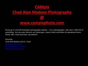
you did well on the title color..you know yellow or a bright orange would also bright up to grab the viewers eye. however red is fine. from title to message to signature is balanced and eye interesting to the viewer. now as another suggestion you can put some sorta avatar (logo sorta) for the message you want to relate to the viewer. still creative and good job overall
reply by the author on 25-Aug-2016
  |
you did well on the title color..you know yellow or a bright orange would also bright up to grab the viewers eye. however red is fine. from title to message to signature is balanced and eye interesting to the viewer. now as another suggestion you can put some sorta avatar (logo sorta) for the message you want to relate to the viewer. still creative and good job overall
Comment Written 25-Aug-2016
reply by the author on 25-Aug-2016
-
Thanks for the suggestions; I'll try yellow next time. A few comments I received was good but the blue is hard on the eyes. Should I do it in white, or try the yellow? Do you mean a CAMpix logo?
-
Yep and yep
Comment from a.samathasena
What a great nice wonderful art.Beautiful nice work.I saw your great photography. The red white letters and dark b/g are gorgeous great and make a nice scene.I like this talent work.Creativity color are excellent.Great job.Well Done.Thanks.
reply by the author on 25-Aug-2016
|
What a great nice wonderful art.Beautiful nice work.I saw your great photography. The red white letters and dark b/g are gorgeous great and make a nice scene.I like this talent work.Creativity color are excellent.Great job.Well Done.Thanks.
Comment Written 25-Aug-2016
reply by the author on 25-Aug-2016
-
Thanks and thanks for viewing my website. I keep updating it so please go back occasionally.
Comment from Alveria
Hi Chaxl, I indeed visited your website and enjoyed looking at all your photos. Your photos are very nice. I really liked all of them. Beautiful landscapes, really nice shots of animals, really good compositions. Creative and well done. I will visit your website again to see what you add new. ;) ~Alveria
reply by the author on 25-Aug-2016
|
Hi Chaxl, I indeed visited your website and enjoyed looking at all your photos. Your photos are very nice. I really liked all of them. Beautiful landscapes, really nice shots of animals, really good compositions. Creative and well done. I will visit your website again to see what you add new. ;) ~Alveria
Comment Written 24-Aug-2016
reply by the author on 25-Aug-2016
-
Thanks so much.
-
Thanks so much.
Comment from Dick Lee Shia
Impressive layout.
Creative concept.
Innovative approach. Imaginative presentation.
Enigmatic color combination.
Inspiring image.
Encouraging advocacy.
Thanks for sharing...
reply by the author on 25-Aug-2016
|
Impressive layout.
Creative concept.
Innovative approach. Imaginative presentation.
Enigmatic color combination.
Inspiring image.
Encouraging advocacy.
Thanks for sharing...
Comment Written 24-Aug-2016
reply by the author on 25-Aug-2016
-
Thanks.
-
Thanks.
Comment from stacey brooks 1969
A well presentation of your art work in the designing of your web site i love the red on black stands out very nicely the blue print was kinda hard to read for me but over all great job thank you for sharing
reply by the author on 24-Aug-2016
|
A well presentation of your art work in the designing of your web site i love the red on black stands out very nicely the blue print was kinda hard to read for me but over all great job thank you for sharing
Comment Written 23-Aug-2016
reply by the author on 24-Aug-2016
-
Thanks for your nice words. Do you suggest the blue text be changed to red or white?
-
I would change it to red stands out nicely
-
Ok thanks
Comment from dalebraatz
very nice advertising sign. very informative , nice colors you and good wording. A pleasure to look at. Thank you for sharing. dale
reply by the author on 24-Aug-2016
|
very nice advertising sign. very informative , nice colors you and good wording. A pleasure to look at. Thank you for sharing. dale
Comment Written 23-Aug-2016
reply by the author on 24-Aug-2016
-
Thanks a lot.