Loophole logo revised
for screenplay writer19 total reviews
Comment from Linda Bickston
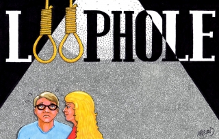
MK, this is really fantastic. The way you have worked the Logo into the spotlight is superb. The two nooses must have a significance to the story line. Interesting. The two characters are truly divine.
reply by the author on 05-Nov-2017
  |
MK, this is really fantastic. The way you have worked the Logo into the spotlight is superb. The two nooses must have a significance to the story line. Interesting. The two characters are truly divine.
Comment Written 04-Nov-2017
reply by the author on 05-Nov-2017
-
thanks for the great review.
Comment from Yogendra R Modak
super Loophole logo revised traditional art formed by artist.way Of forming front view and side of both with there great expressive view so well to see inside light shadow focus well.Great artist.
reply by the author on 05-Nov-2017
 |
super Loophole logo revised traditional art formed by artist.way Of forming front view and side of both with there great expressive view so well to see inside light shadow focus well.Great artist.
Comment Written 03-Nov-2017
reply by the author on 05-Nov-2017
-
thanks for the great review.
-
welcome🌸
Comment from a.samathasena
What a gorgeous artistic cartoon artwork.The Beautiful great drawing scene.The Presentation is very nice.The Logo,their faces and expression,hair cloths and body details,b/g and all are gorgeous great and make a nice scene.I like this talent perfect work.Color blending is great.Creativity color are excellent.Well Done.Thanks.
reply by the author on 05-Nov-2017
|
What a gorgeous artistic cartoon artwork.The Beautiful great drawing scene.The Presentation is very nice.The Logo,their faces and expression,hair cloths and body details,b/g and all are gorgeous great and make a nice scene.I like this talent perfect work.Color blending is great.Creativity color are excellent.Well Done.Thanks.
Comment Written 03-Nov-2017
reply by the author on 05-Nov-2017
-
thanks for the great review.
Comment from karen zima
Love the and the two nooses. The font has a bit impact on the design. I love the look on the two characters faces. One is confused and the other angry. I love this whole concept, but I'm thinking that maybe those two characters need to be bigger than the font and grab that attention they deserve instead of the font.
reply by the author on 05-Nov-2017
|
Love the and the two nooses. The font has a bit impact on the design. I love the look on the two characters faces. One is confused and the other angry. I love this whole concept, but I'm thinking that maybe those two characters need to be bigger than the font and grab that attention they deserve instead of the font.
Comment Written 03-Nov-2017
reply by the author on 05-Nov-2017
-
thanks for the great review.
Comment from Linda Wetzel
This is an eye catching logo that I must warn you could be offensive to some because of the nooses and connotations associated with them. That being said, I am only rating the quality of the art which is expertly rendered. The shading of the background light is reminiscent of film noir detective scenes by Orion Welles and Billy Wilder.
reply by the author on 05-Nov-2017
|
This is an eye catching logo that I must warn you could be offensive to some because of the nooses and connotations associated with them. That being said, I am only rating the quality of the art which is expertly rendered. The shading of the background light is reminiscent of film noir detective scenes by Orion Welles and Billy Wilder.
Comment Written 03-Nov-2017
reply by the author on 05-Nov-2017
-
it was the writers request for his comedy/romance screenplay. i live by the golden rule..yea who has the gold makes the rules..wink. thanks for the great review.
-
Absolutely...and if there is kick back he has to deal with it. Lol.
Comment from Browncat
Before I read your comments, I thought your illustration was appropriate for some kind of theatre production. The ropes are very clever and the facial expression of the fellow is very telling. Your female character looks quite masculine to me, almost like a guy in drag. Overall, a good effort!
reply by the author on 03-Jun-2017
|
Before I read your comments, I thought your illustration was appropriate for some kind of theatre production. The ropes are very clever and the facial expression of the fellow is very telling. Your female character looks quite masculine to me, almost like a guy in drag. Overall, a good effort!
Comment Written 31-May-2017
reply by the author on 03-Jun-2017
-
Lol. Thanks for the great review
Comment from momentsofjoy7351
Wonderful "money talks" shot! Looks like he's a bit annoyed about paying. LOL Not the writer in the drawing??? Anyway, love it! Powerful way to give us the header for the screenplay. "Loophole" has some grand strength. Thanks for sharing!
reply by the author on 03-Jun-2017
|
Wonderful "money talks" shot! Looks like he's a bit annoyed about paying. LOL Not the writer in the drawing??? Anyway, love it! Powerful way to give us the header for the screenplay. "Loophole" has some grand strength. Thanks for sharing!
Comment Written 31-May-2017
reply by the author on 03-Jun-2017
-
Thanks for the great review
Comment from ciaobella
A message with this picture... Nice bold lettering with bright and vivid characters. You can see the spotlight shining down on them.
reply by the author on 03-Jun-2017
|
A message with this picture... Nice bold lettering with bright and vivid characters. You can see the spotlight shining down on them.
Comment Written 30-May-2017
reply by the author on 03-Jun-2017
-
Thanks for the great review
Comment from Life is but a dream.
Message loud and clear, again masterful manipulation of your medium Mark. For me personally, I would not have minded to see the people a tiny bit larger as they seem unreal, like miniature dolls.
reply by the author on 03-Jun-2017
|
Message loud and clear, again masterful manipulation of your medium Mark. For me personally, I would not have minded to see the people a tiny bit larger as they seem unreal, like miniature dolls.
Comment Written 30-May-2017
reply by the author on 03-Jun-2017
-
Noted..but the writer likes it and I got paid so that part counts..wink. Thanks for the great review
Comment from btowngirl
I remember seeing the original and misreading the word. My brain kept wanting to put the ph together, like in phone. Clever idea with the nooses. This would intrigue me enough to want to read the screenplay/see the play.
reply by the author on 03-Jun-2017
|
I remember seeing the original and misreading the word. My brain kept wanting to put the ph together, like in phone. Clever idea with the nooses. This would intrigue me enough to want to read the screenplay/see the play.
Comment Written 30-May-2017
reply by the author on 03-Jun-2017
-
Thanks for the great review