The 918 Caltrain
One way to get to work4 total reviews
Comment from fotogran
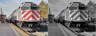
Well, I disagree. The two dominant colors that you mentioned bring the train to the forefront of the image. this train is going somewhere. The lines of the train almost have a 3D effect. The yellow trees on the right balance the yellow line , adding to the effect of the train coming forward. In the B/W version the train recedes into the picture. The excitement of the color shot is gone. OK, that is my opinion!
reply by the author on 20-Dec-2017
  |
Well, I disagree. The two dominant colors that you mentioned bring the train to the forefront of the image. this train is going somewhere. The lines of the train almost have a 3D effect. The yellow trees on the right balance the yellow line , adding to the effect of the train coming forward. In the B/W version the train recedes into the picture. The excitement of the color shot is gone. OK, that is my opinion!
Comment Written 19-Dec-2017
reply by the author on 20-Dec-2017
-
Thanks for your review. This is why I set up this contest, to see what views there were on b/w vs color of the same image. I get what you say about the b/w train receding into the image, it almost seems like an optical illusion. Good eye to notice that.
I have found that some people gravitate toward b/w and some do not. I think those that like b/w look for patterns, structure and texture, without the color to complicate those basic forms.
Thanks much for your response, it think it was great!
Comment from nikman
Your post here is quite fascinating as are your thoughts! Personally I prefer the colour version because it projects a very strong sense of urgency. Both though are enjoyable, good luck and well done!
reply by the author on 20-Dec-2017
|
Your post here is quite fascinating as are your thoughts! Personally I prefer the colour version because it projects a very strong sense of urgency. Both though are enjoyable, good luck and well done!
Comment Written 19-Dec-2017
reply by the author on 20-Dec-2017
-
Thanks for your input. I had hoped this contest would get people to state their preference and why. So I appreciate your feedback a lot!
Comment from iPhone7
What a great entry for the contest. The contrast between the color and black & white photos is stark and makes a great comparison. I agree that the black & white image is more appealing and easier on the eye. Best of the best in the contest ~ Steve
reply by the author on 20-Dec-2017
|
What a great entry for the contest. The contrast between the color and black & white photos is stark and makes a great comparison. I agree that the black & white image is more appealing and easier on the eye. Best of the best in the contest ~ Steve
Comment Written 19-Dec-2017
reply by the author on 20-Dec-2017
-
Thanks for expressing your opinion on this image. I also thought the b/w gives it an "older" look, like trains from yesteryear.
Comment from Photopeb
Nicely done and presented in both color and black and white. Its nice to see both. Good details and sharp focus. Nice depth of field. Your lighting and exposure are very well controlled. Good story telling ability and center of interest. Nice contrast and tones.
Very good technique and technical excellence. Nicely done.
Congrats and Regards,
Paul E Brumit
reply by the author on 20-Dec-2017
|
Nicely done and presented in both color and black and white. Its nice to see both. Good details and sharp focus. Nice depth of field. Your lighting and exposure are very well controlled. Good story telling ability and center of interest. Nice contrast and tones.
Very good technique and technical excellence. Nicely done.
Congrats and Regards,
Paul E Brumit
Comment Written 19-Dec-2017
reply by the author on 20-Dec-2017
-
Thanks Paul for your time and comments on this contest. I am looking forward and hoping more people participate in it also.