Unnatural Botanical
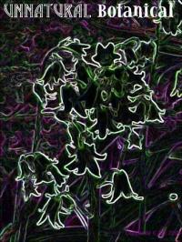
Digitally enhanced photograph of garden bluebells9 total reviews
Comment from Goya
I like these colors, though I wouldn't call it a professional work.
Frankly, this is a tough one for me, and this is one of the main reasons why I took upon my self a challenge to write a review on it :)
May be, if I may suggest, it's not subtle enough, not enough attention to details.
Take care :)
Goya.
   |
I like these colors, though I wouldn't call it a professional work.
Frankly, this is a tough one for me, and this is one of the main reasons why I took upon my self a challenge to write a review on it :)
May be, if I may suggest, it's not subtle enough, not enough attention to details.
Take care :)
Goya.
Comment Written 04-May-2004
Comment from Wolfdancer13
I really like this digitally enhanced work of art, Klaws. Most striking is your outlining in light, the subject of your shot. The blended texturizing of purple and greens adds a nice design to compliment and contrast the use of lit detailing. I could easily see this matted and framed for someone who could appreciate such unique vision.
|
I really like this digitally enhanced work of art, Klaws. Most striking is your outlining in light, the subject of your shot. The blended texturizing of purple and greens adds a nice design to compliment and contrast the use of lit detailing. I could easily see this matted and framed for someone who could appreciate such unique vision.
Comment Written 29-Apr-2004
Comment from Eric_Lachey
I don't know a whole lot about digital art. But I like the picture. It's fast paced and yet flows at the same time. Cool definately cool... Thanks
|
I don't know a whole lot about digital art. But I like the picture. It's fast paced and yet flows at the same time. Cool definately cool... Thanks
Comment Written 29-Apr-2004
Comment from JATH
The lines were somewhat interesting but the colors and picture as a whole left me luke warm. I'm not sure the attached lettering was needed. -- Jackie
|
The lines were somewhat interesting but the colors and picture as a whole left me luke warm. I'm not sure the attached lettering was needed. -- Jackie
Comment Written 28-Apr-2004
Comment from cbirdine
This is a very unique view of bluebells and one I wouldn't have thought of (says she who was photographing bluebells today myself !!). It took me a minute to work it out, but once I did I find it's actually very clever. Good work.
reply by the author on 28-Apr-2004
|
This is a very unique view of bluebells and one I wouldn't have thought of (says she who was photographing bluebells today myself !!). It took me a minute to work it out, but once I did I find it's actually very clever. Good work.
Comment Written 28-Apr-2004
reply by the author on 28-Apr-2004
-
Thank you!
I'm glad that you liked it. I just thought that the original photograph was a bit plain, and decided to use this piece to first experiment with! I hope to see your bluebell shots soon! :0)
Cheers,
-Kat
Comment from WickedLizzie
Klaws, I like the overall color scheme and can appreciate what you were trying to do with this particular image, but it just doesn't seem to pull it off very well. I think you need to do something to make the flowers stand out more from the background, the white outline doesn't seem to do the trick neatly enough. Concept is good, execution needs a little refining. Let me know if you work on this piece and I'll re-review it.
reply by the author on 28-Apr-2004
|
Klaws, I like the overall color scheme and can appreciate what you were trying to do with this particular image, but it just doesn't seem to pull it off very well. I think you need to do something to make the flowers stand out more from the background, the white outline doesn't seem to do the trick neatly enough. Concept is good, execution needs a little refining. Let me know if you work on this piece and I'll re-review it.
Comment Written 28-Apr-2004
reply by the author on 28-Apr-2004
-
Thanks!
It was worth a try - I thought it might make the original image more interesting (for mee too) as I don't usually stray into the digital-art field.
If/when I retouch the image I'll consider your suggestions.
Take Care,
-Kat
-
Hey, nothing wrong with experimenting. :) I wouldn't give up on it, just try some other things out and see what you come up with. :)
Comment from Papa
Klaws, this is very appealing and well done. The colours are great and I admire the manner in which you have added the title to the image. They seem to me to be very appropriate fonts and styles. I am bothered, however, by the unfinished effect at the near-centre where the white outline doesn't completely define particular flowers or leaves. Nevertheless, it is an effective work. Peace, Papa.
reply by the author on 28-Apr-2004
|
Klaws, this is very appealing and well done. The colours are great and I admire the manner in which you have added the title to the image. They seem to me to be very appropriate fonts and styles. I am bothered, however, by the unfinished effect at the near-centre where the white outline doesn't completely define particular flowers or leaves. Nevertheless, it is an effective work. Peace, Papa.
Comment Written 28-Apr-2004
reply by the author on 28-Apr-2004
-
Thanks for the review!
Digital manipulation of images is something I am not very good at, so I am glad that you didn't find it too abominable! I'll try implement your suggestions soon.
-Kat
Comment from Richard
I like th concept behind the piece. I just can't get too excited about it. I think if you just make the flowers only read a bit better it would work. I look forward to seeing more of your work.
reply by the author on 28-Apr-2004
|
I like th concept behind the piece. I just can't get too excited about it. I think if you just make the flowers only read a bit better it would work. I look forward to seeing more of your work.
Comment Written 28-Apr-2004
reply by the author on 28-Apr-2004
-
Thanks for commenting.
First attempt at digital art - I'll see about making some alterations.
Take Care,
-Kat
Comment from mp3004
To be honest I personally am bored with the filters. I like the font for unnatural but I don't think it goes right with the other font. It may be good if you did something more to it.
reply by the author on 28-Apr-2004
|
To be honest I personally am bored with the filters. I like the font for unnatural but I don't think it goes right with the other font. It may be good if you did something more to it.
Comment Written 28-Apr-2004
reply by the author on 28-Apr-2004
-
Thanks.
I'm sorry you didn't like it - I usually stick to traditional photography, but thought I'd try something different with it this time.
I'll have a think about re-working it.
-Kat