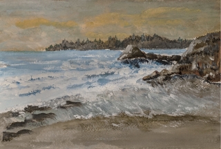
The restless sea
A coastal view of a restless sea25 total reviews
Comment from vicky osley
A wonderful painting of the coastline! I like your strokes and the rugged rocks are done nicely! The ocean motion is cool with less emphasis on the waves and more on the flow of the tide! I like a lot!
reply by the author on 21-Apr-2018
  |
A wonderful painting of the coastline! I like your strokes and the rugged rocks are done nicely! The ocean motion is cool with less emphasis on the waves and more on the flow of the tide! I like a lot!
Comment Written 21-Apr-2018
reply by the author on 21-Apr-2018
-
Thanks much for your review Vicky, I appreciate it a lot.
Comment from momentsofjoy7351
Sorry.... not a painter so can't help in anyway... what I can say is "I wish I had your brush stroke talent"! What I enjoy the most is your time of day play on the lighting - strength - captures me. Takes me to a moment of early evening with some grand powerful oceanic movement and setting of the sun! Thanks for sharing and good luck in the contest!
reply by the author on 21-Apr-2018
|
Sorry.... not a painter so can't help in anyway... what I can say is "I wish I had your brush stroke talent"! What I enjoy the most is your time of day play on the lighting - strength - captures me. Takes me to a moment of early evening with some grand powerful oceanic movement and setting of the sun! Thanks for sharing and good luck in the contest!
Comment Written 21-Apr-2018
reply by the author on 21-Apr-2018
-
Thanks a lot for seeing what I tried to capture in this painting. I always like the dynamics of water movement on a beach. It is always different. Thanks much again.
Comment from Neilnap773
this is a good painting my friend,and although i am not a water colour fan having changed from that medium to the oils ,i have to say its a good attempt .May i suggest viewing some of the sea sceneries and particularly the technique that Bob Ross used in his day (God rest his soul) and it was he who made me transfer from water colours to oils and have never regretted it. Oils give the sea such depth whereas water colours tend to be flat on the canvas. I would like to have seen more tonal control between your darks and lights which would have helped you in achieving more depth and movement in your waves particularly around the rock area where the waves crash. Your sky is a delightful palette and have no critic on this .The only real critic is the waves and the lack of tones and as a result are too flat.Its a good piece and deservedly a 5 from me
reply by the author on 21-Apr-2018
|
this is a good painting my friend,and although i am not a water colour fan having changed from that medium to the oils ,i have to say its a good attempt .May i suggest viewing some of the sea sceneries and particularly the technique that Bob Ross used in his day (God rest his soul) and it was he who made me transfer from water colours to oils and have never regretted it. Oils give the sea such depth whereas water colours tend to be flat on the canvas. I would like to have seen more tonal control between your darks and lights which would have helped you in achieving more depth and movement in your waves particularly around the rock area where the waves crash. Your sky is a delightful palette and have no critic on this .The only real critic is the waves and the lack of tones and as a result are too flat.Its a good piece and deservedly a 5 from me
Comment Written 21-Apr-2018
reply by the author on 21-Apr-2018
-
Thanks so much for your constructive comments on this piece. I have used acrylic for many years, did a stint with pastels, and have tried many times with water color. I think I am not patient enough as oil dries slowly. But I can see why you like it as the colors and blending can be so dramatic.
Thanks so much for your comments and I will pay attention to them in my next piece.
-
Quick drying water
based oil paints..I use
Griffin alkyde oils
Dry in a day, available
on line through Jackson's art supply
Comment from cs144
A very realistic seascape. Nicely composed and great color. I can almost hear the waves crashing on the rocks. Love the sky colors. Thanks for sharing.
reply by the author on 20-Apr-2018
|
A very realistic seascape. Nicely composed and great color. I can almost hear the waves crashing on the rocks. Love the sky colors. Thanks for sharing.
Comment Written 20-Apr-2018
reply by the author on 20-Apr-2018
-
Thanks much!
Comment from csimmons032
Honestly I think you did a fantastic job. I like all of the detail that you put into the waves and the rocks. The soft colors in the sky and the water look great. I think if I had any suggestions at all it would be to may add a tiny bit of yellow to the water so that it looks like it is reflecting from the sky. That is really the only thing I can think of though. Thanks for sharing and keep up the great work. :)
reply by the author on 20-Apr-2018
 |
Honestly I think you did a fantastic job. I like all of the detail that you put into the waves and the rocks. The soft colors in the sky and the water look great. I think if I had any suggestions at all it would be to may add a tiny bit of yellow to the water so that it looks like it is reflecting from the sky. That is really the only thing I can think of though. Thanks for sharing and keep up the great work. :)
Comment Written 20-Apr-2018
reply by the author on 20-Apr-2018
-
Wow, thank you for such a kind review and high rating. I agree, a touch of yellow is needed to show the reflected sky in the water. I will work on that. I appreciate all the tips I can get!
-
You're welcome and I am glad that I can help :) You deserve the high rating :)
Comment from karen zima
I would have to say that you have captured movement in the water very well. The tones in the foam are very good. What I like about this painting is the softer earthy tones. I think you have done a good job just using blue and brown tones with a touch of yellow. Keep up the good work. I
reply by the author on 20-Apr-2018
|
I would have to say that you have captured movement in the water very well. The tones in the foam are very good. What I like about this painting is the softer earthy tones. I think you have done a good job just using blue and brown tones with a touch of yellow. Keep up the good work. I
Comment Written 19-Apr-2018
reply by the author on 20-Apr-2018
-
Thanks Karen, I do not quite use the bold colors that you do. I appreciate your feedback a lot!
Comment from Barbara L.
I'm not a painter so I can't give you the kind of feedback that someone who paints could give, but I like this painting a lot. You've created a wonderful scene and I love the way you painted the waves in the water.
reply by the author on 19-Apr-2018
|
I'm not a painter so I can't give you the kind of feedback that someone who paints could give, but I like this painting a lot. You've created a wonderful scene and I love the way you painted the waves in the water.
Comment Written 19-Apr-2018
reply by the author on 19-Apr-2018
-
Thanks for taking the time to stop by and comment on this piece.
Comment from Monica Morrell
I believe you have done a wonderful water color piece of art here.
Personally I do not care for water color because I prefer more vibrant colors.
For that reason I work primarily with acrylics.
Your image is very nice and well balanced.
A true pleasure to view. Give yourself more credit and continue the media you prefer. It is your world. Enjoy it!
reply by the author on 19-Apr-2018
|
I believe you have done a wonderful water color piece of art here.
Personally I do not care for water color because I prefer more vibrant colors.
For that reason I work primarily with acrylics.
Your image is very nice and well balanced.
A true pleasure to view. Give yourself more credit and continue the media you prefer. It is your world. Enjoy it!
Comment Written 19-Apr-2018
reply by the author on 19-Apr-2018
-
Thanks much for the review.
Comment from ArtistCarl
I voted five stars more for your comments about wanting an honest review than the quality of the painting. In my mind the painting is maybe a four star. Reasons: The overall visual impact is rather bland. While color is present, it actually appears to be monotone. There is no chiaroscuro qualities here. It is a nice painting but does not draw the viewer into wanting to study it for any length of time. The largest portion of the white foam of the wave on the right looks awkward and stiff. I think that could be corrected by making the wave foam lines curving into more horizontal forms rather than the 30 degree angle it is at present. Some of the dark shading in the rocks need to be darker. Some of the ocean and close up blues need to be darker. I would leave the sky alone as the distant faded look would make the distance look improve when more color and definition is added to the foreground land and water. Moving on. Leave the land mass next to the sky alone. The small white wave rivulets need to be enhanced by placing thin varied thicknesses of dark and medium brown lines under the white of the foam. Run a few lines on the beach itself without adding any foam. With sharper images and lines in the foreground and faded forms in the background the illusion of depth is enhanced. Also in your description add the size of the painting. It helps the viewer to imagine the scope of the picture. Hope these comments help.
reply by the author on 19-Apr-2018
|
I voted five stars more for your comments about wanting an honest review than the quality of the painting. In my mind the painting is maybe a four star. Reasons: The overall visual impact is rather bland. While color is present, it actually appears to be monotone. There is no chiaroscuro qualities here. It is a nice painting but does not draw the viewer into wanting to study it for any length of time. The largest portion of the white foam of the wave on the right looks awkward and stiff. I think that could be corrected by making the wave foam lines curving into more horizontal forms rather than the 30 degree angle it is at present. Some of the dark shading in the rocks need to be darker. Some of the ocean and close up blues need to be darker. I would leave the sky alone as the distant faded look would make the distance look improve when more color and definition is added to the foreground land and water. Moving on. Leave the land mass next to the sky alone. The small white wave rivulets need to be enhanced by placing thin varied thicknesses of dark and medium brown lines under the white of the foam. Run a few lines on the beach itself without adding any foam. With sharper images and lines in the foreground and faded forms in the background the illusion of depth is enhanced. Also in your description add the size of the painting. It helps the viewer to imagine the scope of the picture. Hope these comments help.
Comment Written 19-Apr-2018
reply by the author on 19-Apr-2018
-
Hey, thanks for the feedback, just what I was looking for. I like to learn as I go and this will help, so hats off!
-
You are welcome.
Comment from TBI John
Watercolors I love them .
Excellent composition and presentation .
It's a very cool piece and a wonderful entry for the contest .
Suggestions : usually distance mountains are less in focus, even blurry , maybe even blue or a purple hue . It's the atmospheric conditions .
and I guess the color gradation of the water . Just one reporters opinion !
It's a very cool piece and the best of luck with the contest .
Thank you and keep painting !
reply by the author on 19-Apr-2018
|
Watercolors I love them .
Excellent composition and presentation .
It's a very cool piece and a wonderful entry for the contest .
Suggestions : usually distance mountains are less in focus, even blurry , maybe even blue or a purple hue . It's the atmospheric conditions .
and I guess the color gradation of the water . Just one reporters opinion !
It's a very cool piece and the best of luck with the contest .
Thank you and keep painting !
Comment Written 19-Apr-2018
reply by the author on 19-Apr-2018
-
Thanks much for your feedback, I agree with your suggestions, I backed of the value of the distant hills a bit, spot on.
-
Your welcome .