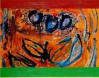
grande cinema paradiso
80x100cm4 total reviews
Comment from gloriajo
I'm not much for abstact ..altho you do have a colorful painting here. To me it just seems messy. What is it suppose to represent?
Gloria Jo
   |
I'm not much for abstact ..altho you do have a colorful painting here. To me it just seems messy. What is it suppose to represent?
Gloria Jo
Comment Written 02-May-2004
Comment from Bambootiger
While orange and blue are complementary colors I wonder about your choice of green here. Perhaps purple would work better
Bambootiger
|
While orange and blue are complementary colors I wonder about your choice of green here. Perhaps purple would work better
Bambootiger
Comment Written 01-May-2004
Comment from Wolfdancer13
I like your mix and blend of colors you chose for this piece. The blue is particularly striking against your colors of rust, reds and oranges. The outlining form of your leaf like subject appeals to the eye. I'm not too sure I'm hot with the upper and lower border of color that cuts off the substance of the piece. Interesting piece of abstract workings.
|
I like your mix and blend of colors you chose for this piece. The blue is particularly striking against your colors of rust, reds and oranges. The outlining form of your leaf like subject appeals to the eye. I'm not too sure I'm hot with the upper and lower border of color that cuts off the substance of the piece. Interesting piece of abstract workings.
Comment Written 01-May-2004
Comment from Eric_Lachey
I like the colors, but it looks very chaotic and confusing. I'm not sure what I'm looking at. If the subject was a little more defined I might think otherwise. Thanks!
|
I like the colors, but it looks very chaotic and confusing. I'm not sure what I'm looking at. If the subject was a little more defined I might think otherwise. Thanks!
Comment Written 01-May-2004