Barkarole
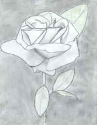
A drawing of a rose.6 total reviews
Comment from Goya
I'm sorry, but I cannot possibly say that this work either masterfull or professional.
For me it looks like a work of a student who is in the process of learning.
To my hamble opinion, you either should go to classic direction- light/shade, perspective, or so called "flat" way.
But it seems you couldn't decide which way to go.
Take care :)
reply by the author on 04-May-2004
   |
I'm sorry, but I cannot possibly say that this work either masterfull or professional.
For me it looks like a work of a student who is in the process of learning.
To my hamble opinion, you either should go to classic direction- light/shade, perspective, or so called "flat" way.
But it seems you couldn't decide which way to go.
Take care :)
Comment Written 04-May-2004
reply by the author on 04-May-2004
-
Why are you sorry? And I do not consider my self a professional, or this work to be masterful; I'm sorry if that's the way I came across. Thank you for giving your honest opinion. :)
Comment from brokelizard
I think this is a good picture but I dont see much else there, I think better attention detail such as shadding and maybe a possible shadow in the background could have made it stand out more and hold my attention. Thanks.
reply by the author on 04-May-2004
|
I think this is a good picture but I dont see much else there, I think better attention detail such as shadding and maybe a possible shadow in the background could have made it stand out more and hold my attention. Thanks.
Comment Written 04-May-2004
reply by the author on 04-May-2004
-
I've gotten a lot of comments on lack of good shading. I think that that may be a hint that I need some more. :P Thank you for giving feedback!
Comment from Cricket
Great detail on the outline of the petals. Encourage more use of shading in the rose itself. I love drawing roses! There are so many types and you can have so much fun with them.
Cricket
reply by the author on 03-May-2004
|
Great detail on the outline of the petals. Encourage more use of shading in the rose itself. I love drawing roses! There are so many types and you can have so much fun with them.
Cricket
Comment Written 03-May-2004
reply by the author on 03-May-2004
-
I like drawing roses for the same reasons! :)
Comment from WickedLizzie
Very nice rendering, unusual choice to render it completely in grayscale, and the background really doesn't look black on my screen, but it's pretty, and you did a good job of drawing it.
reply by the author on 03-May-2004
|
Very nice rendering, unusual choice to render it completely in grayscale, and the background really doesn't look black on my screen, but it's pretty, and you did a good job of drawing it.
Comment Written 03-May-2004
reply by the author on 03-May-2004
-
I used black, it really turned out to be gray. ;P
Comment from Richard
The colors you describe are much lighter on the image we see. Is that from scanning? I am not sure the dark backround is helping this picture. I hope to see more of your work.
reply by the author on 03-May-2004
|
The colors you describe are much lighter on the image we see. Is that from scanning? I am not sure the dark backround is helping this picture. I hope to see more of your work.
Comment Written 03-May-2004
reply by the author on 03-May-2004
-
I meant it to be mainly a black and white, but there is very light shading, which is made a bit lighter because my scanner blows things to rather large proportions. Thank you for your honesty! ^_^
Comment from Papa
Tigrr, I see this as an exceptional work, the detail is magnificently simple and straightforward, and the shading very effective. (On screen I see only the tiniest hint of green on the uppermost leaf.) Congratulations!
Peace, Papa
reply by the author on 03-May-2004
|
Tigrr, I see this as an exceptional work, the detail is magnificently simple and straightforward, and the shading very effective. (On screen I see only the tiniest hint of green on the uppermost leaf.) Congratulations!
Peace, Papa
Comment Written 03-May-2004
reply by the author on 03-May-2004
-
Thank you very much!