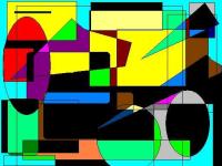
Random Art
My first try at digital art.8 total reviews
Comment from Whisper
I like all of the shapes and colors. I used to play around like that on the computer. I could only use ms paint for the looooongest time. I like how you swapped the colors around.
reply by the author on 16-Apr-2004
   |
I like all of the shapes and colors. I used to play around like that on the computer. I could only use ms paint for the looooongest time. I like how you swapped the colors around.
Comment Written 16-Apr-2004
reply by the author on 16-Apr-2004
-
Thanks a lot for the review.
Comment from emotif
Actually I like this, though am not into this sort of thing normally. I like the honesty of the form, the brightness of the colour, and the decency to give us a look. Thanks. Best wishes.
reply by the author on 16-Apr-2004
|
Actually I like this, though am not into this sort of thing normally. I like the honesty of the form, the brightness of the colour, and the decency to give us a look. Thanks. Best wishes.
Comment Written 16-Apr-2004
reply by the author on 16-Apr-2004
-
Thanks a lot for the review.
Comment from saffron_factor
For a first try, it is very good.
Very vibrant and colourful. It would act as a terrific mood lifter.
The serrated outlines distract and give an unprofessional look.
The colours are dazzling but they don't quite belong to each other and look like kids blocks.
You could experiment with different combos
See that you maintain a proportion between the dark dominating and light smoother colours.
So that the final product seems like one unit, striking yet complementing one another.
Great Job!
Best of Luck!
reply by the author on 15-Apr-2004
|
For a first try, it is very good.
Very vibrant and colourful. It would act as a terrific mood lifter.
The serrated outlines distract and give an unprofessional look.
The colours are dazzling but they don't quite belong to each other and look like kids blocks.
You could experiment with different combos
See that you maintain a proportion between the dark dominating and light smoother colours.
So that the final product seems like one unit, striking yet complementing one another.
Great Job!
Best of Luck!
Comment Written 15-Apr-2004
reply by the author on 15-Apr-2004
-
Thanks for the review and suggestions.
Comment from Tillantria
This was a good first try. The colors don't seem balanced and the background blue distracts the eye away from the main composition. You should try to choose colors that compliment each other.
~Tillie
reply by the author on 15-Apr-2004
|
This was a good first try. The colors don't seem balanced and the background blue distracts the eye away from the main composition. You should try to choose colors that compliment each other.
~Tillie
Comment Written 14-Apr-2004
reply by the author on 15-Apr-2004
-
Thanks for the review and advice.
Comment from Wolfdancer13
This was kewl. Especially the choice of colors mixed in to create the overall geometric effect. A great way to break into the digital art realm. You're off to a great start. :)
reply by the author on 14-Apr-2004
|
This was kewl. Especially the choice of colors mixed in to create the overall geometric effect. A great way to break into the digital art realm. You're off to a great start. :)
Comment Written 14-Apr-2004
reply by the author on 14-Apr-2004
-
Thanks a lot for the review.
Comment from pantherkatz
I love it when an artist uses an array of colors. For me, it's uplifting. However, it many ways, it just looks like a computer creation. I think some of the lines should be strengthened and thickened so that it's bolder and it looks a bit more powerful. ~Jaimee~
reply by the author on 14-Apr-2004
|
I love it when an artist uses an array of colors. For me, it's uplifting. However, it many ways, it just looks like a computer creation. I think some of the lines should be strengthened and thickened so that it's bolder and it looks a bit more powerful. ~Jaimee~
Comment Written 14-Apr-2004
reply by the author on 14-Apr-2004
-
Thanks for the review and suggestions
Comment from S.C.Cobb
Not bad, not bad at all! Hey, we all have to start somewhere. I thought that this was a simple and lively piece. Keep working at the digital art, it can be lots of fun!
reply by the author on 14-Apr-2004
|
Not bad, not bad at all! Hey, we all have to start somewhere. I thought that this was a simple and lively piece. Keep working at the digital art, it can be lots of fun!
Comment Written 14-Apr-2004
reply by the author on 14-Apr-2004
-
Thanks for the review.
Comment from Richard
Nice piece. The choices of colors is pretty good. the edges of the curved and diagonal lines are too jagged for my taste though.
reply by the author on 14-Apr-2004
|
Nice piece. The choices of colors is pretty good. the edges of the curved and diagonal lines are too jagged for my taste though.
Comment Written 14-Apr-2004
reply by the author on 14-Apr-2004
-
Thanks for the reveiw and suggestions.