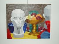
Untitled Still Life 2002
This is a 16x20" still life14 total reviews
Comment from The Muse Diva
This is a unsually busy piece and feels very crowded. It has some interesting elements, but I dont feel anything for it. It seems sterile somehow, and I am thinking to myself, oh well I just dont care for the style. I am sure it is an excellent piece for the style.
:)
   |
This is a unsually busy piece and feels very crowded. It has some interesting elements, but I dont feel anything for it. It seems sterile somehow, and I am thinking to myself, oh well I just dont care for the style. I am sure it is an excellent piece for the style.
:)
Comment Written 11-May-2004
Comment from Magnolia
The colors are very engaging in this painting. I would certainly stop in a gallery to look at it more closely. I do, however, have a little trouble deciding where the light is coming from and the grouping seems a bit "busy". Fewer items would have worked better and the starkness of the bust takes away from the rich feel you get from the rest of the painting.
|
The colors are very engaging in this painting. I would certainly stop in a gallery to look at it more closely. I do, however, have a little trouble deciding where the light is coming from and the grouping seems a bit "busy". Fewer items would have worked better and the starkness of the bust takes away from the rich feel you get from the rest of the painting.
Comment Written 08-May-2004
Comment from ruthsartpage
Great work here....still life is so demanding on the artist. I have done some,,,,hope to eventually have some up. I do have some on my pages at my site.
anyway the variation of color is great
would you please NOT be offended at a comment here, I only do so to maybe throw some thoughts your way for the best wishes for your work. ok?
A still life can be "cluttered" very easily. The rule of thumb here is usually no more than 3 objects per picture.
I guess if it were me, personally I would have not put the bowl of fruit in the middle front of the beautiful pitcher behind it. and the same for the "head figure" in front of the blue bowl. I think since you have 6 objects here, the painting would have been far more outstanding, and strong with. 3 of those objects removed. It causes the eye, to be "not sure" where to land, and causes the picture to be too busy. Do you know what I mean?? I find no fault here with your form and color, etc. its a matter of "artistic clutter". PLEASE do not be offended at my comments, I truly like your work, and would hope to see you do the very best and obtain the best results for a successful career. but assuredly still life is easily cluttered with large objects in particular. I hope you will give this some serious thought, and also know that I in no way am demeaning your work....OK
thanks
ruthsartpage
reply by the author on 08-May-2004
|
Great work here....still life is so demanding on the artist. I have done some,,,,hope to eventually have some up. I do have some on my pages at my site.
anyway the variation of color is great
would you please NOT be offended at a comment here, I only do so to maybe throw some thoughts your way for the best wishes for your work. ok?
A still life can be "cluttered" very easily. The rule of thumb here is usually no more than 3 objects per picture.
I guess if it were me, personally I would have not put the bowl of fruit in the middle front of the beautiful pitcher behind it. and the same for the "head figure" in front of the blue bowl. I think since you have 6 objects here, the painting would have been far more outstanding, and strong with. 3 of those objects removed. It causes the eye, to be "not sure" where to land, and causes the picture to be too busy. Do you know what I mean?? I find no fault here with your form and color, etc. its a matter of "artistic clutter". PLEASE do not be offended at my comments, I truly like your work, and would hope to see you do the very best and obtain the best results for a successful career. but assuredly still life is easily cluttered with large objects in particular. I hope you will give this some serious thought, and also know that I in no way am demeaning your work....OK
thanks
ruthsartpage
Comment Written 08-May-2004
reply by the author on 08-May-2004
-
I know exactly what you mean, I didn't set up the still life myself, it was for a painting class and the professer set it up and our requirement was to fit in what we see, so that it wasn't my choice to set the still life up this way. thanks for your advice and compliement!
Comment from brokelizard
Your attention to detail is great as is your shading throughout the picture, I'm not sure of your subject matter but your techniques worked well here. Good Job.
|
Your attention to detail is great as is your shading throughout the picture, I'm not sure of your subject matter but your techniques worked well here. Good Job.
Comment Written 08-May-2004
Comment from Ms Vegas Eyes
Very nice composition. The colors are fabulous. I love the lighting and shading throughout the whole painting. The graphic quality is excellent.
Wonderful job.
|
Very nice composition. The colors are fabulous. I love the lighting and shading throughout the whole painting. The graphic quality is excellent.
Wonderful job.
Comment Written 07-May-2004
Comment from cbirdine
wow, this is certainly a sunning picture. The starkness of the head sculpture contrasts beautifully with the color from the fruit bowl. All the colors work really well together throughout the whole picture.
|
wow, this is certainly a sunning picture. The starkness of the head sculpture contrasts beautifully with the color from the fruit bowl. All the colors work really well together throughout the whole picture.
Comment Written 07-May-2004
Comment from WickedLizzie
This isn't bad, I like all the different elements in this painting, you've chosen some interesting things to make this composition out of. However, I am noticing some inconsistencies in the lighting of your different components, like the blue bowl on the left has a shadow across the left and illumination on the right, while other pieces have either the center shadowed (the head and the brass plate), or the shading is on the right (or in the case of the red bowl, we don't see the shading, but we do see illumination of the left side of the bowl). Overall, composition is good, and I like the interest in the shapes and colors you've used here, just the lighting throws me off.
|
This isn't bad, I like all the different elements in this painting, you've chosen some interesting things to make this composition out of. However, I am noticing some inconsistencies in the lighting of your different components, like the blue bowl on the left has a shadow across the left and illumination on the right, while other pieces have either the center shadowed (the head and the brass plate), or the shading is on the right (or in the case of the red bowl, we don't see the shading, but we do see illumination of the left side of the bowl). Overall, composition is good, and I like the interest in the shapes and colors you've used here, just the lighting throws me off.
Comment Written 07-May-2004
Comment from Papa
ntorzok, this is another highly impressive work. The collection of elements is most intriguing, and having a version of the bust facing both front and back is very effective. The colours are magnificent and their array is most appealing. This work has great impact.
Peace, Papa
This rating does not count towards story rating or author rank.
The highest and the lowest rating are not included in calculations.
|
ntorzok, this is another highly impressive work. The collection of elements is most intriguing, and having a version of the bust facing both front and back is very effective. The colours are magnificent and their array is most appealing. This work has great impact.
Peace, Papa
This rating does not count towards story rating or author rank.
The highest and the lowest rating are not included in calculations.
Comment Written 07-May-2004
Comment from Charley
hm intersting is that a second head in the back? the high defintion in the cheeks is cool coming to a point. A nice piece my dear...
|
hm intersting is that a second head in the back? the high defintion in the cheeks is cool coming to a point. A nice piece my dear...
Comment Written 07-May-2004
Comment from Wolfdancer13
Interesting combination or mix of artistic blends found within this piece. I like the almost cubism feel of geometric shaping of the statuesque head, its reflective image portraying both angles, as if mirrored, even though the other objects are not duplicated. Your shaping of the vases, bowls, and other shaped objects you chose for this study utlizes many variations of color, elements of textures, as well as depiction of art style. This is an interesting work of art to contemplate. Your shadowing and light brings strength to its presentation.
|
Interesting combination or mix of artistic blends found within this piece. I like the almost cubism feel of geometric shaping of the statuesque head, its reflective image portraying both angles, as if mirrored, even though the other objects are not duplicated. Your shaping of the vases, bowls, and other shaped objects you chose for this study utlizes many variations of color, elements of textures, as well as depiction of art style. This is an interesting work of art to contemplate. Your shadowing and light brings strength to its presentation.
Comment Written 07-May-2004