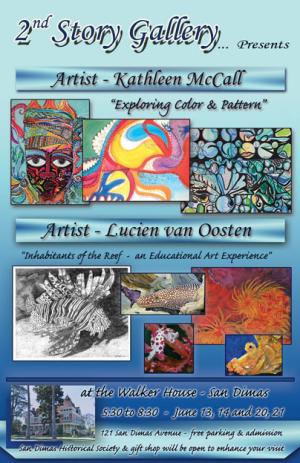
The poster San Dimas art show
Created to be visually inviting, asking for help.31 total reviews
Comment from Snopaw
Nothing like a little self promotion :)) Nice job Lucien.
The poster is nicely designed with uses of arts that is appealing and provides some interest.
At the bottom, of course, the Fanartreview watermark is greatly distracting :(.
Also at the bottom I would get the 'at' out of the picture and onto the blue section, would make it a bit more professional :)
reply by the author on 19-May-2014
  |
Nothing like a little self promotion :)) Nice job Lucien.
The poster is nicely designed with uses of arts that is appealing and provides some interest.
At the bottom, of course, the Fanartreview watermark is greatly distracting :(.
Also at the bottom I would get the 'at' out of the picture and onto the blue section, would make it a bit more professional :)
Comment Written 19-May-2014
reply by the author on 19-May-2014
-
Snowpaw,
Of course, self promoting, is important as is getting feedback on what could make it better. Thank U for the critique of the poster it is appreciated.
Could U go to the tweet button or facebook or both and send the following type of a message, liking it using the tweet button will give it a greater chance of getting seen:
Would love to visit, sounds like a very interesting show, but I am too far away. If U live in that area, go visit the show, let me know what U think.
The more promoting & help I can get doing that the better. And if U can stop on by.
Cheers and thanks again for having looked at the poster and any help you can offer.
Never know, someone in your area may like it and want to pick it and present it to community where U live.
Comment from theqbhawk
Yes, this is a nice colorful poster that gets attention.
It might be a bit too busy for most people to take time to read it, but the artistic effort that was put into it, I can give a five rating for a job well done in creative.
theqbhawk
reply by the author on 19-May-2014
|
Yes, this is a nice colorful poster that gets attention.
It might be a bit too busy for most people to take time to read it, but the artistic effort that was put into it, I can give a five rating for a job well done in creative.
theqbhawk
Comment Written 19-May-2014
reply by the author on 19-May-2014
-
theqbhawk,
thank U for the critique of the poster it is appreciated.
Could U go to the tweet button or facebook or both and send the following type of a message, liking it using the tweet button will give it a greater chance of getting seen:
Would love to visit, sounds like a very interesting show, but I am too far away. If U live in that area, go visit the show, let me know what U think.
The more promoting & help I can get doing that the better. And if U can stop on by.
Cheers and thanks again for having looked at the poster and any help you can offer.
Never know, someone in your area may like it and want to pick it and present it to community where U live.
-
Sorry my friend, But I was locked out of face book last year, because I refused to agree not to make too many friends with people that I didn't know.
Thats a big brother site.
Comment from Capture This
Yes, yes, and yes!! It does all of the above mentioned. Makes you want to see all this. Makes the eye catch all the events and shows etc. The text looks great the way you did it. The layers of the photos and poster looks great in all details and aspects.
reply by the author on 19-May-2014
|
Yes, yes, and yes!! It does all of the above mentioned. Makes you want to see all this. Makes the eye catch all the events and shows etc. The text looks great the way you did it. The layers of the photos and poster looks great in all details and aspects.
Comment Written 19-May-2014
reply by the author on 19-May-2014
-
Capture This,
thank U for the critique of the poster it is appreciated.
Could U go to the tweet button or facebook or both and send the following type of a message, liking it using the tweet button will give it a greater chance of getting seen:
Would love to visit, sounds like a very interesting show, but I am too far away. If U live in that area, go visit the show, let me know what U think.
The more promoting & help I can get doing that the better. And if U can stop on by.
Cheers and thanks again for having looked at the poster and any help you can offer.
Never know, someone in your area may like it and want to pick it and present it to community where U live.
Comment from trishgoody
Lucien, the content of this poster is great and I know how hard it is to put one of these together, I am actually doing something similar as a flyer.
The individual art is colorful but I feel in the top section the two images to the right should be in a straight line leaving a straight line space for the heading.
The bottom section layout I like, although I would like to see the fish in color.
I would be very interested to attend this if it was in my area so your poster has impact.
Good luck with the show.
reply by the author on 19-May-2014
|
Lucien, the content of this poster is great and I know how hard it is to put one of these together, I am actually doing something similar as a flyer.
The individual art is colorful but I feel in the top section the two images to the right should be in a straight line leaving a straight line space for the heading.
The bottom section layout I like, although I would like to see the fish in color.
I would be very interested to attend this if it was in my area so your poster has impact.
Good luck with the show.
Comment Written 19-May-2014
reply by the author on 19-May-2014
-
trisgoody,
I was trying to give it a terestep look to have your eye move through the poster better.
Thank U for the critique of the poster it is appreciated.
Could U go to the tweet button or facebook or both and send the following type of a message, liking it using the tweet button will give it a greater chance of getting seen:
Would love to visit, sounds like a very interesting show, but I am too far away. If U live in that area, go visit the show, let me know what U think.
The more promoting & help I can get doing that the better. And if U can stop on by.
Cheers and thanks again for having looked at the poster and any help you can offer.
Never know, someone in your area may like it and want to pick it and present it to community where U live.
-
I live in Australia Lucien and I'm one of those weird people that doesn't operate on facebook.
But good luck anyway.
Comment from 6Blessings
Looks like a winner ad to me. Nice vibrant colors, the intent is clear. The blue color make a person sense happiness,=.
reply by the author on 19-May-2014
|
Looks like a winner ad to me. Nice vibrant colors, the intent is clear. The blue color make a person sense happiness,=.
Comment Written 18-May-2014
reply by the author on 19-May-2014
-
6Blessings,
thank U for the critique of the poster it is appreciated.
Could U go to the tweet button or facebook or both and send the following type of a message, liking it using the tweet button will give it a greater chance of getting seen:
Would love to visit, sounds like a very interesting show, but I am too far away. If U live in that area, go visit the show, let me know what U think.
The more promoting & help I can get doing that the better. And if U can stop on by.
Cheers and thanks again for having looked at the poster and any help you can offer.
Never know, someone in your area may like it and want to pick it and present it to community where U live.
Comment from MKFlood
an awsome example of how i can refer too for future signage..the artwork is nicely balanced. i do like the overlapping of pictures. the font is excellent. a real eye catcher for the viewer. an excellent job penmaster(standing and clapping)
reply by the author on 19-May-2014
 |
an awsome example of how i can refer too for future signage..the artwork is nicely balanced. i do like the overlapping of pictures. the font is excellent. a real eye catcher for the viewer. an excellent job penmaster(standing and clapping)
Comment Written 18-May-2014
reply by the author on 19-May-2014
-
MKFlood,
Tank U for the high rating, it means a lot.
Thank U for the critique of the poster it is appreciated.
Could U go to the tweet button or facebook or both and send the following type of a message, liking it using the tweet button will give it a greater chance of getting seen:
Would love to visit, sounds like a very interesting show, but I am too far away. If U live in that area, go visit the show, let me know what U think.
The more promoting & help I can get doing that the better. And if U can stop on by.
Cheers and thanks again for having looked at the poster and any help you can offer.
Never know, someone in your area may like it and want to pick it and present it to community where U live.
-
would love to but still a hike from memphis..wink
Comment from cleo85
Smart move. Good commercial!
I guess you designed the poster, but parts of it as the text layouts, and top and bottom was given by the gallery.
I guess you had an input at the background color. The color is a very smart choice, because it supports the pictures of both artists. I can see you have you part composed yourself. I like those different sizes and how the smaller paintings are overlapping the two bigger ones. It gives a almost 3D view. I am not sure if you have influence on the layout of Kathleen McCall; but this part seems not as balanced as yours. If you could make changes, lining the face up with your fish below, setting it more to the center and may a slightly lower would be an option.
reply by the author on 19-May-2014
|
Smart move. Good commercial!
I guess you designed the poster, but parts of it as the text layouts, and top and bottom was given by the gallery.
I guess you had an input at the background color. The color is a very smart choice, because it supports the pictures of both artists. I can see you have you part composed yourself. I like those different sizes and how the smaller paintings are overlapping the two bigger ones. It gives a almost 3D view. I am not sure if you have influence on the layout of Kathleen McCall; but this part seems not as balanced as yours. If you could make changes, lining the face up with your fish below, setting it more to the center and may a slightly lower would be an option.
Comment Written 18-May-2014
reply by the author on 19-May-2014
-
cloe85,
actually everyone gave me the information and the whole thing was my ideas and layout. Of course I had to work with what I was given, and the they all approved it, the gallery and the other artist.
Thank U for the critique of the poster it is appreciated.
Could U go to the tweet button or facebook or both and send the following type of a message, liking it using the tweet button will give it a greater chance of getting seen:
Would love to visit, sounds like a very interesting show, but I am too far away. If U live in that area, go visit the show, let me know what U think.
The more promoting & help I can get doing that the better. And if U can stop on by.
Cheers and thanks again for having looked at the poster and any help you can offer.
Never know, someone in your area may like it and want to pick it and present it to community where U live.
-
I would do that, if i would be on facebook.
I never was on any social site, because that the biggest security mistake someone could make over there. I haven't any idea like it works.
Sorry.
I'll put it into my favorites so I have it handy in case something opens up.
Comment from soulfeeder
Love it! Yes, how I wish I can come to this show. The poster is both informative and substantive, giving the prospective visitor an idea what to expect. Yes, I like the way, you've put some samples of the painting and drawings in this poster. Well done and God bless.
reply by the author on 19-May-2014
|
Love it! Yes, how I wish I can come to this show. The poster is both informative and substantive, giving the prospective visitor an idea what to expect. Yes, I like the way, you've put some samples of the painting and drawings in this poster. Well done and God bless.
Comment Written 18-May-2014
reply by the author on 19-May-2014
-
soulfeeder,
thank U for the critique of the poster it is appreciated.
Could U go to the tweet button or facebook or both and send the following type of a message, liking it using the tweet button will give it a greater chance of getting seen:
Would love to visit, sounds like a very interesting show, but I am too far away. If U live in that area, go visit the show, let me know what U think.
The more promoting & help I can get doing that the better. And if U can stop on by.
Cheers and thanks again for having looked at the poster and any help you can offer.
Never know, someone in your area may like it and want to pick it and present it to community where U live.
Comment from Dick Lee Shia
Impressive poster design & layout but if I may suggest something for its improvement I'd like the title font to be different from the chancery cursives--more solid, multi colored, script without shadows...
The monochromatic backdrop can be darkened to midnight blue and the tiny scribblings will be changed to white to be more readable on a dark background.
The artist name backdrop should be yellow.
This should be colorful enough to attract the viewers' attention!
FREE PARKING & ADMISSION should be All CAPS!
Please add P.M. to the time; dash instead of comma in between dates & the year...BUT the proper sequence should be Date, Time, Place.
Thanks for soliciting our ideas...
reply by the author on 19-May-2014
|
Impressive poster design & layout but if I may suggest something for its improvement I'd like the title font to be different from the chancery cursives--more solid, multi colored, script without shadows...
The monochromatic backdrop can be darkened to midnight blue and the tiny scribblings will be changed to white to be more readable on a dark background.
The artist name backdrop should be yellow.
This should be colorful enough to attract the viewers' attention!
FREE PARKING & ADMISSION should be All CAPS!
Please add P.M. to the time; dash instead of comma in between dates & the year...BUT the proper sequence should be Date, Time, Place.
Thanks for soliciting our ideas...
Comment Written 18-May-2014
reply by the author on 19-May-2014
-
Dick,
Thank U for the suggestion will not forget the input.
Also, thank U for the critique of the poster it is appreciated.
Could U go to the tweet button or facebook or both and send the following type of a message, liking it, by using the tweet button will give it a greater chance of getting seen:
Would love to visit, sounds like a very interesting show, but I am too far away. If U live in that area, go visit the show, let me know what U think.
The more promoting & help I can get doing that the better. And if U can stop on by.
Cheers and thanks again for having looked at the poster and any help you can offer.
-
Okay I did! You're welcome!
-
thank U again for all the help, have great day, Cheers!!!
Lucien
-
Regina, Doris & me, shared your poster on fb!
You're welcome...
Comment from Zilyram
Love the colour and message of the poster and I think overall it is clear and inviting. My only criticism is the shadowing of 2nd Story Gallery a personal dislike of mine as I always feel a little queasy looking at that style of text.
Would love to post on my facebook but as I live in Australia with no friends in that area it would not be of any benefit to your cause.
Cheers and best wishes for the exhibition - love to hear how it goes.
reply by the author on 19-May-2014
|
Love the colour and message of the poster and I think overall it is clear and inviting. My only criticism is the shadowing of 2nd Story Gallery a personal dislike of mine as I always feel a little queasy looking at that style of text.
Would love to post on my facebook but as I live in Australia with no friends in that area it would not be of any benefit to your cause.
Cheers and best wishes for the exhibition - love to hear how it goes.
Comment Written 18-May-2014
reply by the author on 19-May-2014
-
Zilyram,
will let U know how it goes, U could still just "like it" by hitting the tweet button. The more likes the better chance it will be seen.
Thank U for the critique of the poster it is appreciated.
Could U go to the tweet button or facebook or both and send the following type of a message:
Would love to visit, sounds like a very interesting show, but I am too far away. If U live in that area, go visit the show, let me know what U think.
The more promoting & help I can get doing that the better. And if U can stop on by.
Cheers and thanks again for having looked at the poster and any help you can offer.