CocaCola Solarized
Empty can of CocaCola30 total reviews
Comment from MKFlood
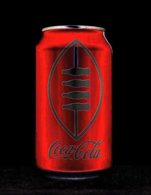
Personally I like ur creation than that puss Warhol. His fame was on the coke scene of the disco days. I won't rant his uncreativity but would pause urs instead. Wink. The clarity is great. The angle of the shot of the rich red coke can is great. The capture of the light is great. The image is balanced and eye appealing to the viewer. Great eye and great job overall
reply by the author on 21-Mar-2016
  |
Personally I like ur creation than that puss Warhol. His fame was on the coke scene of the disco days. I won't rant his uncreativity but would pause urs instead. Wink. The clarity is great. The angle of the shot of the rich red coke can is great. The capture of the light is great. The image is balanced and eye appealing to the viewer. Great eye and great job overall
Comment Written 21-Mar-2016
reply by the author on 21-Mar-2016
-
Thank you. I was never a big fan of Warhol but I do have to credit him for inspiring me to create this. )
-
I usednto joke about the Campbell soup can that original sold for 100,000 and later (Now that he is dead) 1.5 million that I could do the same thing. Simple illustration. It was who he was on the scene not his creativity.. This capture u did has more imagination than he could ever do..so I'll praise ur work and spit on his..course that is only my opinion.. Wink
-
He was a commercial artist before be sold his work as fine art. It was remembering the soup can that gave me the inspiration for this. :)
-
And interior decorator too..I know his history.. That doesn't sway my opinion about the dweeb..I'm praising ur work..him I can go in and on. So let's focus on ur creative eye and I look forward more to ur work..(thumbs up)
-
Thank you :)
Comment from BENSIMO2010
excellent photography, high quality of image, nice black background of picture, I like it, so beautiful coca cola can, I like how you nicely framed this picture and very nice the red and black combination of colors, thank you so much.
reply by the author on 21-Mar-2016
|
excellent photography, high quality of image, nice black background of picture, I like it, so beautiful coca cola can, I like how you nicely framed this picture and very nice the red and black combination of colors, thank you so much.
Comment Written 21-Mar-2016
reply by the author on 21-Mar-2016
-
Thank you
-
you are welcome
Comment from iPhone7
Oh now this is really cool. You showed such imagination and creativity in using the filter to change this ordinary object into something extraordinary. Very well done. A great entry for the contest. Best of fortune in the contest. Well done ~ Steve
reply by the author on 21-Mar-2016
|
Oh now this is really cool. You showed such imagination and creativity in using the filter to change this ordinary object into something extraordinary. Very well done. A great entry for the contest. Best of fortune in the contest. Well done ~ Steve
Comment Written 21-Mar-2016
reply by the author on 21-Mar-2016
-
Thank you
Comment from a.samathasena
What a wonderful nice lovely mixed media shot.Beautiful nice scene and entrance. Coca Cola empty can,nice red color and details,light and color balance,dark b/g are gorgeous great and make a nice scene.Light and color balance are great.I like this talent work.Focus color and all are excellent.Great job.Well Done.Thanks.
reply by the author on 21-Mar-2016
|
What a wonderful nice lovely mixed media shot.Beautiful nice scene and entrance. Coca Cola empty can,nice red color and details,light and color balance,dark b/g are gorgeous great and make a nice scene.Light and color balance are great.I like this talent work.Focus color and all are excellent.Great job.Well Done.Thanks.
Comment Written 21-Mar-2016
reply by the author on 21-Mar-2016
-
Thank you
Comment from dalebraatz
What a wonderful first impression, Very good colors and depth and details have been captured and created here. Very pleasing to look at. Thank you for sharing. dale
reply by the author on 21-Mar-2016
|
What a wonderful first impression, Very good colors and depth and details have been captured and created here. Very pleasing to look at. Thank you for sharing. dale
Comment Written 21-Mar-2016
reply by the author on 21-Mar-2016
-
Thank you
Comment from Joelgraphuchin
This is surely a creative touch on the Coca-Cola can. Keeping its label ( Coca Cola) is smart. The can doesn't lose its identity. The image itself is sharp and clear.
Well done and thanks for sharing.
reply by the author on 21-Mar-2016
|
This is surely a creative touch on the Coca-Cola can. Keeping its label ( Coca Cola) is smart. The can doesn't lose its identity. The image itself is sharp and clear.
Well done and thanks for sharing.
Comment Written 21-Mar-2016
reply by the author on 21-Mar-2016
-
Thank you Joel
Comment from Dick Lee Shia
Aptly captured for the contest theme... Creative concept. Innovative approach. Imaginative presentation. Impressive mixed media rendition. Excellent colors & textures. Interesting modification. Great lighting & framing. Thanks for sharing! Best of luck in the contest!
reply by the author on 21-Mar-2016
|
Aptly captured for the contest theme... Creative concept. Innovative approach. Imaginative presentation. Impressive mixed media rendition. Excellent colors & textures. Interesting modification. Great lighting & framing. Thanks for sharing! Best of luck in the contest!
Comment Written 21-Mar-2016
reply by the author on 21-Mar-2016
-
Thank you
Comment from Sean T Phelan
Your photo of this empty soda can makes for an entertaining and attractive picture,my friend!
The color treatment,a bright metallic orange/red against a jet black background, emits a Lively vibe which is very enjoyable!
~Sean
reply by the author on 21-Mar-2016
|
Your photo of this empty soda can makes for an entertaining and attractive picture,my friend!
The color treatment,a bright metallic orange/red against a jet black background, emits a Lively vibe which is very enjoyable!
~Sean
Comment Written 21-Mar-2016
reply by the author on 21-Mar-2016
-
Thank you Sean. :)
-
You're very welcome,my friend!
Comment from Lolly Cardinal
Nice and clear photo well centered and detailed. Good mimic! Shadow on top well and bottom are in proper place. Very good shot and nice eye viewer.
Thanks for showing. Congratulations and Good Luck.
Lolly.
reply by the author on 21-Mar-2016
|
Nice and clear photo well centered and detailed. Good mimic! Shadow on top well and bottom are in proper place. Very good shot and nice eye viewer.
Thanks for showing. Congratulations and Good Luck.
Lolly.
Comment Written 21-Mar-2016
reply by the author on 21-Mar-2016
-
Thank you :)
Comment from Paul G.
I love the black background. It is pretty amazing for the contrast. Yes, it does favor a Warhol. Well done on that. Excellent work all around. Best of luck in the contest and thank you for sharing.
This rating does not count towards story rating or author rank.
The highest and the lowest rating are not included in calculations.
reply by the author on 21-Mar-2016
|
I love the black background. It is pretty amazing for the contrast. Yes, it does favor a Warhol. Well done on that. Excellent work all around. Best of luck in the contest and thank you for sharing.
This rating does not count towards story rating or author rank.
The highest and the lowest rating are not included in calculations.
Comment Written 21-Mar-2016
reply by the author on 21-Mar-2016
-
Thank you :)