
Royal Subjects
Viewing comments for Page 2 "Royal Bath"Art regarding royal subjects
20 total reviews
Comment from jdbjd123
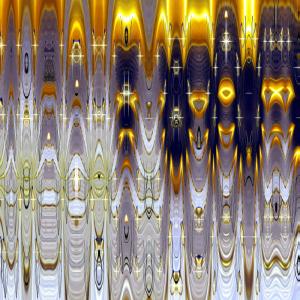
Well, I guess I find I like this one as much as my yesterday's 'favorite' of this series. Very fine translucent, slightly 'pearlescent' areas contrast nicely with the rich, symbolically royal and shimmering gold upper area. The concept of the series is very creative on your part too. Also, congrats on standing #1 in 2008; you are truly deserving of the recognition. Your work is always fascinating and inspired. Best in '09. Judy
reply by the author on 03-Jan-2009
  |
Well, I guess I find I like this one as much as my yesterday's 'favorite' of this series. Very fine translucent, slightly 'pearlescent' areas contrast nicely with the rich, symbolically royal and shimmering gold upper area. The concept of the series is very creative on your part too. Also, congrats on standing #1 in 2008; you are truly deserving of the recognition. Your work is always fascinating and inspired. Best in '09. Judy
Comment Written 02-Jan-2009
reply by the author on 03-Jan-2009
-
Thank you for the congrats and the beautiful review on this, Judy!!! Thank you also for the wonderful comments, and all the great reviews you have given me over the last 6 months. I really appreciate it.
Comment from ARTHOUND
I took a shower in therelove the royal look of the what I'll call a curtain that's very elegant I love the golden mix with the royal look of purple and the awesome design that you put together for this greswat piece the indivigual designs are awesome to the viewer and the glassy look is spectacular arthound john
reply by the author on 03-Jan-2009
|
I took a shower in therelove the royal look of the what I'll call a curtain that's very elegant I love the golden mix with the royal look of purple and the awesome design that you put together for this greswat piece the indivigual designs are awesome to the viewer and the glassy look is spectacular arthound john
Comment Written 02-Jan-2009
reply by the author on 03-Jan-2009
-
Hey, what are doin' in my shower??? lol!! Thanks, John!!!
Comment from ROCK'S PHOTOGRAPHY
this is cool i like how the candle flames look in this.
dof-5
colors-5
reflections-5
contrast-5
lighting-5
creativity-5
i would not change a thing this is nice work.
reply by the author on 03-Jan-2009
|
this is cool i like how the candle flames look in this.
dof-5
colors-5
reflections-5
contrast-5
lighting-5
creativity-5
i would not change a thing this is nice work.
Comment Written 02-Jan-2009
reply by the author on 03-Jan-2009
-
Thank you for the excellent on this, Rocky!!
Comment from Yesunion
This one is not so strong for me. I like the top right quadrant for the strong color contrast and choice of color, but the softer blues and white area is a weaker part of this...maybe if more of that gold stretched across the entire frame as a running theme, it would have more appeal to me. the design is not as rich and intricate as some of the other designs. It does have a soapy bubbly feel to it, but just not enough umph or contrast in that bottom left quadrant. Cool series.
  |
This one is not so strong for me. I like the top right quadrant for the strong color contrast and choice of color, but the softer blues and white area is a weaker part of this...maybe if more of that gold stretched across the entire frame as a running theme, it would have more appeal to me. the design is not as rich and intricate as some of the other designs. It does have a soapy bubbly feel to it, but just not enough umph or contrast in that bottom left quadrant. Cool series.
Comment Written 02-Jan-2009
Comment from kasvam
I love this composition of patterns and colors. You have a great focus on the right part of your art work because of the color contrast between dark blue and yellow. It has become a glowing part. It' a very interesting and creative presentation of something royal as for the colors and the patterns. Thank you for sharing! Karin.
|
I love this composition of patterns and colors. You have a great focus on the right part of your art work because of the color contrast between dark blue and yellow. It has become a glowing part. It' a very interesting and creative presentation of something royal as for the colors and the patterns. Thank you for sharing! Karin.
Comment Written 02-Jan-2009
Comment from BingoStar
Your right this does look like a bathroom with the beautiful curtains, the pretty lighted candles and the gold for good bringing in the good things. Nice designs great lighting cool creation Bingo!
|
Your right this does look like a bathroom with the beautiful curtains, the pretty lighted candles and the gold for good bringing in the good things. Nice designs great lighting cool creation Bingo!
Comment Written 02-Jan-2009
Comment from Spirit Dove
Such brilliant lights coming forth. Very Royal appeal and look.
Love the purple of course, I am a purple freak. LOL
The other colors are transparent like glass. Wow great design and depth.
I also love the delicate detailing and patterns.
Happy New Year.
|
Such brilliant lights coming forth. Very Royal appeal and look.
Love the purple of course, I am a purple freak. LOL
The other colors are transparent like glass. Wow great design and depth.
I also love the delicate detailing and patterns.
Happy New Year.
Comment Written 01-Jan-2009
Comment from witzend74
he he this does look like it might be a royal bath with the gold fixtures. Very interesting piece, thanks for sharing :-)
reply by the author on 03-Jan-2009
|
he he this does look like it might be a royal bath with the gold fixtures. Very interesting piece, thanks for sharing :-)
Comment Written 01-Jan-2009
reply by the author on 03-Jan-2009
-
Thank you again!! Thank you also for the review on both pieces. :) I really appreciate it.
Comment from jgrace
Really like the design and colors in this one. Very interesting to view. Especially like the blues/golds in the top portion of the composition. I do see how you thought it might be a royal bath. Good balance in light and dark areas. Enjoyed viewing.
reply by the author on 01-Jan-2009
|
Really like the design and colors in this one. Very interesting to view. Especially like the blues/golds in the top portion of the composition. I do see how you thought it might be a royal bath. Good balance in light and dark areas. Enjoyed viewing.
Comment Written 01-Jan-2009
reply by the author on 01-Jan-2009
-
Thank you so much again, Julie! WELCOME TO 2009!
Comment from Dazzleme
Your use of the PSP has worked well for this digital artwork. The design again, works nicely here. The effects you have used here do work extrememly well.
|
Your use of the PSP has worked well for this digital artwork. The design again, works nicely here. The effects you have used here do work extrememly well.
Comment Written 31-Dec-2008