Seascapes in England and NZ
Viewing comments for Page 7 "Evening at Te Arai Point"Seascapes of England and New Zealand.
46 total reviews
Comment from Bender
It's amazing how one main color throughout a painting can really make it pop just as much as a multi-colored one. This is really cool to look at.
Thanks for sharing.
reply by the author on 29-Jan-2009
    |
It's amazing how one main color throughout a painting can really make it pop just as much as a multi-colored one. This is really cool to look at.
Thanks for sharing.
Comment Written 28-Jan-2009
reply by the author on 29-Jan-2009
-
Thank you for your review and taking time to look.
Comment from sergiu
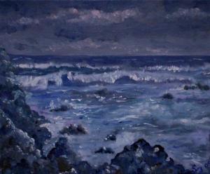
A piece with an unusual a topic which attract suddenly looked exactly through its unique.
Technique seem to be rudimentary,but while maintaining all attributes of genus Traditional Art.
Not scream: "wow!", just looks in silence and fallow the story-line narrated there.
The colors seem traumatic affected of the lack of clear drawing and a solid structure of composition but lead at least to new and spontaneous game of colors that make to revise own opinion and pass trough work again for discover what is hidden...but there is the sea with huge waves which break on rocks.
Composition in itself is very balanced maybe little congested in left side.
Color symbolism arises from cultural and contemporary contexts and in my opinion is to much blue...attention, can break the harmony and become monotonous, that because the harmony is a dynamic equilibrium between all elements from composition.
In my opinion must reduce a little from blue and alternate with blue-green and the light reflect in waves in complementary colors like light orange.The rock from right side (I say it before) to make heavy the picture on left side, it can be brown with blue-gray reflex.Overall
that piece is pleasing to the eye.
reply by the author on 29-Jan-2009
|
A piece with an unusual a topic which attract suddenly looked exactly through its unique.
Technique seem to be rudimentary,but while maintaining all attributes of genus Traditional Art.
Not scream: "wow!", just looks in silence and fallow the story-line narrated there.
The colors seem traumatic affected of the lack of clear drawing and a solid structure of composition but lead at least to new and spontaneous game of colors that make to revise own opinion and pass trough work again for discover what is hidden...but there is the sea with huge waves which break on rocks.
Composition in itself is very balanced maybe little congested in left side.
Color symbolism arises from cultural and contemporary contexts and in my opinion is to much blue...attention, can break the harmony and become monotonous, that because the harmony is a dynamic equilibrium between all elements from composition.
In my opinion must reduce a little from blue and alternate with blue-green and the light reflect in waves in complementary colors like light orange.The rock from right side (I say it before) to make heavy the picture on left side, it can be brown with blue-gray reflex.Overall
that piece is pleasing to the eye.
Comment Written 28-Jan-2009
reply by the author on 29-Jan-2009
-
Thank you for your detailed review.
-
You are welcome.
Regards.
sergiu
Comment from MoonShine
Dramatic and deep use of rich colours which compliment and make a great atmosphere and feeling to this painting. Great depth and technique. Love the way the clouds compliment to crashing waves. Wonderfully composed and a beautiful view thanks for sharing.
reply by the author on 29-Jan-2009
|
Dramatic and deep use of rich colours which compliment and make a great atmosphere and feeling to this painting. Great depth and technique. Love the way the clouds compliment to crashing waves. Wonderfully composed and a beautiful view thanks for sharing.
Comment Written 28-Jan-2009
reply by the author on 29-Jan-2009
-
Many thanks for your great review. I really appreciate your time and thoughts.
Comment from Details
I like this. Dark, gloomy, scary feel to it - but in a good way. :) A person imagines what this must sound and feel like. Really like your color choices for both sky and water. Great work.
reply by the author on 28-Jan-2009
|
I like this. Dark, gloomy, scary feel to it - but in a good way. :) A person imagines what this must sound and feel like. Really like your color choices for both sky and water. Great work.
Comment Written 28-Jan-2009
reply by the author on 28-Jan-2009
-
Many thanks for your great review. Glad you like it.
Comment from shiloh106
You have created wonderful movement in the sea in this work. The whitecaps look very strong and choppy as you say. Nice use of color. Only suggestion is might have used some artistic license and add some light from a moon.
This rating does not count towards story rating or author rank.
The highest and the lowest rating are not included in calculations.
reply by the author on 28-Jan-2009
|
You have created wonderful movement in the sea in this work. The whitecaps look very strong and choppy as you say. Nice use of color. Only suggestion is might have used some artistic license and add some light from a moon.
This rating does not count towards story rating or author rank.
The highest and the lowest rating are not included in calculations.
Comment Written 28-Jan-2009
reply by the author on 28-Jan-2009
-
Many thanks for your comments. Much appreciated.
Comment from MissNoma
I really like the different textures to this painting Suzanne. You have portrayed the movement of the turbulent ocean very well. The dark, stormy sky compliments the rough sea. The rocks to the left and in the f/g give perspective. We must be on a similar wavelength (pardon the pun) today, I have just posted a photo of an incoming storm, complete with rocks to the left like yours. Two different mediums but very similar in their own way. K.
This rating does not count towards story rating or author rank.
The highest and the lowest rating are not included in calculations.
reply by the author on 28-Jan-2009
|
I really like the different textures to this painting Suzanne. You have portrayed the movement of the turbulent ocean very well. The dark, stormy sky compliments the rough sea. The rocks to the left and in the f/g give perspective. We must be on a similar wavelength (pardon the pun) today, I have just posted a photo of an incoming storm, complete with rocks to the left like yours. Two different mediums but very similar in their own way. K.
This rating does not count towards story rating or author rank.
The highest and the lowest rating are not included in calculations.
Comment Written 28-Jan-2009
reply by the author on 28-Jan-2009
-
Many thanks for your nice comments and review. I'm glad you like it. I haven't seen yours yet. Suzanne