Seascapes in England and NZ
Viewing comments for Page 5 "Shades of Blue"Seascapes of England and New Zealand.
79 total reviews
Comment from redwolf
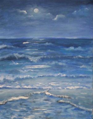
The varying shades of blue are used well. However, what is the focal point? The lower flow line pulls you into the sea only to be abruptly stopped. The midline wave drops us back in and towards the lower part of painting only to have us crash into the lower focal line stopping us again. The moon and skyline are well done, I just feel like I am left up there wondering in the sky with nowhere else to go or focus on.
This rating does not count towards story rating or author rank.
The highest and the lowest rating are not included in calculations.
reply by the author on 27-Apr-2009
     |
The varying shades of blue are used well. However, what is the focal point? The lower flow line pulls you into the sea only to be abruptly stopped. The midline wave drops us back in and towards the lower part of painting only to have us crash into the lower focal line stopping us again. The moon and skyline are well done, I just feel like I am left up there wondering in the sky with nowhere else to go or focus on.
This rating does not count towards story rating or author rank.
The highest and the lowest rating are not included in calculations.
Comment Written 27-Apr-2009
reply by the author on 27-Apr-2009
-
Really!
Comment from DAberle
Wonderful water effect! I know how difficult it is to get waves to look real. My only suggestions would be to deepen the horizon water area to creat a little more depth. Also eliminate the light areas on the right and left of center - they draw the eye out of the picture. Perhaps lighten the clouds under the moon slightly to draw the eye up to the moon. What was your intended focal point - the moon or the one very light wave -- I suggest brightening the waves coming forward to match that wave's light and lightening the clouds under the moon (if the moon was the intended focal point). The eye stops at the one light wave, instead of traveling up and through the painting. Terrific work! With just a little tweaking it is a 5 star!
reply by the author on 27-Apr-2009
|
Wonderful water effect! I know how difficult it is to get waves to look real. My only suggestions would be to deepen the horizon water area to creat a little more depth. Also eliminate the light areas on the right and left of center - they draw the eye out of the picture. Perhaps lighten the clouds under the moon slightly to draw the eye up to the moon. What was your intended focal point - the moon or the one very light wave -- I suggest brightening the waves coming forward to match that wave's light and lightening the clouds under the moon (if the moon was the intended focal point). The eye stops at the one light wave, instead of traveling up and through the painting. Terrific work! With just a little tweaking it is a 5 star!
Comment Written 26-Apr-2009
reply by the author on 27-Apr-2009
-
Thank you very much for your detailed review.
Comment from ega39
This is lovely, you really master the Oil technique and create a beautiful painting with nice shades of blue, lots of movement in the water, good lighting and contrast, nice texture and a wonderful sky.
Thanks for sharing
reply by the author on 27-Apr-2009
|
This is lovely, you really master the Oil technique and create a beautiful painting with nice shades of blue, lots of movement in the water, good lighting and contrast, nice texture and a wonderful sky.
Thanks for sharing
Comment Written 26-Apr-2009
reply by the author on 27-Apr-2009
-
Many thanks for your great review. I'm glad you like this.
-
My pleasure
Comment from KTTHELEPRACHAUN
gorgreous copositon and color working, its very pretty. booth impresionistic yet realistic :D the only thing is that there is not much contrast with the sky and the waves and theyt sortof mush together, you can almost see the clouds as just being more waves if you looked at a glance, still, a great painting
reply by the author on 27-Apr-2009
|
gorgreous copositon and color working, its very pretty. booth impresionistic yet realistic :D the only thing is that there is not much contrast with the sky and the waves and theyt sortof mush together, you can almost see the clouds as just being more waves if you looked at a glance, still, a great painting
Comment Written 26-Apr-2009
reply by the author on 27-Apr-2009
-
Thank you for your review and taking time to look.
Comment from howdy5
Excellent choice for the contest. Blues of the ocean with waves and the moon adds to the appeal or interest. Blend of blues and white mix well. Composition well organized. Thank you for sharing your talent.
reply by the author on 26-Apr-2009
|
Excellent choice for the contest. Blues of the ocean with waves and the moon adds to the appeal or interest. Blend of blues and white mix well. Composition well organized. Thank you for sharing your talent.
Comment Written 26-Apr-2009
reply by the author on 26-Apr-2009
-
Thank you so much for your very nice review. I'm happy that you like this one.
Comment from dlwagner
Although I am a photographer I admire anyone who has any type of artistic talent. This painting is beautiful and shows great depth and drama. Well done!
reply by the author on 26-Apr-2009
|
Although I am a photographer I admire anyone who has any type of artistic talent. This painting is beautiful and shows great depth and drama. Well done!
Comment Written 26-Apr-2009
reply by the author on 26-Apr-2009
-
Thank you so much for your great review. Message sent.
Comment from BingoStar
I really love the ocean and its many sounds and beauty. This is such a awesome display of blues and lights and shadows. Excellent I love the moon too as it shines its glow on the water below So much beauty, power and movement. Thank you so much for sharing your great creation. Bingo!
reply by the author on 26-Apr-2009
|
I really love the ocean and its many sounds and beauty. This is such a awesome display of blues and lights and shadows. Excellent I love the moon too as it shines its glow on the water below So much beauty, power and movement. Thank you so much for sharing your great creation. Bingo!
Comment Written 26-Apr-2009
reply by the author on 26-Apr-2009
-
Thank you so much for your very nice comments and review. I'm very pleased you like this one.
Comment from ARTHOUND
very beautiful suzannereally like the action of the sky and the crashing of the waves and the awesome lighting effects that you did in this great looking picture the action o0f the water is so reallistic like the way thre lightis hitting the water abd reflecting and the great way you seperated the ocean form the sky gret inital impact great use of your coloreation and the superiorw way you depicted the scean i like the lighting on the horizoneand the light from the moon great artwork john ( :
reply by the author on 26-Apr-2009
 |
very beautiful suzannereally like the action of the sky and the crashing of the waves and the awesome lighting effects that you did in this great looking picture the action o0f the water is so reallistic like the way thre lightis hitting the water abd reflecting and the great way you seperated the ocean form the sky gret inital impact great use of your coloreation and the superiorw way you depicted the scean i like the lighting on the horizoneand the light from the moon great artwork john ( :
Comment Written 26-Apr-2009
reply by the author on 26-Apr-2009
-
Thank you so much. Message sent. Suzanne
-
your welcome suzanne very beautful john ( :
Comment from Jorge Gaete
Fantastic treatment of the color blue.
Everything so softly blended.
The detail and sense of movement on the water is phenomenal.
Beautiful technique.
Great work.
reply by the author on 26-Apr-2009
|
Fantastic treatment of the color blue.
Everything so softly blended.
The detail and sense of movement on the water is phenomenal.
Beautiful technique.
Great work.
Comment Written 26-Apr-2009
reply by the author on 26-Apr-2009
-
Many thanks for your great review. I'm very pleased you like this one.
Comment from Smurphgirl
I find painting water one of the most difficult things to do. You have done an excellent job with this. I especially like that you used blue for the entire painting. Excellent! Very, very good work.
reply by the author on 26-Apr-2009
|
I find painting water one of the most difficult things to do. You have done an excellent job with this. I especially like that you used blue for the entire painting. Excellent! Very, very good work.
Comment Written 25-Apr-2009
reply by the author on 26-Apr-2009
-
Thank you so much for your very nice comments and review. I'm glad you like this one.