
The Dark Side
digital painting50 total reviews
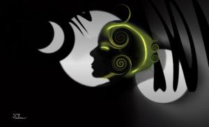
Comment from rscsjessamine
Good Art Deco style design with a strong composition reminds me of a book cover for a `who done it` mystery.A very well handled piece of work.
  |
Good Art Deco style design with a strong composition reminds me of a book cover for a `who done it` mystery.A very well handled piece of work.
Comment Written 22-Nov-2009
Comment from Robotkin
Shades of Art Deco with hintsof fantasy thrown in for good measure..a most interesting composition with its subtle play of light and dark and shadow...Good Rob
|
Shades of Art Deco with hintsof fantasy thrown in for good measure..a most interesting composition with its subtle play of light and dark and shadow...Good Rob
Comment Written 22-Nov-2009
Comment from focaldot
This is beautifull digital painting, i really like the silhouette face against the white, very nicely composed too. Welld one and enjoyed viewing your art as always.
reply by the author on 21-Nov-2009
|
This is beautifull digital painting, i really like the silhouette face against the white, very nicely composed too. Welld one and enjoyed viewing your art as always.
Comment Written 21-Nov-2009
reply by the author on 21-Nov-2009
-
Thank you so very much for the wonderful review, Surmed. I haven't seen you for so long, I thought maybe you had quit posting. Many others seem to have. In art and photography. Good to hear from you again, and I thank you :)
-
:) Yeah was busy, still i am, but try to logon here to see whats been cookin ;)
Comment from sarnia2
This is really cool!
The colours are so well blended, with the yellow/green lightened areas really giving impact to the composition.
The lighter 'moons' behind the silhouettegive depth to the image.
Would make a superb piece of artwork for a new perfume!
|
This is really cool!
The colours are so well blended, with the yellow/green lightened areas really giving impact to the composition.
The lighter 'moons' behind the silhouettegive depth to the image.
Would make a superb piece of artwork for a new perfume!
Comment Written 21-Nov-2009
Comment from hannahraye
i love the glowing look around the head. And the basic shapes and lines you used, its really pleasing to the eye. It's clean and neat.. well done. Also i like the detail with the shadow behind the head thanks for showing!
  |
i love the glowing look around the head. And the basic shapes and lines you used, its really pleasing to the eye. It's clean and neat.. well done. Also i like the detail with the shadow behind the head thanks for showing!
Comment Written 21-Nov-2009
Comment from Wolfdancer
A most intriguing work of art, Shawn. Frightening in one sense and eerie on another. A sense of the future of humanity perhaps?
|
A most intriguing work of art, Shawn. Frightening in one sense and eerie on another. A sense of the future of humanity perhaps?
Comment Written 21-Nov-2009
Comment from dreamndee
Interesting use of color. This has a noirish, art deco feel to it. Great design, the only thing I would tweak is the focal point. I think your female figure should be in a different position. using the rule of thirds if she were shifted right and slightly up the flow would be a bit smoother. But overall this is a fantastic design.
|
Interesting use of color. This has a noirish, art deco feel to it. Great design, the only thing I would tweak is the focal point. I think your female figure should be in a different position. using the rule of thirds if she were shifted right and slightly up the flow would be a bit smoother. But overall this is a fantastic design.
Comment Written 21-Nov-2009
Comment from Jorge Gaete
Beautiful technique.
Great framing and depth.
The color brings her right to my eyes.
Opens ones imagination to conjecture.
Great framing.
|
Beautiful technique.
Great framing and depth.
The color brings her right to my eyes.
Opens ones imagination to conjecture.
Great framing.
Comment Written 20-Nov-2009
Comment from hickey61570
interesting picture. I like the person in the middle. The black things hanging down give me the feeling of letters. Cool picture. Good Job
|
interesting picture. I like the person in the middle. The black things hanging down give me the feeling of letters. Cool picture. Good Job
Comment Written 20-Nov-2009
Comment from Eleanor Perrotta
I love your creative side on this one. Very different from your usual work.
Interesting design. Works well as a black and white with slight color to offset the simplicity of it. Good visual impact. Nicely done. Eleanor
|
I love your creative side on this one. Very different from your usual work.
Interesting design. Works well as a black and white with slight color to offset the simplicity of it. Good visual impact. Nicely done. Eleanor
Comment Written 20-Nov-2009