Flowers & Still Life
Viewing comments for Page 61 "Fallen Beauty"Arty Flowers
42 total reviews
Comment from Nadege
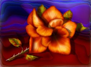
Wow, this is very stricking.
Great initial impact.
Very creative.
I love the bright colors and the details in the petals.
I like the radiating soft focus which draws you eyes to the flower.
Wish I could give you more.
  |
Wow, this is very stricking.
Great initial impact.
Very creative.
I love the bright colors and the details in the petals.
I like the radiating soft focus which draws you eyes to the flower.
Wish I could give you more.
Comment Written 11-Jun-2010
Comment from ardefra1
i like the look of the painting as it caught my eye so good initial impact. good creativity in presentation. good color harmony the reds with the deep blue background. good center of interest the flower stands out nicely. good technical excellence nice work. good lighting. i like the rug look of what the flower is lying on this looks hard to do.
|
i like the look of the painting as it caught my eye so good initial impact. good creativity in presentation. good color harmony the reds with the deep blue background. good center of interest the flower stands out nicely. good technical excellence nice work. good lighting. i like the rug look of what the flower is lying on this looks hard to do.
Comment Written 11-Jun-2010
Comment from vipshehan-Nikon
Nice piece of art with good initial impact and nice color harmony. The detail is nice and the blue and red always blends nice together.
Thanks for sharing.
|
Nice piece of art with good initial impact and nice color harmony. The detail is nice and the blue and red always blends nice together.
Thanks for sharing.
Comment Written 11-Jun-2010
Comment from Al'Bout Learning
Very dynamic impact! I love the way you use light to add life to your image. Well thought out. Clarity is perfect. Such a show of color brilliance. Great creativity! The details in the main image are tremendous. Very attractive piece of art. Good luck.
|
Very dynamic impact! I love the way you use light to add life to your image. Well thought out. Clarity is perfect. Such a show of color brilliance. Great creativity! The details in the main image are tremendous. Very attractive piece of art. Good luck.
Comment Written 11-Jun-2010
Comment from jerry s.
bright and beautifully presented.great colors and contrasts.shading and highlights are effective in displaying subject.black to purple shows a nice backdrop.
|
bright and beautifully presented.great colors and contrasts.shading and highlights are effective in displaying subject.black to purple shows a nice backdrop.
Comment Written 11-Jun-2010
Comment from aLeoLady
Commanding. One HAS to stop a look at this incredibly vibrant flower beautifully rendered, lighting artfully done and the thorns look so sharp you can almost feel the prick. Of concern is the "horizon's" sharpness is not carried to the flower at the same depth of vision. I would highly recommend to soften the horizon and it's distinction to match that of the flower and make the transition between it and the very blurred background softer. I find this descrepency distracting and disturbing.
This rating does not count towards story rating or author rank.
The highest and the lowest rating are not included in calculations.
  |
Commanding. One HAS to stop a look at this incredibly vibrant flower beautifully rendered, lighting artfully done and the thorns look so sharp you can almost feel the prick. Of concern is the "horizon's" sharpness is not carried to the flower at the same depth of vision. I would highly recommend to soften the horizon and it's distinction to match that of the flower and make the transition between it and the very blurred background softer. I find this descrepency distracting and disturbing.
This rating does not count towards story rating or author rank.
The highest and the lowest rating are not included in calculations.
Comment Written 11-Jun-2010
Comment from lorac1
This is a stunning opiece of digital art. The colors are strong and harmonious. I love the lighting and coontrast on the petals and leaves. The picture holds one's interest.
|
This is a stunning opiece of digital art. The colors are strong and harmonious. I love the lighting and coontrast on the petals and leaves. The picture holds one's interest.
Comment Written 11-Jun-2010
Comment from fila4
The 2D effect really makes the fallen rose stand out well. And one can tell from the stem end it was not cut. Nice color harmony. Good form on the rose petals, leaves and thorns. The red foreground seems to draw the eyes right into the rose. Topped of nicely with a cool blue. Well presented with good impact. The best of luck in the contest. Thanks for sharing.
|
The 2D effect really makes the fallen rose stand out well. And one can tell from the stem end it was not cut. Nice color harmony. Good form on the rose petals, leaves and thorns. The red foreground seems to draw the eyes right into the rose. Topped of nicely with a cool blue. Well presented with good impact. The best of luck in the contest. Thanks for sharing.
Comment Written 11-Jun-2010
Comment from David Ruhl
This is really pretty Shawn.
I love the color, lighting, and 3-D look of the flower petals.
I also like the blue at the top, it goes well with the orange. But I think the red area is a bit bright, and might look better with another color that goes better with orange (dark green maybe ?)
|
This is really pretty Shawn.
I love the color, lighting, and 3-D look of the flower petals.
I also like the blue at the top, it goes well with the orange. But I think the red area is a bit bright, and might look better with another color that goes better with orange (dark green maybe ?)
Comment Written 11-Jun-2010
Comment from donkeyoatey
I am always amazed at the depth in your paintings..and this is no exception. I like the colors a great deal, and how the petals seem lit from with in. Donkeyoatey
|
I am always amazed at the depth in your paintings..and this is no exception. I like the colors a great deal, and how the petals seem lit from with in. Donkeyoatey
Comment Written 11-Jun-2010