
Flowers & Still Life
Viewing comments for Page 50 "Juicy Fruit"Arty Flowers
36 total reviews
Comment from DonFofo
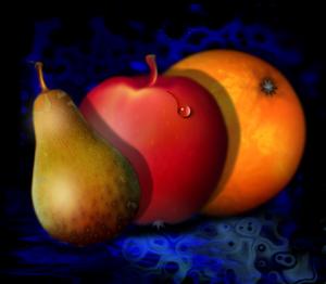
Hello there, 3 fruits, 3 colors, 3 shades, one common background and a water drop to brake into the center of attention, very good, well done, thank you for sharing, Don Fofo
  |
Hello there, 3 fruits, 3 colors, 3 shades, one common background and a water drop to brake into the center of attention, very good, well done, thank you for sharing, Don Fofo
Comment Written 25-Aug-2010
Comment from andylouviere
Another creative piece. I like your still life version. They look real as ever. I like the water drop on it too. Thanks for sharing and keep it up I look forward to more from you
|
Another creative piece. I like your still life version. They look real as ever. I like the water drop on it too. Thanks for sharing and keep it up I look forward to more from you
Comment Written 25-Aug-2010
Comment from Mubashir Iqbal
This is a great piece of digital artwork especially with regards to the subject matter and the title.
Very well executed.
The colours of the fruits are great and work well with the contrasting background.
I like how the single droplet is enough to convey the 'juiciness' of the fruit.
Very well done in concept and execution.
Thanks for the share.
|
This is a great piece of digital artwork especially with regards to the subject matter and the title.
Very well executed.
The colours of the fruits are great and work well with the contrasting background.
I like how the single droplet is enough to convey the 'juiciness' of the fruit.
Very well done in concept and execution.
Thanks for the share.
Comment Written 25-Aug-2010
Comment from lorac1
That is an attractive picture of the fruit. The colors are bright and harmonious. The composition is good, and the painting is clear.
|
That is an attractive picture of the fruit. The colors are bright and harmonious. The composition is good, and the painting is clear.
Comment Written 24-Aug-2010
Comment from AlienVoyager
This image creates strong impression.
The textures and the colors of the fruits'
skins are quite realistic. The dark
background highlighted those fruits.
I notice that the stalk of the apple and the pear still can be improved (I think the general lighting suggested that it should be darker at some parts).
The shadows of the fruits on the other fruits are not so realistic to me, I think the way the shadows fall should be down (not up). And the shadow of the pear on the background shouldn't be on the same line with the one on the apple's surface.
|
This image creates strong impression.
The textures and the colors of the fruits'
skins are quite realistic. The dark
background highlighted those fruits.
I notice that the stalk of the apple and the pear still can be improved (I think the general lighting suggested that it should be darker at some parts).
The shadows of the fruits on the other fruits are not so realistic to me, I think the way the shadows fall should be down (not up). And the shadow of the pear on the background shouldn't be on the same line with the one on the apple's surface.
Comment Written 24-Aug-2010
Comment from virginian
Good background and vibrant fruit colors displaying nice shadows. Like the touch of a water drop. Subject(s) well presented with just enough details. Enjoyed looking at this.
|
Good background and vibrant fruit colors displaying nice shadows. Like the touch of a water drop. Subject(s) well presented with just enough details. Enjoyed looking at this.
Comment Written 24-Aug-2010
Comment from cleo85
I like to bite into these fruits. Especially the apple looks so inviting. The combination of the fruit color on the blue-dark background is captivating. I love the light as if coming through a unseen window left and the shadows.
Much luck for the contest.
|
I like to bite into these fruits. Especially the apple looks so inviting. The combination of the fruit color on the blue-dark background is captivating. I love the light as if coming through a unseen window left and the shadows.
Much luck for the contest.
Comment Written 24-Aug-2010
Comment from Eric Liller
Initial impact 5
center of interest 5
color harmony 5
crop/frame 5
technical excellence 5+
Great work. Good on te lighting and shadowing. Thank you for sharing.Eric
|
Initial impact 5
center of interest 5
color harmony 5
crop/frame 5
technical excellence 5+
Great work. Good on te lighting and shadowing. Thank you for sharing.Eric
Comment Written 24-Aug-2010
Comment from paulinejjones
I like the lovely blue background. Your lighting is very good and i like the textures on the fruit. The best bit it the little water drop; this is the center of interest and really enhances the piece.
reply by the author on 24-Aug-2010
|
I like the lovely blue background. Your lighting is very good and i like the textures on the fruit. The best bit it the little water drop; this is the center of interest and really enhances the piece.
Comment Written 24-Aug-2010
reply by the author on 24-Aug-2010
-
Thank you so very much for the excellent review, Pauline. :) Shawn
Comment from flygirl254
This is a very nice depiction of fruit as generated by the computer programming. I do miss a little more detail that would make it seem a bit more realistic. Perhaps it was your intent to keep the fruit shown in a sterile way. The drop of water seems a little out of place, and while the orange does have a little bit of core, it doesn't have the indentation and imperfections there, and the rind of the orange is far too smooth. The apple and pear also seem a bit too perfect. Even though the pair does have some of the characteristic browning areas, it's still not quite believable and real. The apple's core does not have a place to attach, just a smooth area that really doesn't show a connection at all. Also, the bottom of the apple seems to have the same kind of core as the orange does, instead of having the dark core with the characteristic shape of an apple.
All that being said, the quality of the production for the picture is very good and precise. You have some interesting colors within the three fruits in some places. I also like the background and its reflection, but it does seem a bit off that, while these fruits cast slight shadows on each other, they don't have any reflection, and I'm not sure where the lighting source would be for the picture.
I am very unsure as to my reaction to his picture. In many ways, it seem as though things I find to be "off" are done on purpose. I'm having a hard time knowing how to rate the picture, but I have to say that the more a person stays with the picture, the more it tends to "grow" on you. :-)
I do wish you the best of luck in the contest.
  |
This is a very nice depiction of fruit as generated by the computer programming. I do miss a little more detail that would make it seem a bit more realistic. Perhaps it was your intent to keep the fruit shown in a sterile way. The drop of water seems a little out of place, and while the orange does have a little bit of core, it doesn't have the indentation and imperfections there, and the rind of the orange is far too smooth. The apple and pear also seem a bit too perfect. Even though the pair does have some of the characteristic browning areas, it's still not quite believable and real. The apple's core does not have a place to attach, just a smooth area that really doesn't show a connection at all. Also, the bottom of the apple seems to have the same kind of core as the orange does, instead of having the dark core with the characteristic shape of an apple.
All that being said, the quality of the production for the picture is very good and precise. You have some interesting colors within the three fruits in some places. I also like the background and its reflection, but it does seem a bit off that, while these fruits cast slight shadows on each other, they don't have any reflection, and I'm not sure where the lighting source would be for the picture.
I am very unsure as to my reaction to his picture. In many ways, it seem as though things I find to be "off" are done on purpose. I'm having a hard time knowing how to rate the picture, but I have to say that the more a person stays with the picture, the more it tends to "grow" on you. :-)
I do wish you the best of luck in the contest.
Comment Written 24-Aug-2010