Elfs in heaven
Not real24 total reviews
Comment from raineyknightartwork
Initial Perception: striking imagination gone wild
Emotionally Charged: yes
Story Telling Ability: Yes
Colour Harmony: balanced
Title: fits
Artist Notes: included and descriptive
Technical Creativity: expert
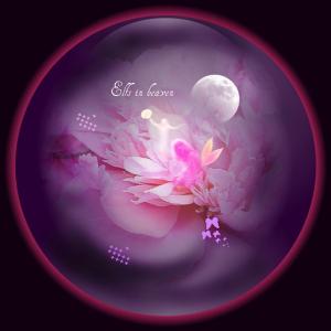
Center of Interest: the moon
Category Posted: photography mixed - when starting with a photograph it has to be in photography mixed.
Story Telling Ability: Yes
What Works Well? Depth of field, focus, colours and subject
Comments: nice work
Star Rating: 5.5+ cyber
A cyber rating may be given when actual stars are unavailable
Per site scale (6=Exceptional, 5.5=Professional, 5=Expert (no revisions necessary) 4.5=Above Average, 4=Average)
Thank you for sharing. Rainey
reply by the author on 27-Nov-2010
  |
Initial Perception: striking imagination gone wild
Emotionally Charged: yes
Story Telling Ability: Yes
Colour Harmony: balanced
Title: fits
Artist Notes: included and descriptive
Technical Creativity: expert
Center of Interest: the moon
Category Posted: photography mixed - when starting with a photograph it has to be in photography mixed.
Story Telling Ability: Yes
What Works Well? Depth of field, focus, colours and subject
Comments: nice work
Star Rating: 5.5+ cyber
A cyber rating may be given when actual stars are unavailable
Per site scale (6=Exceptional, 5.5=Professional, 5=Expert (no revisions necessary) 4.5=Above Average, 4=Average)
Thank you for sharing. Rainey
Comment Written 26-Nov-2010
reply by the author on 27-Nov-2010
-
Thank you very much
-
You are welcome. I am happy you appreciate my efforts. Rainey
Comment from shiloh106
Very pretty creation you have come up with here. Nice use of colors. The peonies looks great. Like your composition with the moon. Fairy and butterflies are delicate and sweet.
reply by the author on 27-Nov-2010
|
Very pretty creation you have come up with here. Nice use of colors. The peonies looks great. Like your composition with the moon. Fairy and butterflies are delicate and sweet.
Comment Written 26-Nov-2010
reply by the author on 27-Nov-2010
-
Thank you very much
Comment from wilkor
Beautiful piece of work, love the many details, stars, moon etc. and the color. This is so nice, I'd call it "heaven on earth" Wilf
reply by the author on 27-Nov-2010
|
Beautiful piece of work, love the many details, stars, moon etc. and the color. This is so nice, I'd call it "heaven on earth" Wilf
Comment Written 26-Nov-2010
reply by the author on 27-Nov-2010
-
Thank you very much
Comment from John House
I have not seen this type of work from you before I am impressed the impact is good showing some good imagination. There colors and harmony of the picture woks well together. Its like looking at a vision through a crystal ball.
reply by the author on 26-Nov-2010
|
I have not seen this type of work from you before I am impressed the impact is good showing some good imagination. There colors and harmony of the picture woks well together. Its like looking at a vision through a crystal ball.
Comment Written 26-Nov-2010
reply by the author on 26-Nov-2010
-
Thank you very much
-
Interesting new work cheers john
Comment from RagsAuggie
Interesting! I like the details! Good colors and lighting in this piece! I ilke teh artist notes! Thanks for sharing! Cindy
reply by the author on 26-Nov-2010
|
Interesting! I like the details! Good colors and lighting in this piece! I ilke teh artist notes! Thanks for sharing! Cindy
Comment Written 26-Nov-2010
reply by the author on 26-Nov-2010
-
Thank you very much
Comment from Pat Christensen
Truly beautiful! Lovely colors and lighting. The addition of all the different componets are very original, well done. A pleasure to view, truly enjoyed. A great job, a great feel to this image!
This rating does not count towards story rating or author rank.
The highest and the lowest rating are not included in calculations.
reply by the author on 26-Nov-2010
  |
Truly beautiful! Lovely colors and lighting. The addition of all the different componets are very original, well done. A pleasure to view, truly enjoyed. A great job, a great feel to this image!
This rating does not count towards story rating or author rank.
The highest and the lowest rating are not included in calculations.
Comment Written 26-Nov-2010
reply by the author on 26-Nov-2010
-
Thank you very much indeed
Comment from RPHOTOTNY
Very good composition.
Colors great.
Storytelling good.
Reflections great.
Thank you for sharing your work.
reply by the author on 26-Nov-2010
|
Very good composition.
Colors great.
Storytelling good.
Reflections great.
Thank you for sharing your work.
Comment Written 26-Nov-2010
reply by the author on 26-Nov-2010
-
Thank you very much
Comment from RedRockArt
My reviews are set with "Blinders" which means the names of those who are being reviewed, are not shown.
Thus the reviewer does not know who the artist may be or if they are one of my Fans and so am not influenced by reputations of the artist. That way you get a fresh review or your work, as each piece is a new challenge.
A challenge for an artist, is to make their work look as good in a photograph as the original subject.
We can only judge the photo.
Many times an automatic adjustment in an editor can make a major improvement or make it worse.
So, sometimes we need to learn to use an editor to make it look as close as possible to the original and this can only be done on a calibrated monitor. This way if the reviewers monitor is also calibrated, we see the same thing.
Your work looks excellent, on my monitor. It probably would make a really good print, on Fuji papers, think Id like it best on Pearl.
Colors fool many into thinking they have contrast, when it is lacking. Some colors are dark, some light, some in middle ranges. But, each color needs a contrast range to look its best. All whites, yellows, blues, etc.
You have a very good range, well, done.
One way to tell if we have a tonal range, is to remove saturation completely. That will show the range of zones, from black without detail, to white without detail, and at least ten shades of grays in between. For it is the blacks to whites in an image, that gives color its impact.
That gives it have more punch. Sometimes it is only necessary to change the middle tones.
When we have an advanced editor, like PS or Gimp, we can use the histogram to adjust Shadows, mid-tones and highlights.
Your tonal range is great.
Like the yellows in the wings, whites, purples from light do darks.
You do have a good eye for composition.
The light grabs attention, leading to the center of interest.
With changes in a good editor, we can bring out individual colors so they could be stronger or have better contrast and dominate.
Your work really stands out.
Sharpening is important. With an editor like Photoshop or Gimp (the latter is free on the Internet) We can use sharpening to focus attention on the center of our choice. So it dominates. When editing digital images, they lose sharpness. Even just resizing does. So we can do a final sharpening.
Sharpening of the elf could be a bit better, but it is still a five.
Many photos are too dark or light and flat or grayed, without sufficient contrast for the subject.
You have done well.
Keep practicing or learning more and a year from now, you can be surprised at the difference in your work. :)
With 74 years experience, am always learning something new.
Some say they would not change the way anything is captured in the camera. They think of photos like a Journalist does, only recording reality.
Artists change anything which the creative side of their brain, motivates them, to express. They express a part of themselves into their art.
They communicate things, that no straight duplication does. When we communicate feelings to one or more people, we are successful. Money is not the only measure of success.
reply by the author on 26-Nov-2010
|
My reviews are set with "Blinders" which means the names of those who are being reviewed, are not shown.
Thus the reviewer does not know who the artist may be or if they are one of my Fans and so am not influenced by reputations of the artist. That way you get a fresh review or your work, as each piece is a new challenge.
A challenge for an artist, is to make their work look as good in a photograph as the original subject.
We can only judge the photo.
Many times an automatic adjustment in an editor can make a major improvement or make it worse.
So, sometimes we need to learn to use an editor to make it look as close as possible to the original and this can only be done on a calibrated monitor. This way if the reviewers monitor is also calibrated, we see the same thing.
Your work looks excellent, on my monitor. It probably would make a really good print, on Fuji papers, think Id like it best on Pearl.
Colors fool many into thinking they have contrast, when it is lacking. Some colors are dark, some light, some in middle ranges. But, each color needs a contrast range to look its best. All whites, yellows, blues, etc.
You have a very good range, well, done.
One way to tell if we have a tonal range, is to remove saturation completely. That will show the range of zones, from black without detail, to white without detail, and at least ten shades of grays in between. For it is the blacks to whites in an image, that gives color its impact.
That gives it have more punch. Sometimes it is only necessary to change the middle tones.
When we have an advanced editor, like PS or Gimp, we can use the histogram to adjust Shadows, mid-tones and highlights.
Your tonal range is great.
Like the yellows in the wings, whites, purples from light do darks.
You do have a good eye for composition.
The light grabs attention, leading to the center of interest.
With changes in a good editor, we can bring out individual colors so they could be stronger or have better contrast and dominate.
Your work really stands out.
Sharpening is important. With an editor like Photoshop or Gimp (the latter is free on the Internet) We can use sharpening to focus attention on the center of our choice. So it dominates. When editing digital images, they lose sharpness. Even just resizing does. So we can do a final sharpening.
Sharpening of the elf could be a bit better, but it is still a five.
Many photos are too dark or light and flat or grayed, without sufficient contrast for the subject.
You have done well.
Keep practicing or learning more and a year from now, you can be surprised at the difference in your work. :)
With 74 years experience, am always learning something new.
Some say they would not change the way anything is captured in the camera. They think of photos like a Journalist does, only recording reality.
Artists change anything which the creative side of their brain, motivates them, to express. They express a part of themselves into their art.
They communicate things, that no straight duplication does. When we communicate feelings to one or more people, we are successful. Money is not the only measure of success.
Comment Written 26-Nov-2010
reply by the author on 26-Nov-2010
-
Thank you very much
Comment from steve's lot
nice job obviously alot of work has gone into this.
really nice colors and images.
thank you for posting
5/5
reply by the author on 26-Nov-2010
|
nice job obviously alot of work has gone into this.
really nice colors and images.
thank you for posting
5/5
Comment Written 26-Nov-2010
reply by the author on 26-Nov-2010
-
Thank you very much
Comment from Pat Groleau
This looks like one of the inserts in magazines etc. that are advertisement of painting on plates. You have done an exception painting. Loved it. The colors are vibrant and well placed. I love the theme.
Very well done.
Pat G
reply by the author on 26-Nov-2010
|
This looks like one of the inserts in magazines etc. that are advertisement of painting on plates. You have done an exception painting. Loved it. The colors are vibrant and well placed. I love the theme.
Very well done.
Pat G
Comment Written 26-Nov-2010
reply by the author on 26-Nov-2010
-
Thank you very much