
Bird Phoenix
Paradise flower47 total reviews
Comment from jesuel
what a beautiful photo the mixture of black and white with color really creates some great contrast and depth beautiful work here
reply by the author on 29-May-2011
  |
what a beautiful photo the mixture of black and white with color really creates some great contrast and depth beautiful work here
Comment Written 28-May-2011
reply by the author on 29-May-2011
-
Thank you very much
Comment from mike@niagarafalls
This has real nice dramatic impact. Composed beautifully as the added touch of vignette. This is stunning Good luck in the contest
reply by the author on 29-May-2011
|
This has real nice dramatic impact. Composed beautifully as the added touch of vignette. This is stunning Good luck in the contest
Comment Written 28-May-2011
reply by the author on 29-May-2011
-
Thank you very much
Comment from MaxineO
Great shot, i love the water drop that is just about to fall off.
Your editing is lovely, definitely makes it very eye catching.
I too have these flowers in my garden, they are definitely interesting.
Lovely work.
reply by the author on 29-May-2011
|
Great shot, i love the water drop that is just about to fall off.
Your editing is lovely, definitely makes it very eye catching.
I too have these flowers in my garden, they are definitely interesting.
Lovely work.
Comment Written 28-May-2011
reply by the author on 29-May-2011
-
Thank you very much
Comment from The Condition Black
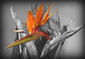
Nicely done. This is one of my favorites going in to this contest. You have a good balance of tones, although it is a little heavy on the grays. I would liked to have seen a little more contrast between the lights and dark. Using the single flower as your color selection was a neat idea. It really does make it pop off the page and stand out. It seems to have been cut off a little abruptly; not the masking but the flower itself. Although the purpose is to make it stand out I think that this piece may have gained a little depth had you colored the rest of the flower (that reappears below the section that comes in front of it). I'm not docking you on your rating for that, just a thought. (For the record I am a pretty harsh critique, and have reviewed every photo in this contest equally as tough).
Again, in regards to the color That bright orange, red and the hint of green offer a good mix. They really pop with the dark tones. I think they would have popped a little more had there been a little more contrast in the BW portion.
You have a good eye as a photographer, but this photo should not have been shot straight on. The focus shouldn't comprise the center of the photo like this, it's too balanced. Offsetting the camera just a tad would have created more alternation; the additional variety would have created more visual and conceptual interest. Along the same lines with this concept is the fact that the focus doesn't leave the canvas area (with the minor exception of a few tips on a couple of the flowers). The problem with this is that the space isn't utilized effectively. For example, if the figure being photographed was offset and portions of it were to leave the confines of the photograph it creates a sense that there is more going on than just what we are seeing. Doing so really adds depth to a photograph and has a substantial impact in immersing the viewer into the work.
You have taken some time in putting together this piece and your work is quite apparent. You have a good eye and aside from a few minor errors you have succeeded in creating a fine piece of art. Good luck in the contest!
This rating does not count towards story rating or author rank.
The highest and the lowest rating are not included in calculations.
reply by the author on 29-May-2011
 |
Nicely done. This is one of my favorites going in to this contest. You have a good balance of tones, although it is a little heavy on the grays. I would liked to have seen a little more contrast between the lights and dark. Using the single flower as your color selection was a neat idea. It really does make it pop off the page and stand out. It seems to have been cut off a little abruptly; not the masking but the flower itself. Although the purpose is to make it stand out I think that this piece may have gained a little depth had you colored the rest of the flower (that reappears below the section that comes in front of it). I'm not docking you on your rating for that, just a thought. (For the record I am a pretty harsh critique, and have reviewed every photo in this contest equally as tough).
Again, in regards to the color That bright orange, red and the hint of green offer a good mix. They really pop with the dark tones. I think they would have popped a little more had there been a little more contrast in the BW portion.
You have a good eye as a photographer, but this photo should not have been shot straight on. The focus shouldn't comprise the center of the photo like this, it's too balanced. Offsetting the camera just a tad would have created more alternation; the additional variety would have created more visual and conceptual interest. Along the same lines with this concept is the fact that the focus doesn't leave the canvas area (with the minor exception of a few tips on a couple of the flowers). The problem with this is that the space isn't utilized effectively. For example, if the figure being photographed was offset and portions of it were to leave the confines of the photograph it creates a sense that there is more going on than just what we are seeing. Doing so really adds depth to a photograph and has a substantial impact in immersing the viewer into the work.
You have taken some time in putting together this piece and your work is quite apparent. You have a good eye and aside from a few minor errors you have succeeded in creating a fine piece of art. Good luck in the contest!
This rating does not count towards story rating or author rank.
The highest and the lowest rating are not included in calculations.
Comment Written 28-May-2011
reply by the author on 29-May-2011
-
Thank you very much. And I do read your review properly. Not all on this site do.
Comment from kmcw53
Great mix of BW and Color!
I like the orange, or the flower and it really stands out against Black and White.
You have done a wonderful job with composition, exposure and focus.
Very nice work
reply by the author on 28-May-2011
|
Great mix of BW and Color!
I like the orange, or the flower and it really stands out against Black and White.
You have done a wonderful job with composition, exposure and focus.
Very nice work
Comment Written 28-May-2011
reply by the author on 28-May-2011
-
Thank you very much
Comment from papabear5769
Yes it does look like a Phoenix good eye you got there!I love how you incorporated the color & B&W!Great focus,contrast & colors,lighting is great also!Thanks for sharing!papabear5769
reply by the author on 28-May-2011
|
Yes it does look like a Phoenix good eye you got there!I love how you incorporated the color & B&W!Great focus,contrast & colors,lighting is great also!Thanks for sharing!papabear5769
Comment Written 28-May-2011
reply by the author on 28-May-2011
-
Thank you very much
-
you are very welcomed!papabear5769
Comment from Ross Albert
This is fun and very appropriate use of the selective color. Kind of a character piece - one lively bird standing out from the crowd. Some of us are just more colorful than the rest.
reply by the author on 28-May-2011
|
This is fun and very appropriate use of the selective color. Kind of a character piece - one lively bird standing out from the crowd. Some of us are just more colorful than the rest.
Comment Written 28-May-2011
reply by the author on 28-May-2011
-
Thank you very much
Comment from mrt5003
Very interesting use of color here. The colors in these flowers are so pretty and the effect used here really highlights that. Very nice composition and I like the faded border as well, which seems to cast some added brightness to the subject.
reply by the author on 28-May-2011
|
Very interesting use of color here. The colors in these flowers are so pretty and the effect used here really highlights that. Very nice composition and I like the faded border as well, which seems to cast some added brightness to the subject.
Comment Written 28-May-2011
reply by the author on 28-May-2011
-
Thank you very much
Comment from Antipodean
Very effective photo. By just highlighting the central bloom you have created a great picture. Focus & depth of field good. These are called 'bird of paradise' flowers down here, so your title of 'bird Phoenix' is very appropriate!
reply by the author on 28-May-2011
|
Very effective photo. By just highlighting the central bloom you have created a great picture. Focus & depth of field good. These are called 'bird of paradise' flowers down here, so your title of 'bird Phoenix' is very appropriate!
Comment Written 28-May-2011
reply by the author on 28-May-2011
-
Thank you very much
Comment from John House
Great impact color and depth well executed technically and holds imaginative story telling ability the center of interest does indeed look like the beak of a phoenix
reply by the author on 28-May-2011
|
Great impact color and depth well executed technically and holds imaginative story telling ability the center of interest does indeed look like the beak of a phoenix
Comment Written 28-May-2011
reply by the author on 28-May-2011
-
Thank you very much
-
your welcome