
Cascade
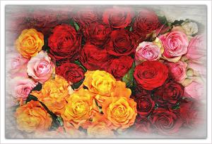
The many colors of roses59 total reviews
Comment from helvi2
Don't blame you at all for wanting to capture these beauties. I don't know what you did but I love the overall effect you used. I can see depth in here too. THe colors are beautiful and I like the unusual vignette you used.
Very Micely Done!
Good Luck in the Contest!
:o) Helvi
reply by the author on 17-Jul-2011
  |
Don't blame you at all for wanting to capture these beauties. I don't know what you did but I love the overall effect you used. I can see depth in here too. THe colors are beautiful and I like the unusual vignette you used.
Very Micely Done!
Good Luck in the Contest!
:o) Helvi
Comment Written 17-Jul-2011
reply by the author on 17-Jul-2011
-
Thank you very much
Comment from The Condition Black
This is an interesting approach to after-shoot additions. I like it when people add these "texture" filters over their shots. ClintHudson does a fantastic job of this. I've been trying to learn it myself, but I have the same problem that you do here; it just doesn't seem to work. They don't fit the piece.
I have to say too that I abhore vignettes. I rarely ever see them work, and even when they do they do not work as well as a good matte board. The detract from the composition. For example, in your piece the vignette only serves to de-saturate the color around the border. It doesn't assist in the overall balance of the piece. It doesn't add depth, tonal range or balance. It's just there... I guess because you know where to find the effect in the toolbar? I just don't get them (unless planned specifically for something in particular).
You have good tonal balance here, and some very fine contrast between the various imagery. It is a cool photograph and I commend your attempts to liven them up through the use of creative editing, but I am afraid that the final product falls just a little short of perfect.
Good luck in the contest, I hope you do well!
reply by the author on 17-Jul-2011
  |
This is an interesting approach to after-shoot additions. I like it when people add these "texture" filters over their shots. ClintHudson does a fantastic job of this. I've been trying to learn it myself, but I have the same problem that you do here; it just doesn't seem to work. They don't fit the piece.
I have to say too that I abhore vignettes. I rarely ever see them work, and even when they do they do not work as well as a good matte board. The detract from the composition. For example, in your piece the vignette only serves to de-saturate the color around the border. It doesn't assist in the overall balance of the piece. It doesn't add depth, tonal range or balance. It's just there... I guess because you know where to find the effect in the toolbar? I just don't get them (unless planned specifically for something in particular).
You have good tonal balance here, and some very fine contrast between the various imagery. It is a cool photograph and I commend your attempts to liven them up through the use of creative editing, but I am afraid that the final product falls just a little short of perfect.
Good luck in the contest, I hope you do well!
Comment Written 17-Jul-2011
reply by the author on 17-Jul-2011
-
I don't agree with you. You are right about Clint, and I am not even close to his abilities, but I actually think the texture works. If not I would not have posted it. Liking or not liking vignettes is of course a matter of taste. I want to thank you for a very thorough review. It is very much appreciated.
-
Hmm... I don't think that the texture "doesn't work." It just appears a little unfinished. It needs a little something. And I don't know as much about this level of photograph editing to weigh in on what needs to be done to make it along the lines of someone like Clint Hudson. And that's it; you are simply missing one or two little adjustments to make it on par with his work.I am holding you to that bar, because that is the next step for you.
I really don't like vignettes. I rarely if ever see them used in a way that is beneficial to a photograph. And I really think that this piece suffers from the vignette. That having been said I totally understand that at the end of the day I am offering nothing more than my own opinion. I didn't drop your rating as a result of the vignette. It isn't fair to do that based on an opinion. That was based on the overall composition; it just seems to be lacking something to really make it a nice piece. I wouldn't even know where to begin suggesting things to make it better. It could have been something done prior to shooting; different lighting or an additional focal point (overall there isn't anything in particular to focus on in this piece). Or maybe a little more contrast in the editing bay. Or may taking off the vignette. Without messing with the photo myself I find it hard to suggest what would have worked best.
-
Thank you for spending so much time to explain your point of view. I know the feeling when you think something is missing in a photo, but you cannot exactly put your finger on it. As a reviewer you are entitled to having these feeilings. I don't usually respond to a review with more than a Thank you. I suppose it was your extensive review that gave me the urge to disagree. I have ebjoyed this little discussion.
-
Hey, I totally agree. It's nice to get some feedback on your critique too, you know? Even if it's one of those cases (like this one) where you totally disagree. I get that. Had a chic rate one of my paintings a 4 because it look too real and needed to look more like art. I didn't get that at all. But oh well. Everyone has their opinion; no matter how stupid, unobjective and ultimately worthless some of them may be :)
I've enjoyed this too. It's nice to have a conversation in total disagreement and still be rational. Look forward to seeing more of your work!
Comment from Chaxl
Great in detail and color. The contrast is perfect as everything goes together. I love the zoom and angle of this photo, as well as your detailed description of both photo and camera settings.
reply by the author on 17-Jul-2011
|
Great in detail and color. The contrast is perfect as everything goes together. I love the zoom and angle of this photo, as well as your detailed description of both photo and camera settings.
Comment Written 16-Jul-2011
reply by the author on 17-Jul-2011
-
Thank you very much
Comment from mermaids
This picture reminds me when I use to work in a florist shoppe. The smell is incredible and I can almost smell them seeing this picture. Fabulous shot. I like the fading around edge.
reply by the author on 17-Jul-2011
|
This picture reminds me when I use to work in a florist shoppe. The smell is incredible and I can almost smell them seeing this picture. Fabulous shot. I like the fading around edge.
Comment Written 16-Jul-2011
reply by the author on 17-Jul-2011
-
Thank you very much
Comment from EvaB
Beautiful, great color. I think I'd not have vignetted, but that's personal taste and no reflection on the photo.
Really well done.
reply by the author on 17-Jul-2011
|
Beautiful, great color. I think I'd not have vignetted, but that's personal taste and no reflection on the photo.
Really well done.
Comment Written 16-Jul-2011
reply by the author on 17-Jul-2011
-
Thank you very much
Comment from Kevan
Beautiful work,nicely done.Good color and clarity.Good initial impact,holds my interest.Thanks for sharing.
reply by the author on 17-Jul-2011
|
Beautiful work,nicely done.Good color and clarity.Good initial impact,holds my interest.Thanks for sharing.
Comment Written 16-Jul-2011
reply by the author on 17-Jul-2011
-
Thank you very much
Comment from marieann green
Highly creative and unique shot. The mass of roses are nicely composed and colors are very harmonious. A pleasure to review
reply by the author on 17-Jul-2011
|
Highly creative and unique shot. The mass of roses are nicely composed and colors are very harmonious. A pleasure to review
Comment Written 16-Jul-2011
reply by the author on 17-Jul-2011
-
Thank you very much
Comment from mobil69
very color full pic good contrast good lighting good story telling good tech good harmony good tech no cropping here
reply by the author on 16-Jul-2011
|
very color full pic good contrast good lighting good story telling good tech good harmony good tech no cropping here
Comment Written 16-Jul-2011
reply by the author on 16-Jul-2011
-
Thank you very much
Comment from John House
Not the most visually impacting picture I feel the color and subject matter could have been more emphatic you have a good sense of color and how it compliments so be a little more brazen about it you obviously have the technical skill and imagination
reply by the author on 16-Jul-2011
|
Not the most visually impacting picture I feel the color and subject matter could have been more emphatic you have a good sense of color and how it compliments so be a little more brazen about it you obviously have the technical skill and imagination
Comment Written 16-Jul-2011
reply by the author on 16-Jul-2011
-
Thank you very much
-
your most welcome cheers john
Comment from ALYSSAA
Wonderful photograph. The colors are great, very clear and vibrant
Scale of 1 to 5 (highest)
Initial Impact 5 Creativity in Composition 5 Color and Exposure 5
Sharpness 5 Technique 5
Great job.
Thanks for sharing.
reply by the author on 16-Jul-2011
|
Wonderful photograph. The colors are great, very clear and vibrant
Scale of 1 to 5 (highest)
Initial Impact 5 Creativity in Composition 5 Color and Exposure 5
Sharpness 5 Technique 5
Great job.
Thanks for sharing.
Comment Written 16-Jul-2011
reply by the author on 16-Jul-2011
-
Thank you very much