
The Yellow Rose of Texas
Map with yellow rose28 total reviews
Comment from Dr. Michael Shelton
this is an interesting work of art it has great color and texture it is a cleaver idea that is well designed and has great balance it has focus and tells a great story well done and thanks for sharing this work of art
reply by the author on 16-Aug-2011
  |
this is an interesting work of art it has great color and texture it is a cleaver idea that is well designed and has great balance it has focus and tells a great story well done and thanks for sharing this work of art
Comment Written 15-Aug-2011
reply by the author on 16-Aug-2011
-
Thank you very much
Comment from peter
The first impression is a good mixed photo with a original story. The focus is good and the colors are nice. The presentation is well chosen.
reply by the author on 16-Aug-2011
|
The first impression is a good mixed photo with a original story. The focus is good and the colors are nice. The presentation is well chosen.
Comment Written 15-Aug-2011
reply by the author on 16-Aug-2011
-
Thank you very much
Comment from GaliaG
nice idea and good notes, but the bright yellow flares distracting and distrubing
good luck with the contest and thanks for sharing
reply by the author on 16-Aug-2011
  |
nice idea and good notes, but the bright yellow flares distracting and distrubing
good luck with the contest and thanks for sharing
Comment Written 15-Aug-2011
reply by the author on 16-Aug-2011
-
Thank you very much
Comment from Shakeadog
good creation for the contest
very good ideas used here
colours are striking and vivid
good details in it
well thought out and executed too
well done
good luck with it in the contest
reply by the author on 16-Aug-2011
|
good creation for the contest
very good ideas used here
colours are striking and vivid
good details in it
well thought out and executed too
well done
good luck with it in the contest
Comment Written 15-Aug-2011
reply by the author on 16-Aug-2011
-
Thank you very much
Comment from cen12964
Nice piece of art. Good initial impact. Does tell the story. Nice composition. Very good creative presentation. Thanks for sharing.
reply by the author on 16-Aug-2011
|
Nice piece of art. Good initial impact. Does tell the story. Nice composition. Very good creative presentation. Thanks for sharing.
Comment Written 14-Aug-2011
reply by the author on 16-Aug-2011
-
Thank you very much
Comment from trekbabe
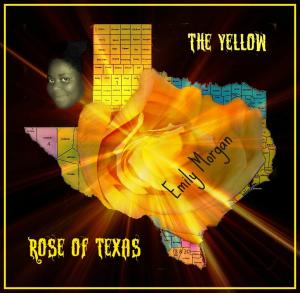
This is a very eye-catching piece. Vivid colours along with the burst of sun rays create a vivacious effect. It's a very clever idea and well presented. One small criticism and that is a glaring spelling mistake! It doesn't detract from the quality of the piece but my eye was drawn to it. Texas has been spelled Twxas! Other than that niggle, I love it!
reply by the author on 16-Aug-2011
|
This is a very eye-catching piece. Vivid colours along with the burst of sun rays create a vivacious effect. It's a very clever idea and well presented. One small criticism and that is a glaring spelling mistake! It doesn't detract from the quality of the piece but my eye was drawn to it. Texas has been spelled Twxas! Other than that niggle, I love it!
Comment Written 14-Aug-2011
reply by the author on 16-Aug-2011
-
Thank you very much. I have edited the photo. It looks slightly different, and with the correct spelling
Comment from photosbyted
I spent some time in Texas and like the yellow rose good worki and thank you for sharing with us.
Ted
reply by the author on 16-Aug-2011
|
I spent some time in Texas and like the yellow rose good worki and thank you for sharing with us.
Ted
Comment Written 14-Aug-2011
reply by the author on 16-Aug-2011
-
Thank you very much
Comment from ramonafrances
High points for creativity and as a poster, it really gets my attention. Think I would have liked to have seen the same level of detail on the right as on the left. My eye keeps wanted to compare the right side with the left.
reply by the author on 16-Aug-2011
|
High points for creativity and as a poster, it really gets my attention. Think I would have liked to have seen the same level of detail on the right as on the left. My eye keeps wanted to compare the right side with the left.
Comment Written 14-Aug-2011
reply by the author on 16-Aug-2011
-
Thank you very much. Have edited the image. Perhaps you think it was an improvement ?
-
Yes, it looks more balanced!
Comment from Pat Groleau
I really like your picture. Very artistic and unique. I would correct the writting on this...the word 'TWXAS' you can go in an edit it. I like your overall presentation. Great job and good luck on the yellow contest. Pat
reply by the author on 14-Aug-2011
|
I really like your picture. Very artistic and unique. I would correct the writting on this...the word 'TWXAS' you can go in an edit it. I like your overall presentation. Great job and good luck on the yellow contest. Pat
Comment Written 14-Aug-2011
reply by the author on 14-Aug-2011
-
Thank you Pat. Never noticed the bad spelling. Also thanks for the lovely review
-
You are more than welcomed. It is a honor to review your work and look forward to seeing more of it! Pat
Comment from The Condition Black
I like the attempt at this. Photo editing can really add some depth to a picture. I am afraid you fell a bit short on this piece.
I spent nearly ten years as a journalist/layout designer/illustrator for several newspapers (in South Texas, of all places) and there are a couple of rules that you MUST follow when presenting recognizable imagery; first, you don't want to manipulate or distort the borders of a recognizable image without good reason. And second you absolutely can NOT miss-spell names. HUGE faux pas.
The borders of the state of Texas are almost unintelligible in this picture. I had no idea that is what we were seeing until I read the title. I am a fan of the layering you did, and even of the effect. But the effect used here is too overpowering. You can't even tell that the center is a rose, either. And of course "TWXAS" is a big no no. Spell check. You gotta copy edit all text.
Overall this piece is a little simplistic. It doesn't look like you spent a whole lot of time on it, and honestly I think there may be some copyright violations in the use of that map. The good thing about all of this is that you have an obvious talent for the software you are using, and I fully believe that you have the ability to put out some interesting work. Graphically this piece is not far off from the things I see used as CD/book/movie covers, fliers and things like that. In fact I do work like that all the time for t-shirt designs etc.
I tell you what. If you have any questions regarding your work, or if you would like a preliminary review prior to posting on this site hit me up on facebook. facebook.com/theconditionblack (and check out my website www.theconditionblack.com if you want to see the work that I do). I am happy to answer questions, provide insight... anything you need. You have the ability to be a talented artist.
This rating does not count towards story rating or author rank.
The highest and the lowest rating are not included in calculations.
reply by the author on 14-Aug-2011
 |
I like the attempt at this. Photo editing can really add some depth to a picture. I am afraid you fell a bit short on this piece.
I spent nearly ten years as a journalist/layout designer/illustrator for several newspapers (in South Texas, of all places) and there are a couple of rules that you MUST follow when presenting recognizable imagery; first, you don't want to manipulate or distort the borders of a recognizable image without good reason. And second you absolutely can NOT miss-spell names. HUGE faux pas.
The borders of the state of Texas are almost unintelligible in this picture. I had no idea that is what we were seeing until I read the title. I am a fan of the layering you did, and even of the effect. But the effect used here is too overpowering. You can't even tell that the center is a rose, either. And of course "TWXAS" is a big no no. Spell check. You gotta copy edit all text.
Overall this piece is a little simplistic. It doesn't look like you spent a whole lot of time on it, and honestly I think there may be some copyright violations in the use of that map. The good thing about all of this is that you have an obvious talent for the software you are using, and I fully believe that you have the ability to put out some interesting work. Graphically this piece is not far off from the things I see used as CD/book/movie covers, fliers and things like that. In fact I do work like that all the time for t-shirt designs etc.
I tell you what. If you have any questions regarding your work, or if you would like a preliminary review prior to posting on this site hit me up on facebook. facebook.com/theconditionblack (and check out my website www.theconditionblack.com if you want to see the work that I do). I am happy to answer questions, provide insight... anything you need. You have the ability to be a talented artist.
This rating does not count towards story rating or author rank.
The highest and the lowest rating are not included in calculations.
Comment Written 14-Aug-2011
reply by the author on 14-Aug-2011
-
Oh shit. Will of course correct that. Thank you very much for the thorough review.
-
I have no edited this. Texas looks like Texas, and the spelling is correct. Also added a woman who could have been the slave. Thank you so much for your offer. Sometimes it would be good to get some prelimenary opinions.