Feeling Pushed And Pulled ?
Partial abstract of hands5 total reviews
Comment from Anne
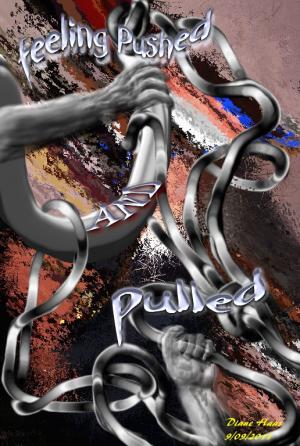
This is fascinating the way you have done it. I like the colors in the background and the way you added the touch of red white and blue near the top. I like the way you have the silver line running all through this too. Neat the way you have the arms, hands and wording in this. A very creative and excellent work of art.
reply by the author on 15-Sep-2011
  |
This is fascinating the way you have done it. I like the colors in the background and the way you added the touch of red white and blue near the top. I like the way you have the silver line running all through this too. Neat the way you have the arms, hands and wording in this. A very creative and excellent work of art.
Comment Written 14-Sep-2011
reply by the author on 15-Sep-2011
-
thank you anne for a great review. I'm glad you like my weird art LOL
lynnkah
Comment from sarah63
Great work Diane .
Great colors and tones ,
A very apt title also along with great notes and the picture is as expressive as are the notes VERY well done .
Great work and many thanks for sharing.
reply by the author on 11-Sep-2011
|
Great work Diane .
Great colors and tones ,
A very apt title also along with great notes and the picture is as expressive as are the notes VERY well done .
Great work and many thanks for sharing.
Comment Written 10-Sep-2011
reply by the author on 11-Sep-2011
-
thanks sarah, life gets a bit hectic at times I think I might make a poster out of this one and hang it on my front door LOL
-
Thats a bloomin good idea...LOL
I truely think its a great piece hun really well done.
Take care.
Comment from cleo85
Amazing with what you come up just playing around. I envy you. If I just play around I usually come up with nothing. If I do painting or Mixed Media the Ideas are usually in my head for weeks, sometimes months but when I start I usually know how it should look when it's finished.
First I thought it had something to do with the France revolution 1848. Must be the colors. The white, red, blue looks like the Tricolore but for your theme it works as well. It reminds a bit of posters in the style. I personally would not have ad the words; but it is very effective.
reply by the author on 11-Sep-2011
|
Amazing with what you come up just playing around. I envy you. If I just play around I usually come up with nothing. If I do painting or Mixed Media the Ideas are usually in my head for weeks, sometimes months but when I start I usually know how it should look when it's finished.
First I thought it had something to do with the France revolution 1848. Must be the colors. The white, red, blue looks like the Tricolore but for your theme it works as well. It reminds a bit of posters in the style. I personally would not have ad the words; but it is very effective.
Comment Written 10-Sep-2011
reply by the author on 11-Sep-2011
-
thank you again cleo for a great review and compliment. It does seem to fit more of that time era, wish I had come up with that LOL
-
You're very welcome :-)
Comment from Outdoor Wonders
I guess you are right we all feel the way that your expression is showing. This is very creative. The splash of color in the back round pushes the center of interest forward nicely. I like how you have things laded out. Nice effect of the transparency of the hand as it is pulling. The words are bold giving depth to the image. The interaction of rope gives a good effect to what you are expressing. Very interesting piece. Nicely done.
reply by the author on 10-Sep-2011
|
I guess you are right we all feel the way that your expression is showing. This is very creative. The splash of color in the back round pushes the center of interest forward nicely. I like how you have things laded out. Nice effect of the transparency of the hand as it is pulling. The words are bold giving depth to the image. The interaction of rope gives a good effect to what you are expressing. Very interesting piece. Nicely done.
Comment Written 10-Sep-2011
reply by the author on 10-Sep-2011
-
thank you so much for a fantastic review. I can see that you put some thought into the review of this piece which is a hugh complment .
thank you again
lynnkah
-
You are welcome. I believe if a person is going to take the time to look at something they should look at the whole image that is before them. There are so many on this site that only write 10 to 15 words. You know that they did not fully look at the artists work. They are just giving a quick review for the reviewing points, and really don't put any thought into what they are viewing. I know it is sometimes hard to describe what is before the eye but I do my best.
Comment from amfunny
Well, now .. this is interesting.. I like the message. It does have a bit of humor in it. Love the metal and the hands. Very creatively done.
reply by the author on 10-Sep-2011
|
Well, now .. this is interesting.. I like the message. It does have a bit of humor in it. Love the metal and the hands. Very creatively done.
Comment Written 10-Sep-2011
reply by the author on 10-Sep-2011
-
this is my version of lives struggles LOL, not really it just turned out that way LOl
thanks for the rating
told you it wasn't as graceful and elegant as yours LOL