Pastel Landscapes
Viewing comments for Page 6 "Lonely Bench - Take Two"impressionist landscapes in pastels
29 total reviews
Comment from JanDeAngelis
Very nice. Love this, love the colors they just really pop! Like the composition love the lines of the trees really helps to break up the color and add interest. Beautiful!
reply by the author on 09-Oct-2011
  |
Very nice. Love this, love the colors they just really pop! Like the composition love the lines of the trees really helps to break up the color and add interest. Beautiful!
Comment Written 06-Oct-2011
reply by the author on 09-Oct-2011
-
Aww thank you so much for the lovely review, this one is one of my faves and Im hoping to recreate it next year but on a large canvas
Comment from The Condition Black
Ok, this will be my last review for today. Hope you enjoy all this, and I hope it isn't too repetitive.
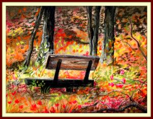
Contrast here is great. A bright, colorful field broken up by the dark shadows of the bench and the trees. Great silhouettes. Really makes for a stark center of focus. And I actually like black here. The one time I really forgive black is with silhouettes. Using black makes them stand out a little brighter than the rest of the picture, they have a tendency to "pop." It still doesn't look natural, and if you really want to be a RAD artist I fully believe that you must create your own black.
[For the record I believe that a truly GNARLY artist must make their own colors... since I was 10 years old I have only ever used Red, Yellow and Blue pigment in my paintings]
This is another piece that would do well as a large backdrop to a couch or as the centerpiece to a wall.
You need a webpage and a Zazzle account. I use Zazzle and Spreadshirt, and both work real well for me. I'll give you a link to see what I'm talking about at the end of this note. Both Zazzle and Spreadshirt allow you to upload your work and place it on a variety of items. On spreadshirt you mainly design clothing, Zazzle is great about canvas prints. You design how each piece looks, and you add it to your "store" with a set price. (Zazzle/Spreadshirt charge a certain amount for their items, you add the commission you feel comfortable with). List the store link on your website. People can purchase your items direct from these retailors, and they cut you a check.
Spreadshirt is good because they cut you a check once a month. Zazzle is cool because they do canvas prints, but they only cut a check after you have earned $25. Not fond of that. But I am sure you can request a check if you've had money sitting in your Zazzle account or want to close it. They give you that option.
You can see how I've set mine up by going to my website:
www.theconditionblack.com
On the left side of your browser click on "Merchandise." From that page click on the picture of the T-shirt for Spreadsheet, or there is a self-explanatory link for Zazzle (it claims canvas prints).
Ok, I think I've written enough for one day. I think now I am in Austin... the work day is done and I feel like going to get some sushi and having a drink or two!
reply by the author on 02-Oct-2011
|
Ok, this will be my last review for today. Hope you enjoy all this, and I hope it isn't too repetitive.
Contrast here is great. A bright, colorful field broken up by the dark shadows of the bench and the trees. Great silhouettes. Really makes for a stark center of focus. And I actually like black here. The one time I really forgive black is with silhouettes. Using black makes them stand out a little brighter than the rest of the picture, they have a tendency to "pop." It still doesn't look natural, and if you really want to be a RAD artist I fully believe that you must create your own black.
[For the record I believe that a truly GNARLY artist must make their own colors... since I was 10 years old I have only ever used Red, Yellow and Blue pigment in my paintings]
This is another piece that would do well as a large backdrop to a couch or as the centerpiece to a wall.
You need a webpage and a Zazzle account. I use Zazzle and Spreadshirt, and both work real well for me. I'll give you a link to see what I'm talking about at the end of this note. Both Zazzle and Spreadshirt allow you to upload your work and place it on a variety of items. On spreadshirt you mainly design clothing, Zazzle is great about canvas prints. You design how each piece looks, and you add it to your "store" with a set price. (Zazzle/Spreadshirt charge a certain amount for their items, you add the commission you feel comfortable with). List the store link on your website. People can purchase your items direct from these retailors, and they cut you a check.
Spreadshirt is good because they cut you a check once a month. Zazzle is cool because they do canvas prints, but they only cut a check after you have earned $25. Not fond of that. But I am sure you can request a check if you've had money sitting in your Zazzle account or want to close it. They give you that option.
You can see how I've set mine up by going to my website:
www.theconditionblack.com
On the left side of your browser click on "Merchandise." From that page click on the picture of the T-shirt for Spreadsheet, or there is a self-explanatory link for Zazzle (it claims canvas prints).
Ok, I think I've written enough for one day. I think now I am in Austin... the work day is done and I feel like going to get some sushi and having a drink or two!
Comment Written 01-Oct-2011
reply by the author on 02-Oct-2011
-
wow well to say Im blown away by these reviews is an understatement,I think I have learned more in this site in the last ten minutes than I have in a year!! Gosh well where do I begin, firstly, yay you like it lol and the thing about the black is a very interesting one, I will have to play about with that and experiment more with the colours. I do tend to mix most of my colours, I only have a small set of pastels and so far they have done just fine. I try not to match the colours in the photos too much that way I can just add a bit more pizazz to it, I just try and get the tones right but make up the colours as I go along.
Now its funny you should mention the larger pieces, I have always thought these would look great blown up as paintings, they are only a4 studies right now. I see them as starting points for bigger canvases but as to when I will find the time to go through with that who knows! You have helped me realise that this should be my next project though. I will spend the rest of the year perfecting these scenes in the same size and with different settings and then next year start thinking BIG!
I looked at your webpage and its fab, and so sweet that you have joined it with your brothers work, how come he hasn't signed up on here as well? You both make quite the duo, a very creative family!! I do have a website but its something I have had to put together myself, I haven't got the cash for a professional one, its very simple but does the job for now its at www.corrinascreations.co.uk
I have signed up to Zazzle and another couple, red bubble and deviantart all produce your work as posters, mugs, coasters you name it etc. Cant say I have seen many sales on them, a few here and there but nothing substantial. Im not sure my stuff would work on clothing.
Thanks again for all this input, greatly appreciated
Comment from Edward Davie
I like this work. It is your style. I've seen your other works along this line and think you have tapped into something. Its a landscape with a very good contemporary interpretation. Nice.
reply by the author on 19-Sep-2011
  |
I like this work. It is your style. I've seen your other works along this line and think you have tapped into something. Its a landscape with a very good contemporary interpretation. Nice.
Comment Written 19-Sep-2011
reply by the author on 19-Sep-2011
-
Thank you so much and coming from someone who appreciates colour as much as I do that means alot. I hope you are right there, they certainly seem to be selling more than my other pieces did. Fingers crossed eh :)
Comment from Rivergirl51
Well, you certainly put this to good use as this is lovely. I'm sure Jesus liked the idea that you used his photo to do this. The colors are really gorgeous. Nice work.
reply by the author on 17-Sep-2011
|
Well, you certainly put this to good use as this is lovely. I'm sure Jesus liked the idea that you used his photo to do this. The colors are really gorgeous. Nice work.
Comment Written 14-Sep-2011
reply by the author on 17-Sep-2011
-
Thank you so much yes he fell in love with it and its now in the air as we speak to take proud place in his home. Must admit this is my fave to date, the photo was so inspirational.
Comment from cleo85
That is excellent. I love these colors. Looks as if nature is exploding in beauty. The sunlight through the trees is outstanding.The lonely bench dark on the ground overgrown by plants; but sun lighted above and the tree trunks; dark above but sun lighted below are an intensely eye drawing assemble. that is surely one of your best.
reply by the author on 17-Sep-2011
 |
That is excellent. I love these colors. Looks as if nature is exploding in beauty. The sunlight through the trees is outstanding.The lonely bench dark on the ground overgrown by plants; but sun lighted above and the tree trunks; dark above but sun lighted below are an intensely eye drawing assemble. that is surely one of your best.
Comment Written 14-Sep-2011
reply by the author on 17-Sep-2011
-
Thank you so much Cleo, yes this is def my fave and I think I am going to have to redo a larger one now as this one has now been sent to Jesus. I wouldn't mind having one for myself. I feel like Im up my own bottom bragging about it but I really like this one too lol
-
You're very welcome. It is definitelly my favorite.
Comment from Mr Jones
well i have not had much luck, since reviewing your "lucky" postcard but maybe it's a delayed reaction. oh well i'm certainly enjoying the traditional art of this wonderful lady. this one seems to be bordering on the impressionist movement and the way you have mixed and merged such vibrant colour, well even the great Turner, would be proud of this.
reply by the author on 17-Sep-2011
|
well i have not had much luck, since reviewing your "lucky" postcard but maybe it's a delayed reaction. oh well i'm certainly enjoying the traditional art of this wonderful lady. this one seems to be bordering on the impressionist movement and the way you have mixed and merged such vibrant colour, well even the great Turner, would be proud of this.
Comment Written 14-Sep-2011
reply by the author on 17-Sep-2011
-
Oh yes you have Mr Jones ;) Thank you so much, I have had a lot of feedback now mentioning the impressionist, looks like this is how my style is evolving, I do love paintings from that era so I must be influenced by it. I love the way they just use shapes to make up a painting but off course with mine they have to be quite bright and bold so not as muted as some of the impressionist painters. More Van Gogh than your Monet
Comment from syork47
Very nice, for a mimnute I thought I had already reviewed then realized what you had done. Love the subject
reply by the author on 14-Sep-2011
|
Very nice, for a mimnute I thought I had already reviewed then realized what you had done. Love the subject
Comment Written 14-Sep-2011
reply by the author on 14-Sep-2011
-
Lol I love that it made you think twice, Im glad it resembled the photo. Thanks so much for the review
Comment from margofeatherpainter
NO wonder it sold, it is lovely art, love the colors and placement of the bench, great job, thank you for sharing
reply by the author on 14-Sep-2011
|
NO wonder it sold, it is lovely art, love the colors and placement of the bench, great job, thank you for sharing
Comment Written 13-Sep-2011
reply by the author on 14-Sep-2011
-
Aww thank you so much. Im really enjoying doing these pastels,hoping to do some more fall ones soon
Comment from helvi2
Hi Corrina,
I'm surprised that this bench would be lonely. I for one would love to sit on it! The surroundings are beautiful there. I can imagine colorful leaves falling all around me in a soft flutter. Love the hues you used here. This would be pure serenity to me. Your painting is gorgeous! Wish I had a six for you. :o) Helvi
reply by the author on 14-Sep-2011
|
Hi Corrina,
I'm surprised that this bench would be lonely. I for one would love to sit on it! The surroundings are beautiful there. I can imagine colorful leaves falling all around me in a soft flutter. Love the hues you used here. This would be pure serenity to me. Your painting is gorgeous! Wish I had a six for you. :o) Helvi
Comment Written 13-Sep-2011
reply by the author on 14-Sep-2011
-
Aww I graciously accept your cyber 6, thank you :) I know I would be sitting on it straight away. It was the name of the original photo so wanted to keep it the same.Im so pleased you like it
Comment from Jane Jenkins
I think you did so well that you should re-name it 'Happy Bench.' The colors are so bright and warm and reach up to the bench as if embracing it. Good job.
reply by the author on 14-Sep-2011
|
I think you did so well that you should re-name it 'Happy Bench.' The colors are so bright and warm and reach up to the bench as if embracing it. Good job.
Comment Written 13-Sep-2011
reply by the author on 14-Sep-2011
-
Lol I like happy bench, the original was called Lonely bench so wanted to keep it the same. Thank you so much for the lovely review