Yorkshire Farmhouse
Old farmhouse in Yorkshire25 total reviews
Comment from katsi
Initial impact: Very good
Creativity of presentation: Great
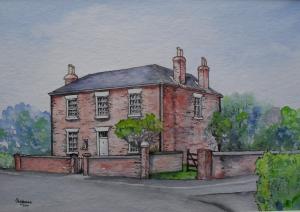
Color harmony: Best part of the work ... They compliment and balance the entire painting. Love the muted colors of the tees in the background
Center of Interest: Great old house! Classic architecture
Tech excellence: Just to be picky, here: The furthest wall corner seems to be leaning slightly. The inside wall that is perpendicular to the house seems to float off the ground a bit.
Your use of pen & ink over the watercolor is good for giving detail and adding perspective. Makes the house and walls pop! Shading & shadows is very good.
Storytelling opp's: Yes
Nice work!
...katsi...
reply by the author on 18-Oct-2011
    |
Initial impact: Very good
Creativity of presentation: Great
Color harmony: Best part of the work ... They compliment and balance the entire painting. Love the muted colors of the tees in the background
Center of Interest: Great old house! Classic architecture
Tech excellence: Just to be picky, here: The furthest wall corner seems to be leaning slightly. The inside wall that is perpendicular to the house seems to float off the ground a bit.
Your use of pen & ink over the watercolor is good for giving detail and adding perspective. Makes the house and walls pop! Shading & shadows is very good.
Storytelling opp's: Yes
Nice work!
...katsi...
Comment Written 18-Oct-2011
reply by the author on 18-Oct-2011
-
Thank you very much for your review.
-
Most welcome!
Comment from The Condition Black
Fantastic work, on a couple of levels. For one you have a a very precise manner with which you apply your pigments. I love that. It is very detailed and focused and that bodes well for the imagery. I would like to see you add varying layers of color. Your greens and reds look like they are right out of the bottle; mix them up a bit. Add some contrasting color. Gives the viewer a little more depth.
You have executed your linear perspective flawlessly. Stunning work in that regard, every single little window frame, every brick and line... all are formed very well. That makes this piece shine above all else. I firmly believe the best paintings (works of art?) are those that feature symmetry against chaos. You have to be Frank Lloyd Wright and Jackson Pollock all rolled into one. You have that in spades. It is rare to see this, but I would actually suggest you improve slightly the 'artistic' qualities of your painting. And by that I simply mean adding some contrasting color. Because that is about the only thing lacking in this piece.
I have one more addition to this critique. You have completed a fantastic work of art, but this photograph does not do it justice. The detail is good, and the photograph isn't terrible but it is very muddy in its appearance. You need to run that through a photo editing program before you post it. Just adjust the contrast a little and it will look WORLDS better.
Thank you for posting, your work make a fine addition to this site!
reply by the author on 18-Oct-2011
|
Fantastic work, on a couple of levels. For one you have a a very precise manner with which you apply your pigments. I love that. It is very detailed and focused and that bodes well for the imagery. I would like to see you add varying layers of color. Your greens and reds look like they are right out of the bottle; mix them up a bit. Add some contrasting color. Gives the viewer a little more depth.
You have executed your linear perspective flawlessly. Stunning work in that regard, every single little window frame, every brick and line... all are formed very well. That makes this piece shine above all else. I firmly believe the best paintings (works of art?) are those that feature symmetry against chaos. You have to be Frank Lloyd Wright and Jackson Pollock all rolled into one. You have that in spades. It is rare to see this, but I would actually suggest you improve slightly the 'artistic' qualities of your painting. And by that I simply mean adding some contrasting color. Because that is about the only thing lacking in this piece.
I have one more addition to this critique. You have completed a fantastic work of art, but this photograph does not do it justice. The detail is good, and the photograph isn't terrible but it is very muddy in its appearance. You need to run that through a photo editing program before you post it. Just adjust the contrast a little and it will look WORLDS better.
Thank you for posting, your work make a fine addition to this site!
Comment Written 18-Oct-2011
reply by the author on 18-Oct-2011
-
Thank you very much for your very detailed and encouraging review.
Comment from 4 I AM
I'm a photographer and i know i would have taken a picture of this house from this angle, so i love it's composition. The soft colors are magic and blend well.
reply by the author on 18-Oct-2011
|
I'm a photographer and i know i would have taken a picture of this house from this angle, so i love it's composition. The soft colors are magic and blend well.
Comment Written 18-Oct-2011
reply by the author on 18-Oct-2011
-
Many thank for your very nice comments. I'm glad you like this.
Comment from s neufeldt
i actually like the effect you created as it does look like a character house
i like the added detail of ink, its nice to see mixes done in artwork
reply by the author on 26-Sep-2011
|
i actually like the effect you created as it does look like a character house
i like the added detail of ink, its nice to see mixes done in artwork
Comment Written 26-Sep-2011
reply by the author on 26-Sep-2011
-
Many thanks for your very nice review. Glad you like it.
Comment from amfunny
I love this and the look of the watercolor. Wish I knew how to do that. excellent details in this. Just needs a bit more definition or clouds in the sky.Good job.
reply by the author on 26-Sep-2011
|
I love this and the look of the watercolor. Wish I knew how to do that. excellent details in this. Just needs a bit more definition or clouds in the sky.Good job.
Comment Written 25-Sep-2011
reply by the author on 26-Sep-2011
-
Many thanks for your kind review. Much appreciated.
Comment from joelise
Very good initial impact. Good design, lighting and color harmony. The interest ing architectural style with multiple chimneys and flues is the center of interest. Good composition with surrounding brick fence and trees. Good technique, technical skill in use of media and story telling potential. Creativity in good notes.
reply by the author on 24-Sep-2011
|
Very good initial impact. Good design, lighting and color harmony. The interest ing architectural style with multiple chimneys and flues is the center of interest. Good composition with surrounding brick fence and trees. Good technique, technical skill in use of media and story telling potential. Creativity in good notes.
Comment Written 23-Sep-2011
reply by the author on 24-Sep-2011
-
Thank you so much for your great review. Much appreciated.
Comment from G.P.Photography
This is a lovely painting with pen. It is a rather modern looking English house,I know what you were looking for more an old cottage look. I love English cottages,My Auntie lives in a very old cottage,they even have names for them,hers is rose cottage.You have really done a nice job of this house though. He should be very proud of this painting,well done!
reply by the author on 24-Sep-2011
|
This is a lovely painting with pen. It is a rather modern looking English house,I know what you were looking for more an old cottage look. I love English cottages,My Auntie lives in a very old cottage,they even have names for them,hers is rose cottage.You have really done a nice job of this house though. He should be very proud of this painting,well done!
Comment Written 23-Sep-2011
reply by the author on 24-Sep-2011
-
Many thanks for your great review. I'm glad you like this.
Comment from Galyavision
Beautiful painting and house. Nice soft colors. Great initial impact and technique. I like the different tonalities and contrasts. The detail on the windows is excellent.
reply by the author on 23-Sep-2011
|
Beautiful painting and house. Nice soft colors. Great initial impact and technique. I like the different tonalities and contrasts. The detail on the windows is excellent.
Comment Written 23-Sep-2011
reply by the author on 23-Sep-2011
-
Thank you so much for your very nice review. Much appreciated.
Comment from Lynnmarie
I think this is a very lovely painting of this building and the surrounding foliage. It looks a very peaceful and beautiful place. You did a wonderful job on the brick which has lots of great texture. Very well done! Lynnmarie
reply by the author on 23-Sep-2011
|
I think this is a very lovely painting of this building and the surrounding foliage. It looks a very peaceful and beautiful place. You did a wonderful job on the brick which has lots of great texture. Very well done! Lynnmarie
Comment Written 23-Sep-2011
reply by the author on 23-Sep-2011
-
Thank you so much for your very nice review. I'm glad you like it.
Comment from Max Eac
Your rendering is outstanding, and inviting. But your use of color is just beautiful, creative, and just plain puts you into the painting. Your use of light is such a wonderful part of your use of color. I wanna be there!
This rating does not count towards story rating or author rank.
The highest and the lowest rating are not included in calculations.
reply by the author on 23-Sep-2011
|
Your rendering is outstanding, and inviting. But your use of color is just beautiful, creative, and just plain puts you into the painting. Your use of light is such a wonderful part of your use of color. I wanna be there!
This rating does not count towards story rating or author rank.
The highest and the lowest rating are not included in calculations.
Comment Written 23-Sep-2011
reply by the author on 23-Sep-2011
-
Many thanks for your great review. Separate message sent.
-
Many your welcomes. When I see a piece like this it cranks up the ole idea machine. So thank you.